


More details
How can Kerozen’s graphic design balance rugged military heritage and nostalgic elegance to evoke adventure, bravery, and authenticity across diverse branded materials?
The visual identity for Kerozen is deployed across stationery, paper bags, travel bags, clothing tags, and t-shirts. Inspired by aviation fuel, the brand name evokes the bold spirit of early military aviators. The graphic design combines a vintage logo—styled like aircraft fuselage markings—with detailed engravings of pioneering pilots, reinforcing a narrative of authenticity and adventure. Dominated by khaki and beige-yellow tones, the visuals suggest reliability, bravery, and a rugged, time-worn elegance. The design pays homage to WWI flying aces, blending military heritage with a fashionable edge, creating a unique and nostalgic style that celebrates courage, resilience, and the thrill of the skies.
Jardin Secret
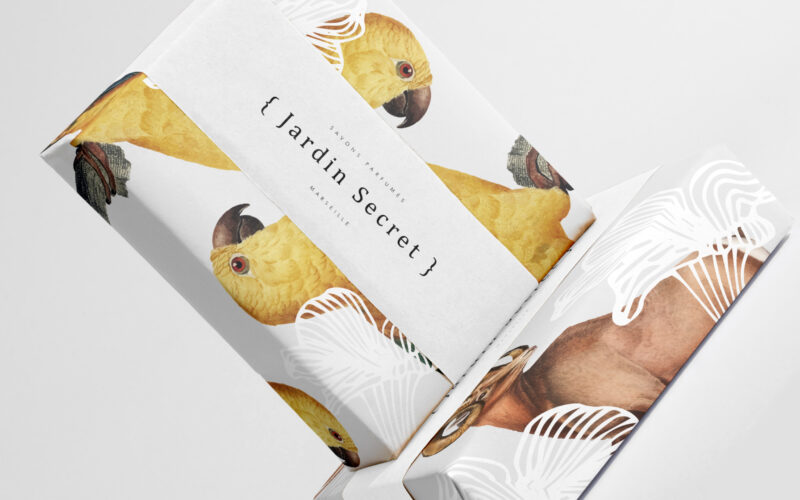
How can Jardin Secret’s graphic design balance vibrant natural imagery with intimacy and exclusivity, creating a fresh, radiant identity that evokes a personal sensory escape in eco-friendly packaging? Bright and lush, {Jardin Secret} by...
Jardin Secret
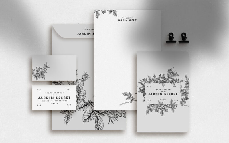
How can Jardin Secret’s graphic design express eco-consciousness and intimacy using delicate black and white illustrations, creating a poetic and personal identity that evokes hidden gardens and quiet self-care rituals? Jardin Secret...
Jerry Khane
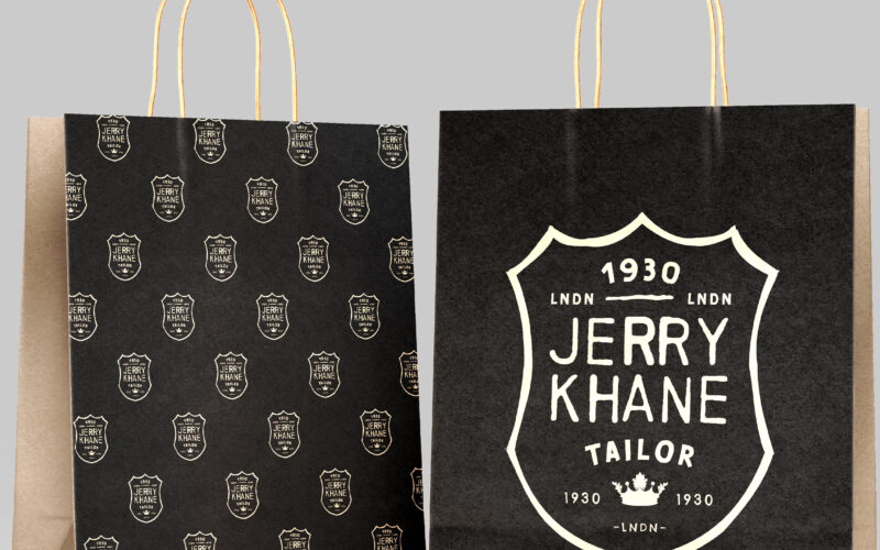
How can Jerry Khane’s graphic design balance vintage sophistication and artisanal rawness, combining aristocratic heritage with modern rebellion through textured visuals and a refined yet rugged identity? Jerry Khane – Tailor blends...
Kropper
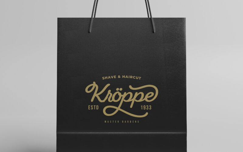
How can graphic design express heritage, masculinity, and expertise in modern men’s cosmetics? Kroppe’s challenge: create a timeless identity that feels both historic and premium, with unmistakable character. Kroppe’s graphic design...