How can visual design affirm a modest, deliberate identity — using fashion and the metaphor of the mask not to hide, but to reveal the self with elegance, distance, and quiet power?INKONITO is a conceptual brochure exploring identity...
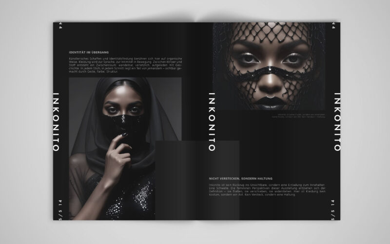

How can visual design affirm a modest, deliberate identity — using fashion and the metaphor of the mask not to hide, but to reveal the self with elegance, distance, and quiet power?INKONITO is a conceptual brochure exploring identity...
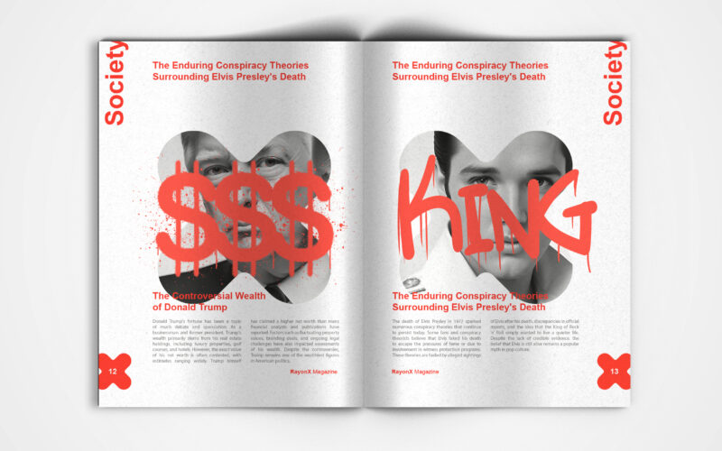
X-Ray magazine uses bold design and the X motif to decode society's layers. But can visual aesthetics alone effectively unveil the hidden complexities shaping modern culture and public discourse? This is a visually striking society...
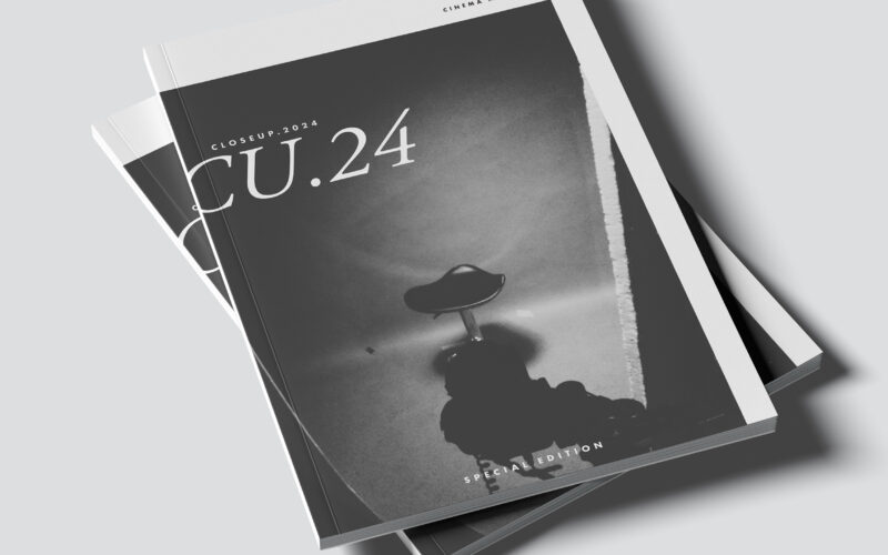
CU.24 plays with contrast, framing, and cinematic rhythm. The challenge: how can graphic design capture the depth of film language—light, shadow, and emotion—through purely static composition? The CU.24 brochure embodies cinematic...
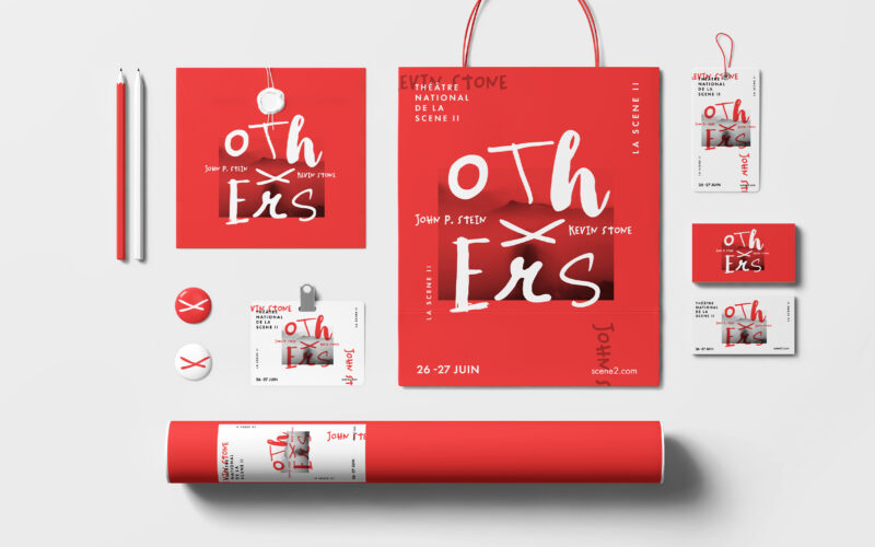
How can graphic design convey reconstruction and the rewriting of truths, using fragmented typography and the “X” to reveal, conceal, and question the narratives of “the others”? The Others project builds a bold, minimalist identity...
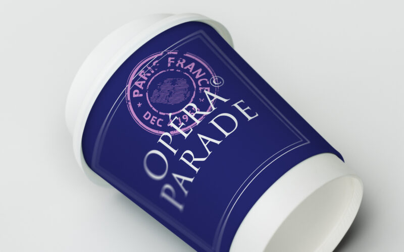
How can Opéra Parade’s graphic design blend classical elegance with nomadic playfulness, turning each performance into a visual postcard that celebrates movement, music, and shared cultural journeys? The graphic identity for Opéra Parade,...
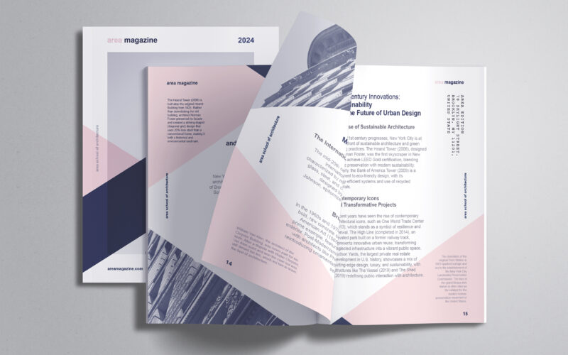
How can editorial design embody architectural thinking? AREA Magazine’s brochure uses layered, intersecting forms and unexpected imagery to mirror the structural logic and creative spontaneity that define the built environment. The graphic...
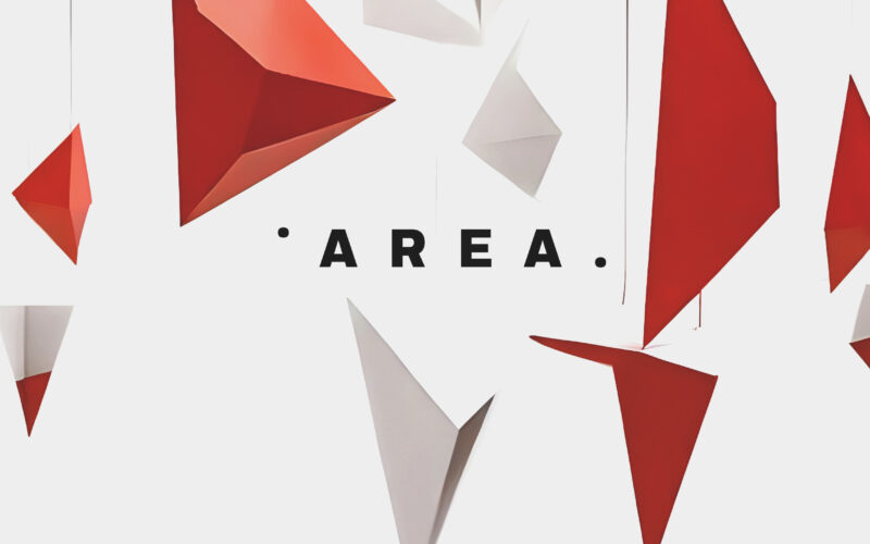
Can graphic design express the concept of space itself? AREA Academy’s identity uses suspended geometric forms and stark minimalism to evoke architecture’s dual nature—structured yet free, fragmented yet visionary. The graphic design for...
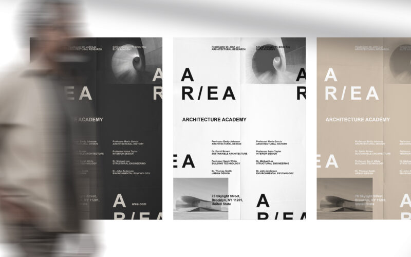
How can graphic design embody architectural research and elite education? AR/EA’s minimal, dual-directional logo and earthy palette capture space, sustainability, and industrial heritage, merging identity with New York’s architectural...
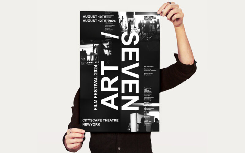
How to visually celebrate cinema’s artistry and craft? Seven Art 2024 uses bold vertical titling and shadowy film set silhouettes, creating a cinematic identity that honors both screen and unseen creators. The visual identity for Seven Art...
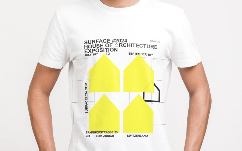
How to visually express architectural innovation? Surface uses neon yellow, minimalist logos, and grid motifs to create a bold, modern identity that reflects precision, structure, and contemporary design. The brand identity for Surface, an...
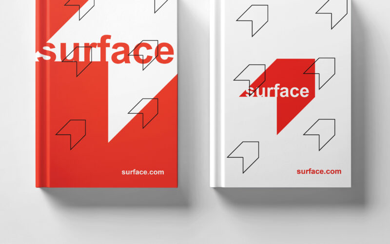
How to convey architectural duality? Surface uses red and white with a minimalist, 3D-illusion logo that balances flatness and volume, creating a refined, modern identity for the exhibition’s visual universe. The graphic design for the...
Surface explores architectural duality through a bold red and white palette and a minimalist logo. Its 3D illusion balances flatness and volume, crafting a sleek, modern identity for the exhibition’s visual world. The graphic identity of...
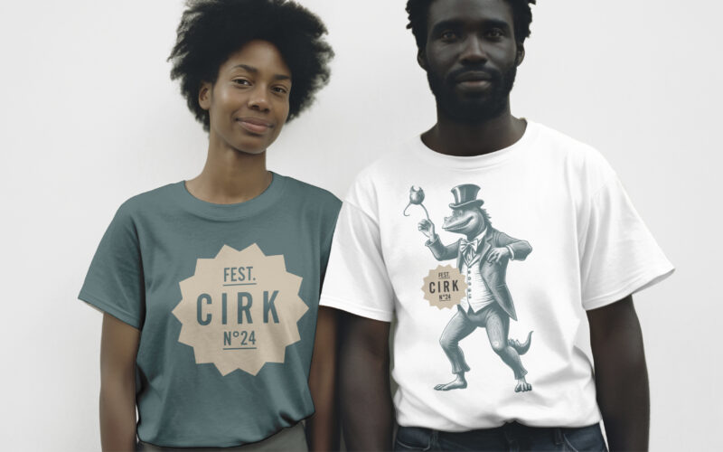
How can CIRK N°24’s graphic design capture both nostalgia and surreal imagination? Through rich colors and mythical engravings, the identity creates a poetic, theatrical world balancing whimsy and eerie wonder. The visual identity of CIRK...
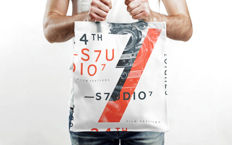
How does S7UDIO 7’s graphic design embody the essence of cinema through typography and color? The bold use of the number 7 and energetic palette highlights creativity and cinematic power. The visual identity of S7UDIO 7, a film festival,...
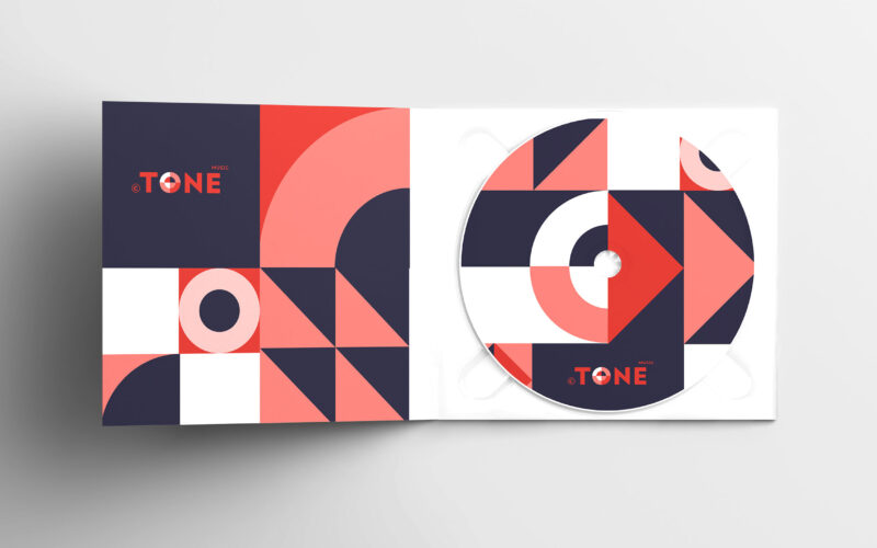
How can a website visually echo the universal language of music? The challenge: create a modular, adaptive design that feels rhythmic, immersive, and responsive—like music itself. The TONE website is a digital space dedicated to all forms...
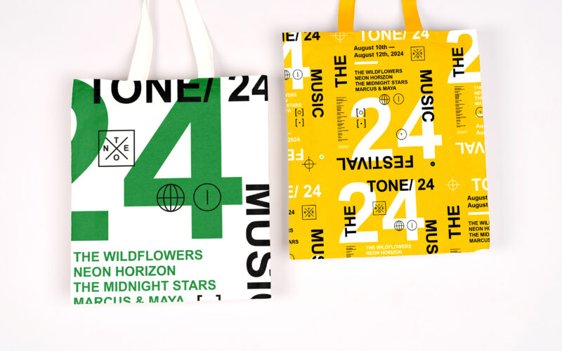
How can graphic design capture youthful energy and spontaneity for a music festival? TONE 24 uses bright colors and dynamic typography, creating a playful, DIY aesthetic that celebrates rhythm and community. The visual identity of TONE 24,...
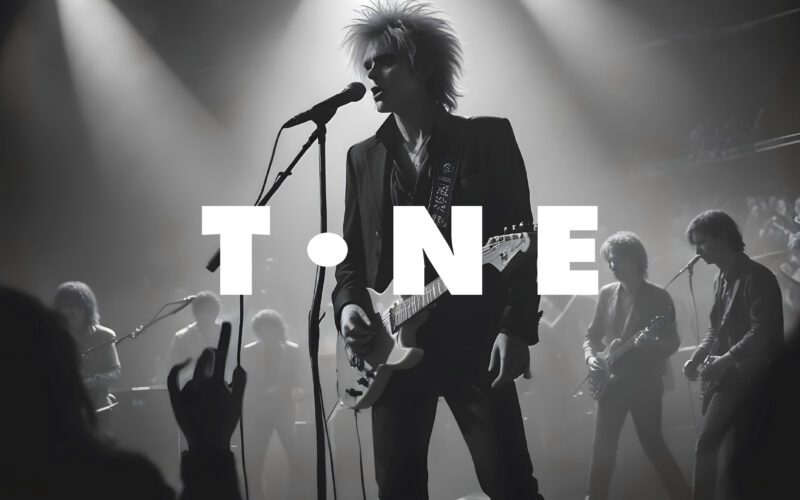
How can graphic design visually translate the rhythm, spontaneity, and structure of jazz? The challenge: create a bold, cohesive identity that feels as alive and dynamic as the music itself. The graphic design for the “TONE” Jazz Music...
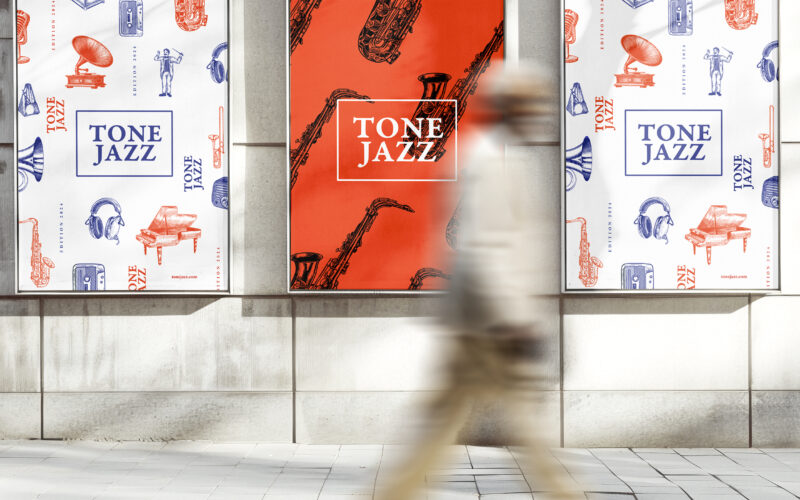
How does graphic design balance tradition and modernity for a jazz festival? TONE JAZZ uses orange and blue with intricate musician engravings, blending vintage charm and contemporary clarity in a cohesive visual identity. The visual...
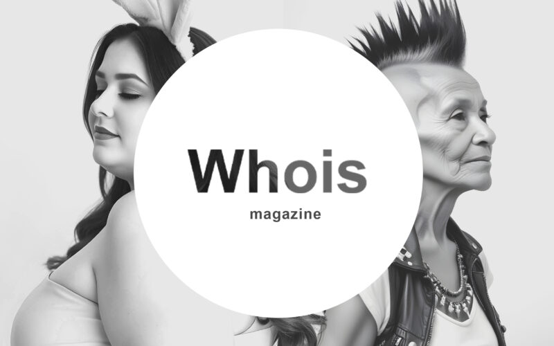
How can graphic design challenge conventions while preserving clarity? Whois magazine uses black-and-white contrasts and subtle distortions, turning its logo into a visual riddle that provokes curiosity and questions identity. The graphic...
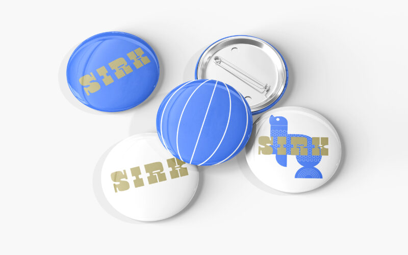
How can graphic design reinterpret nostalgic imagery with a fresh, contemporary tone? SIRK revives vintage circus icons through playful motifs and rhythmic elegance, blending 1950s charm with modern visual poetry. Playful and poetic, the...
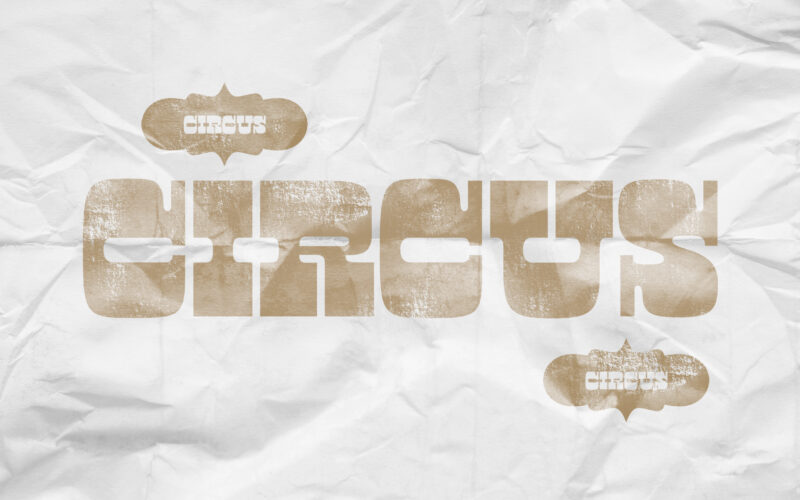
How can graphic design revive historical spectacle without falling into nostalgia? Circus reimagines 19th-century show aesthetics through sepia tones and stark layouts, creating a timeless visual mythology of performance. Evoking the charm...
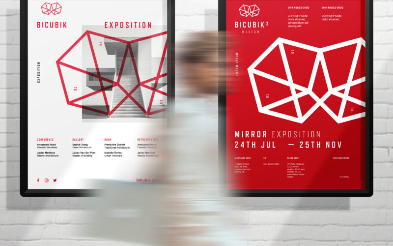
How can graphic design translate the conceptual depth of architecture—geometry, volume, ambiguity—into a clean, modern visual identity that balances the precision of form with the emotional impact of space? A sleek, modern design that...
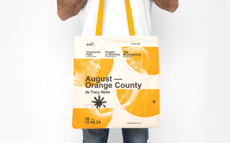
How can graphic design balance tradition and modernity? Théâtre Les Arènes uses vibrant yellow and geometric motifs to explore how visual identity combines architectural heritage with contemporary clarity and dynamic creativity. The visual...
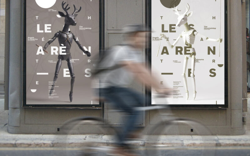
How can design capture theatrical creativity and whimsy? Théâtre Les Arènes’ poetic, modular visuals and symbolic motifs explore the blend of craftsmanship and imagination in shaping a unique, memorable identity. The visual identity of...
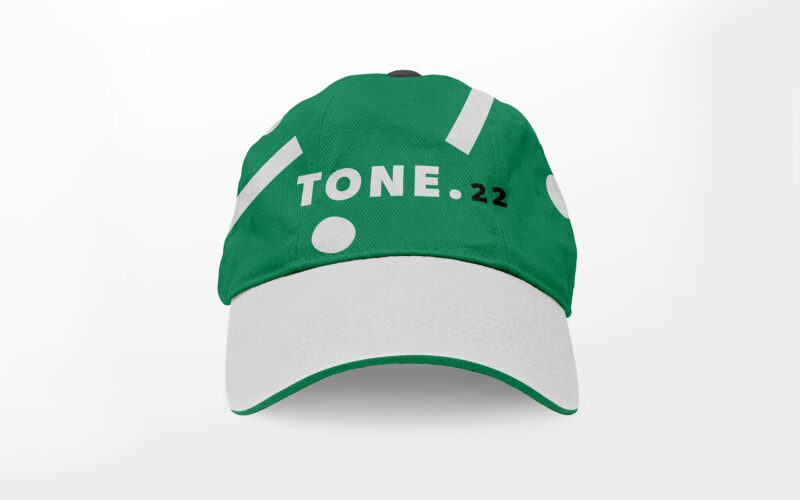
How can design visually capture music’s energy and harmony? TONE 22’s vibrant greens and animated typography explore rhythm, nature, and authenticity, creating a dynamic identity that celebrates sound and movement. The visual identity of...
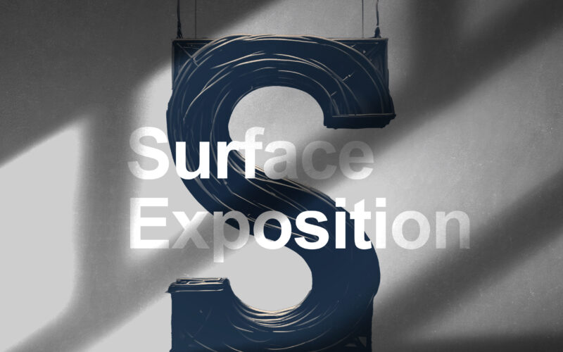
How can graphic design embody architecture as a “living machine”? Surface Exposition explores the tension between structure and flow, merging technological precision with the organic rhythm of human experience. The Surface Exposition...
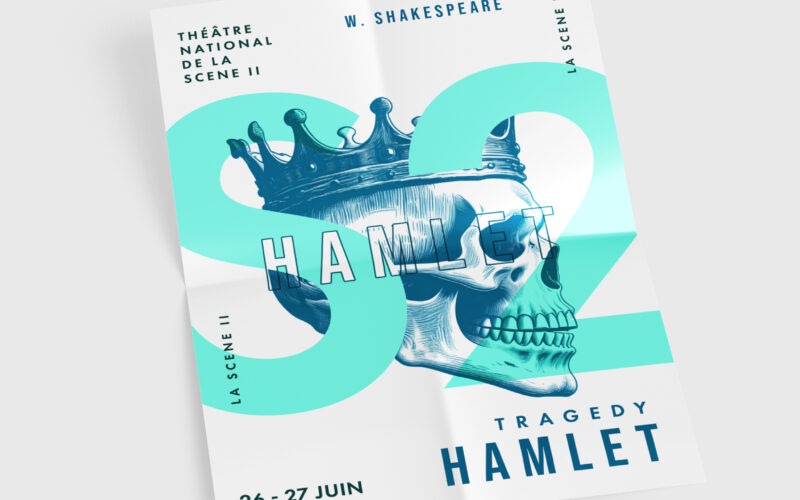
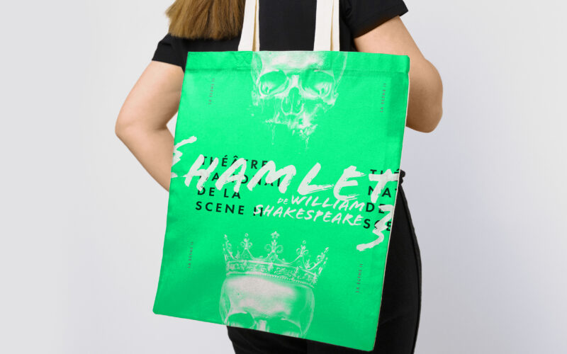
How can design blend classical heritage with modern storytelling? Théâtre National de la Scène II uses engraved illustrations and a symbolic logo to create a refined, emotional identity bridging tradition and innovation. The graphic design...
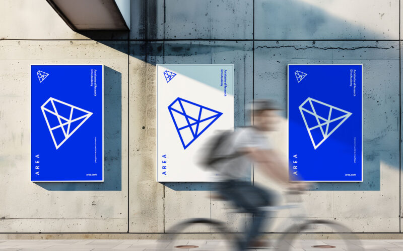
How can design symbolize innovation and collaboration? AREA’s minimalist blue-and-white identity uses a suspended “A” logo referencing pyramids to embody timeless architecture and interconnected ideas within a modern school brand. The...
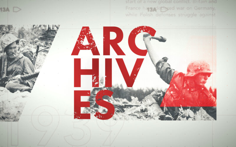
How can a history channel convey the gravity of World War II with respect and depth? Archive answers with a tense, visually striking trailer that blends vintage footage, bold graphics, and investigative tones to honor and reveal untold...