


More details
CU.24 plays with contrast, framing, and cinematic rhythm. The challenge: how can graphic design capture the depth of film language—light, shadow, and emotion—through purely static composition?
The CU.24 brochure embodies cinematic precision through a monochromatic palette and refined typography. Inspired by the language of film, it translates motion, framing, and light into still composition. Each spread evokes the rhythm of editing—alternating between tension and silence, density and emptiness. The minimal black-and-white design enhances contrast, guiding the viewer’s gaze as a camera would. Typographic hierarchy and spatial restraint mirror the discipline of direction and montage. More than a program, CU.24 becomes a visual screenplay—an editorial object that captures the essence of cinema not by movement, but by the eloquence of controlled visual composition.
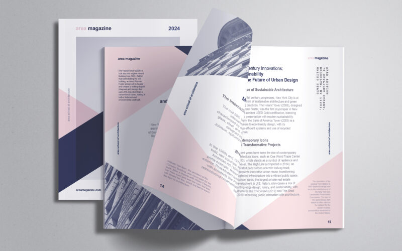
Area
How can editorial design embody architectural thinking? AREA Magazine’s brochure uses layered, intersecting forms and unexpected imagery to mirror the structural logic and creative spontaneity that define the built environment. The graphic...
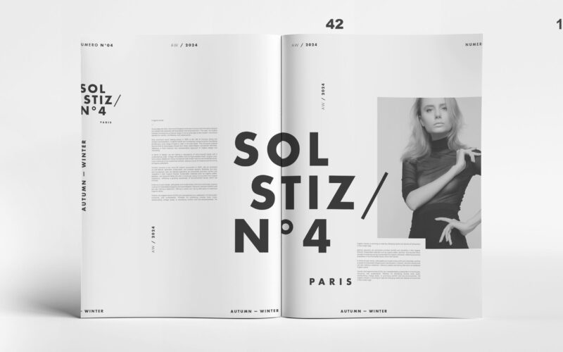
Solstiz
How can Soltiz N°4’s design balance bold creativity with clarity? The graphic identity merges minimalism and controlled chaos, crafting a refined yet raw look that captivates without overwhelming. The graphic design of Soltiz N°4,...
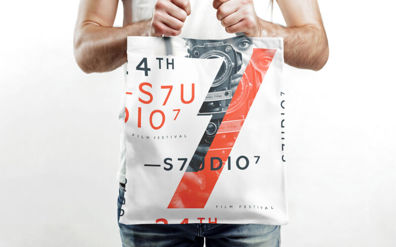
S7UDIO 7
How does S7UDIO 7’s graphic design embody the essence of cinema through typography and color? The bold use of the number 7 and energetic palette highlights creativity and cinematic power. The visual identity of S7UDIO 7, a film festival,...
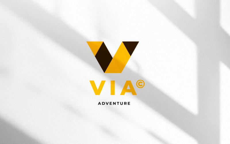
Via
How can a visual identity translate the energy of travel — movement, direction, and discovery — through geometry and contrast, while maintaining a clear, modern sense of structure and destination? This travel identity system for VIA...