Apar-Té explores balance through emptiness, contrast, and space. The challenge lies in creating visual emotion with minimal elements—how to express depth and tension through pure graphic restraint. The Apar-Té brochure captures refined...
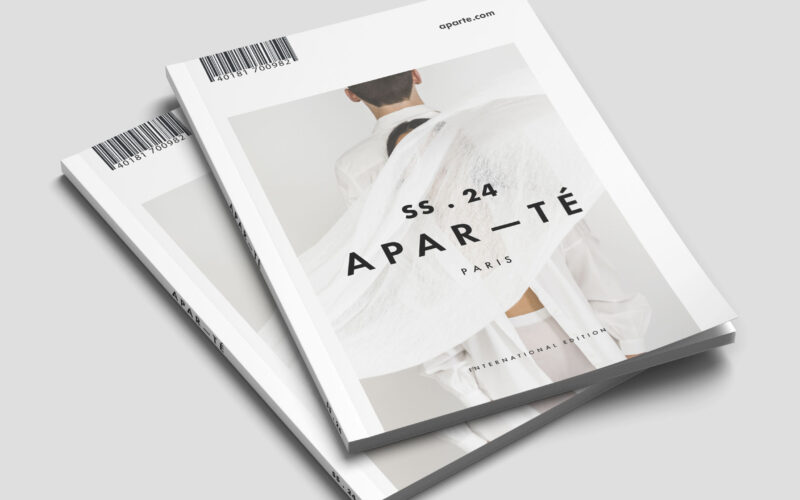

Apar-Té explores balance through emptiness, contrast, and space. The challenge lies in creating visual emotion with minimal elements—how to express depth and tension through pure graphic restraint. The Apar-Té brochure captures refined...
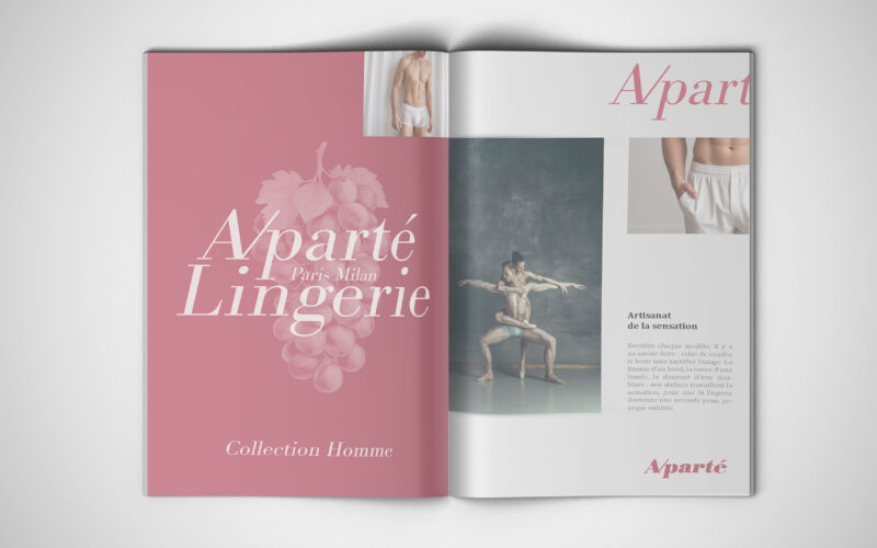
How can a lingerie brand communicate sensuality and intimacy without falling into clichés — instead creating an artistic, emotional experience that celebrates connection, elegance, and the shared space between two bodies?Aparté is a...
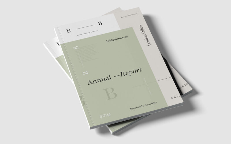
Brige Bank’s identity centers on the dash linking its two Bs—a metaphorical bridge and connection. How can visual design express trust and relationship within a contemporary banking image? The Brige Bank of London Annual Report centers its...
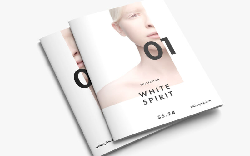
White Spirit SS.24 questions the notion of purity in modern aesthetics — is whiteness a symbol of innocence or emptiness? The magazine explores identity, fragility, and transcendence through minimalist visual storytelling. White Spirit...
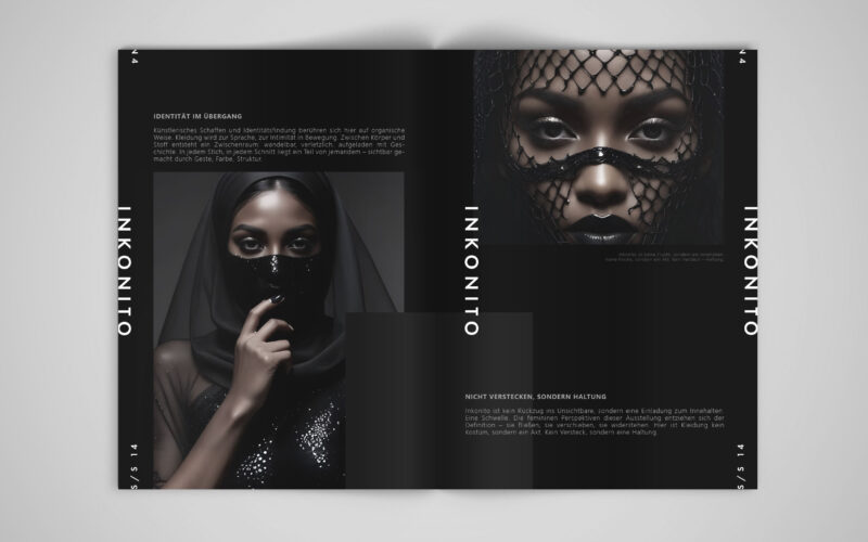
How can visual design affirm a modest, deliberate identity — using fashion and the metaphor of the mask not to hide, but to reveal the self with elegance, distance, and quiet power?INKONITO is a conceptual brochure exploring identity...
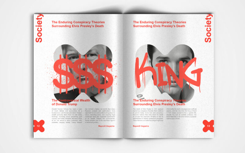
X-Ray magazine uses bold design and the X motif to decode society's layers. But can visual aesthetics alone effectively unveil the hidden complexities shaping modern culture and public discourse? This is a visually striking society...
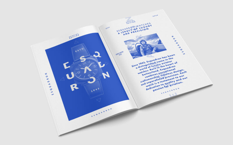
How can editorial design elevate a luxury watch brand’s aviation heritage? Esquadron translates precision, adventure, and identity into visuals that echo cockpit geometry and evoke sky-bound elegance and technical mastery. Esquadron is a...
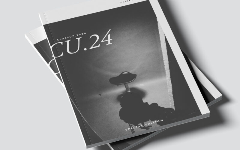
CU.24 plays with contrast, framing, and cinematic rhythm. The challenge: how can graphic design capture the depth of film language—light, shadow, and emotion—through purely static composition? The CU.24 brochure embodies cinematic...
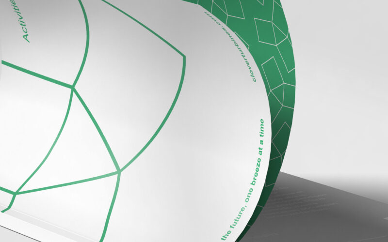
How can Clover’s magazine graphic design balance minimalist Swiss modernism with ecological symbolism, integrating the helix logo to reflect clean energy and sustainability while maintaining elegance and clarity? The magazine for Clover, a...
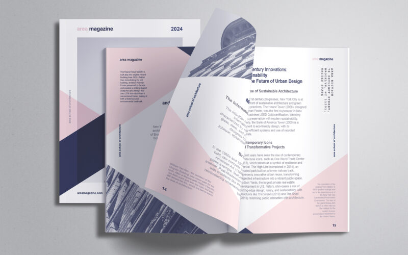
How can editorial design embody architectural thinking? AREA Magazine’s brochure uses layered, intersecting forms and unexpected imagery to mirror the structural logic and creative spontaneity that define the built environment. The graphic...
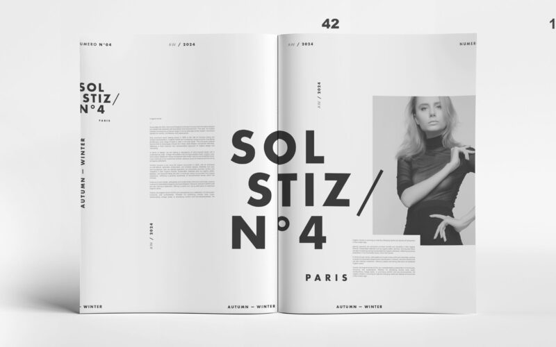
How can Soltiz N°4’s design balance bold creativity with clarity? The graphic identity merges minimalism and controlled chaos, crafting a refined yet raw look that captivates without overwhelming. The graphic design of Soltiz N°4,...
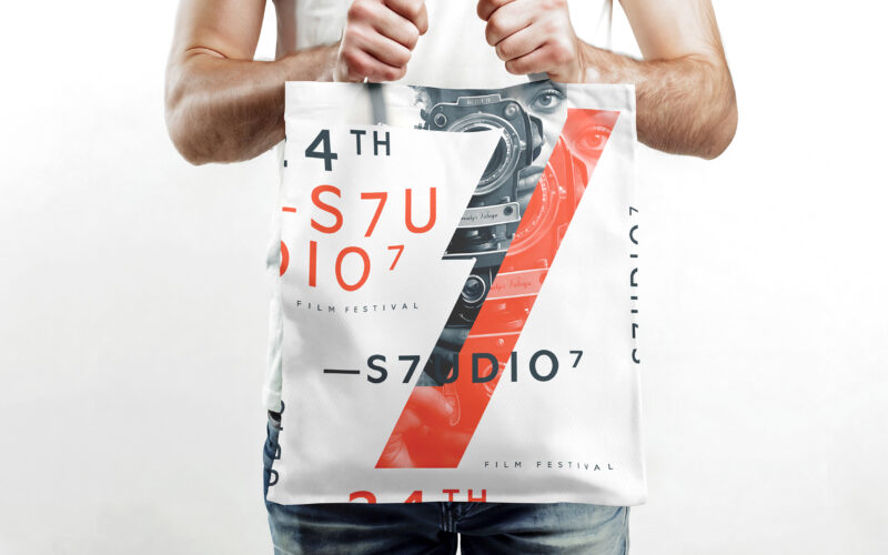
How does S7UDIO 7’s graphic design embody the essence of cinema through typography and color? The bold use of the number 7 and energetic palette highlights creativity and cinematic power. The visual identity of S7UDIO 7, a film festival,...
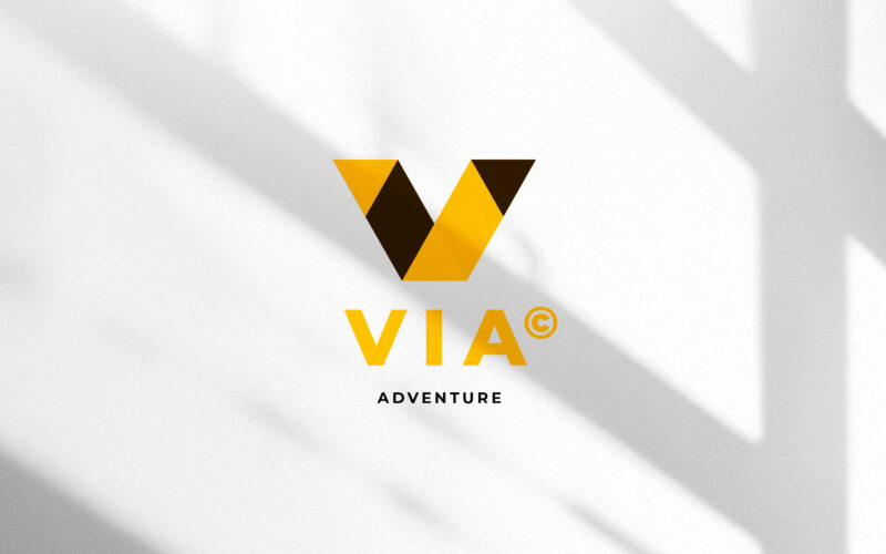
How can a visual identity translate the energy of travel — movement, direction, and discovery — through geometry and contrast, while maintaining a clear, modern sense of structure and destination? This travel identity system for VIA...
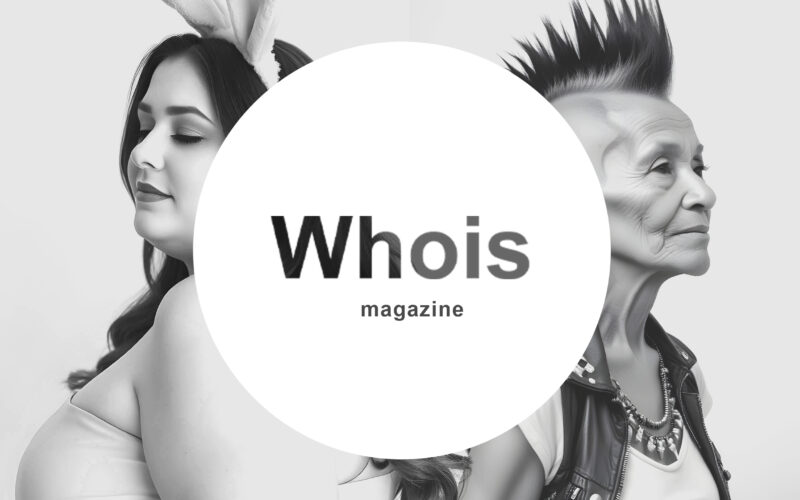
How can graphic design challenge conventions while preserving clarity? Whois magazine uses black-and-white contrasts and subtle distortions, turning its logo into a visual riddle that provokes curiosity and questions identity. The graphic...
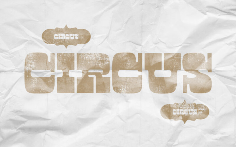
How can graphic design revive historical spectacle without falling into nostalgia? Circus reimagines 19th-century show aesthetics through sepia tones and stark layouts, creating a timeless visual mythology of performance. Evoking the charm...