


More details
Apar-Té explores balance through emptiness, contrast, and space. The challenge lies in creating visual emotion with minimal elements—how to express depth and tension through pure graphic restraint.
The Apar-Té brochure captures refined minimalism through soft light, neutral palettes, and quiet sensuality. Each page expresses a dialogue between fabric, form, and emotion—where what is unseen becomes as meaningful as what is shown. Clean typography and balanced composition reinforce a sense of calm precision, while delicate photography conveys intimacy and stillness. This Spring–Summer 24 edition reads like a visual meditation, blending fashion, emotion, and atmosphere into one coherent aesthetic. Apar-Té explores the subtle tension between exposure and concealment, presence and pause—offering a moment of contemplation in a world of overstimulation and noise.
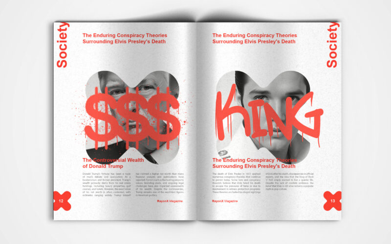
X-Ray
X-Ray magazine uses bold design and the X motif to decode society's layers. But can visual aesthetics alone effectively unveil the hidden complexities shaping modern culture and public discourse? This is a visually striking society...
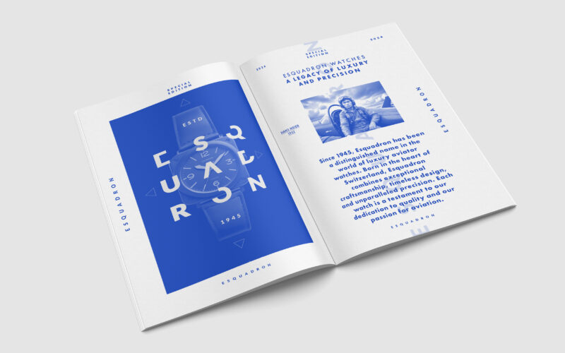
Escadron
How can editorial design elevate a luxury watch brand’s aviation heritage? Esquadron translates precision, adventure, and identity into visuals that echo cockpit geometry and evoke sky-bound elegance and technical mastery. Esquadron is a...
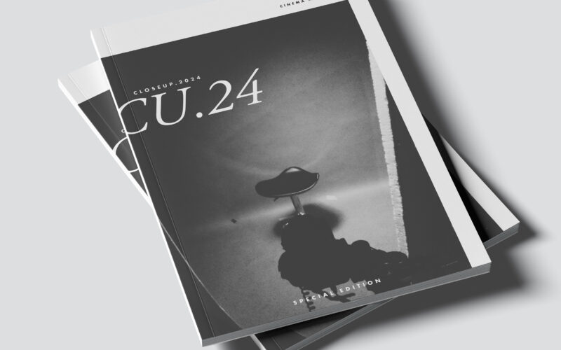
Close Up
CU.24 plays with contrast, framing, and cinematic rhythm. The challenge: how can graphic design capture the depth of film language—light, shadow, and emotion—through purely static composition? The CU.24 brochure embodies cinematic...
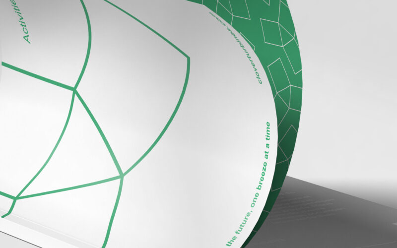
Clover
How can Clover’s magazine graphic design balance minimalist Swiss modernism with ecological symbolism, integrating the helix logo to reflect clean energy and sustainability while maintaining elegance and clarity? The magazine for Clover, a...