


More details
How to visually express architectural innovation? Surface uses neon yellow, minimalist logos, and grid motifs to create a bold, modern identity that reflects precision, structure, and contemporary design.
The brand identity for Surface, an architecture exhibition, is defined by a bold and modern graphic design. The dominant color is neon yellow, creating a striking impact and emphasizing contemporary aesthetics. The logo is minimalist, featuring a yellow house shape overlaid on a grid background, symbolizing a blueprint or architectural plan with defined spaces. The overall design is structural and clean, reflecting the simplicity and precision of architecture itself. This graphic style extends across various media, including posters, magazines, tote bags, and t-shirts, maintaining a consistent, sleek look that resonates with the event’s theme of architectural exploration and innovation.
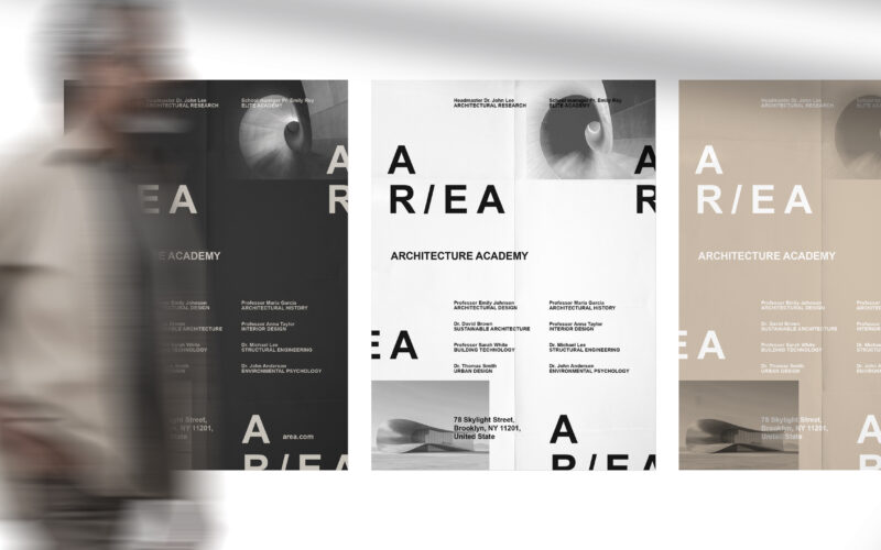
Area
How can graphic design embody architectural research and elite education? AR/EA’s minimal, dual-directional logo and earthy palette capture space, sustainability, and industrial heritage, merging identity with New York’s architectural...
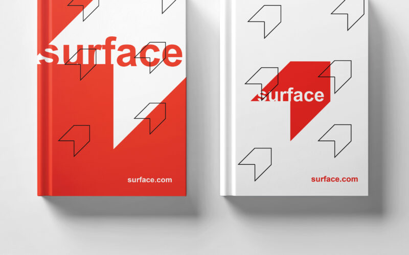
Surface
How to convey architectural duality? Surface uses red and white with a minimalist, 3D-illusion logo that balances flatness and volume, creating a refined, modern identity for the exhibition’s visual universe. The graphic design for the...
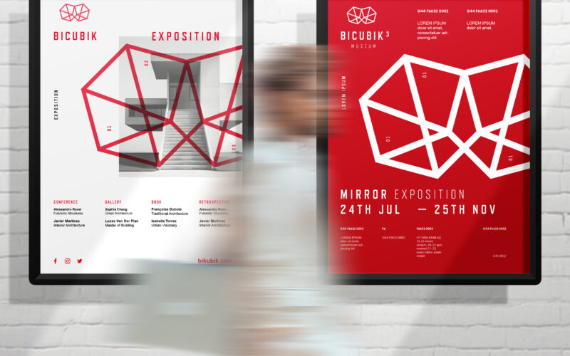
Bicubik
How can graphic design translate the conceptual depth of architecture—geometry, volume, ambiguity—into a clean, modern visual identity that balances the precision of form with the emotional impact of space? A sleek, modern design that...
Surface
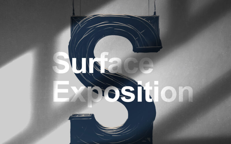
How can graphic design embody architecture as a “living machine”? Surface Exposition explores the tension between structure and flow, merging technological precision with the organic rhythm of human experience. The Surface Exposition...