


More details
Café Lenoirs packaging uses colored craft paper with clean, cartridge-style text boxes. Black, pink, white, and gold indicate coffee intensity, reflecting organic, fair trade values in a minimalist, sophisticated design.
The packaging for “Café Lenoirs,” which includes coffee capsules, coffee bags, and takeaway coffee cups, features a clean, informative design on colored craft paper, emphasizing the simplicity and authenticity of the product. The design focuses on clear, essential information presented in cartridge-style text boxes. The packaging reflects the brand’s commitment to being organic, fair trade, and responsible. The dominant colors—black, pink, white, and gold—vary depending on the coffee’s intensity, adding a subtle touch of sophistication. The minimalist approach highlights the pure essence of the product, offering a visually appealing and eco-conscious experience.
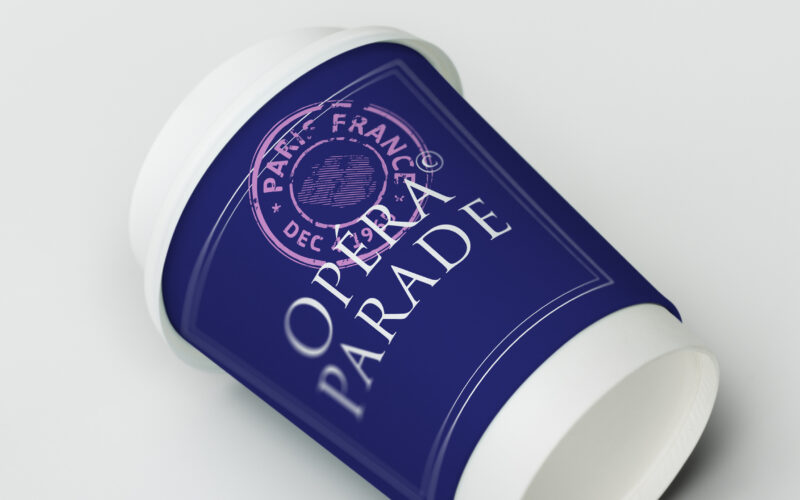
Opera Parade
How can Opéra Parade’s graphic design blend classical elegance with nomadic playfulness, turning each performance into a visual postcard that celebrates movement, music, and shared cultural journeys? The graphic identity for Opéra Parade,...
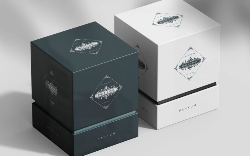
Belle De Nuit
How can Belle De Nuit’s graphic identity express a perfume’s secret sensuality—balancing vintage elegance with veiled desire—through imagery that conceals and reveals, inviting viewers into a world of silent temptation? Elegant and...
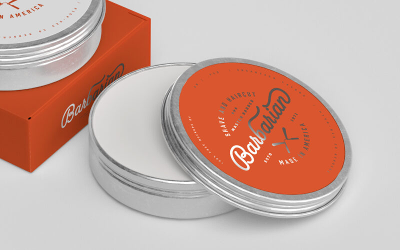
Barbarian
How can graphic design express Barbarian’s dual identity—raw masculinity and expert precision—by merging vintage barber traditions with a bold, modern aesthetic that celebrates strength, care, and timeless masculine refinement? Bold and...
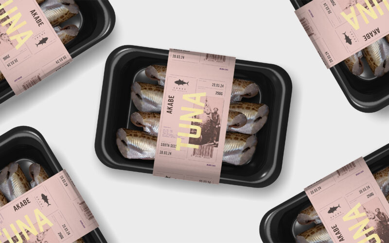
Akabe
How can seafood packaging express both freshness and legacy? Akabe’s graphic identity balances minimalist structure with artisanal luxury—using salmon tones and gold accents to merge modern clarity with timeless ocean heritage. The graphic...