


More details
How to create a warm, energetic sushi brand? SushiSushi uses bold red, hand-drawn logos, and playful sushi icons to build a friendly, approachable identity that’s both professional and fun.
The graphic design for SushiSushi, a sushi delivery restaurant, features a bold, friendly identity centered around the color red—a tone that evokes appetite, energy, and warmth. The name playfully references “moshi moshi,” adding an approachable, international flair. The logo uses a rounded, hand-drawn style, complemented by cute sushi icons, reinforcing the brand’s accessible and cheerful personality. Applied to bags, cups, stationery, aprons, and packaging, the identity is cohesive and inviting. The overall tone is lighthearted yet professional, appealing to a broad, urban clientele seeking quality sushi with a fun, memorable twist in both service and visual experience.
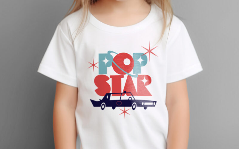
Popstar
How can ice cream packaging evoke nostalgia, glamour, and space-age adventure? Popstar’s graphic challenge is to turn a simple treat into a retro-futuristic journey through identity and imagination. Popstar’s graphic design blends...
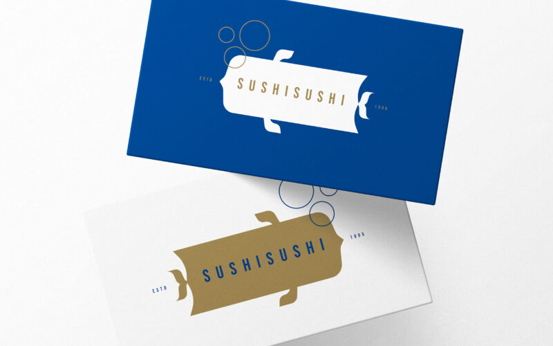
Sushi Sushi
How to balance elegance and playfulness in sushi branding? SUSHISUSHI uses deep sea blue and gold with minimal fish-inspired logos and bubbles to evoke freshness, quality, and friendly delivery service. The graphic design for SUSHISUSHI, a...
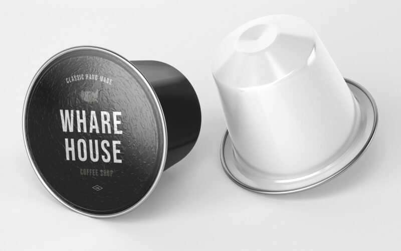
Wharehouse
How can graphic design communicate both craftsmanship and eco-conscious professionalism? Whare House uses vintage textures, natural kraft tones, and a clear system to reflect heritage, authenticity, and refined coffee expertise. The...
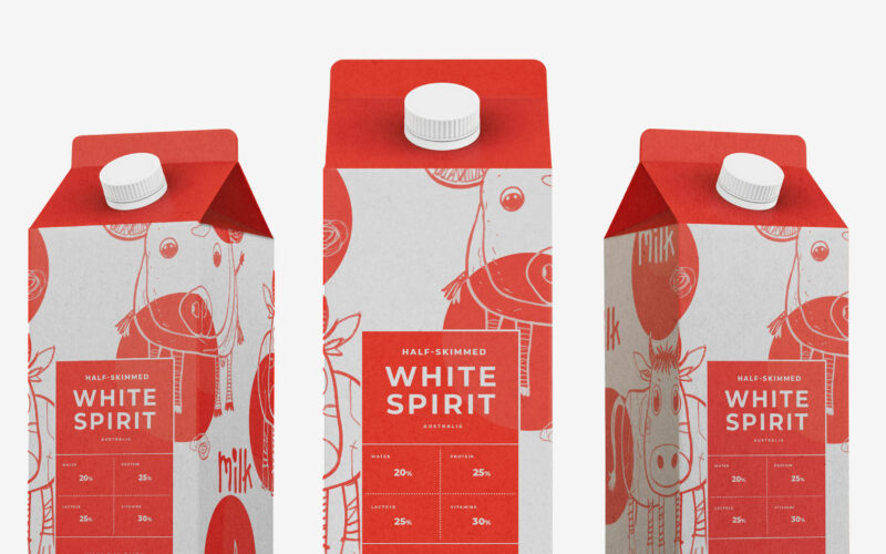
White Spirit
Playful and endearing, White Spirit features childlike cow illustrations that give the packaging a joyful, youthful spirit. The name evokes the color and purity of milk, while red polka dots scattered across the design recall cowhide...