


More details
How can ecological certification be visually translated into a recognizable, trustworthy emblem—one that conveys sustainable values and speaks meaningfully to both producers and consumers through form, color, and material?
At the center of Eco Cycle‘s identity, a stylized geometric wheat ear symbolizes certification, reward, and ecological commitment. Designed as a formal emblem, the motif evokes the prestige of a diploma or seal of approval, reinforcing the trustworthiness of the organic label. The dominant colors—green and ecru—highlight natural values and sustainable practices. Applied to seed packets, bags, and caps, the design combines clarity with symbolic strength. The use of recycled paper in communication materials further emphasizes the label’s environmental integrity. This visual language speaks to producers and consumers alike: certification not just as a stamp, but as a promise to the Earth.
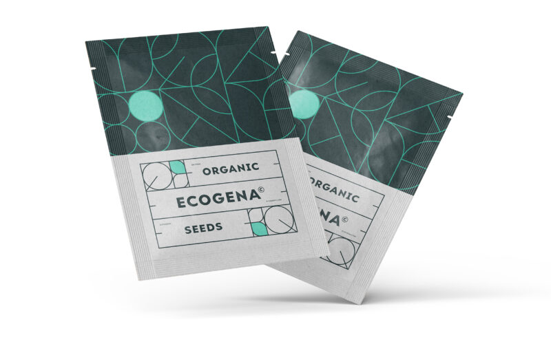
Ecogena
How can graphic design express both ecological sensitivity and scientific rigor? Ecogena balances organic motifs with structured layouts, crafting a visual identity that feels both natural and technical—designed for serious, sustainable...
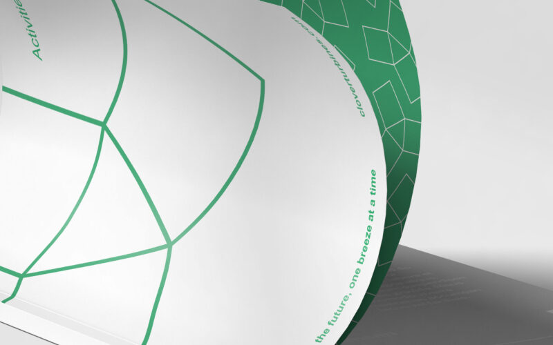
Clover
How can Clover’s magazine graphic design balance minimalist Swiss modernism with ecological symbolism, integrating the helix logo to reflect clean energy and sustainability while maintaining elegance and clarity? The magazine for Clover, a...
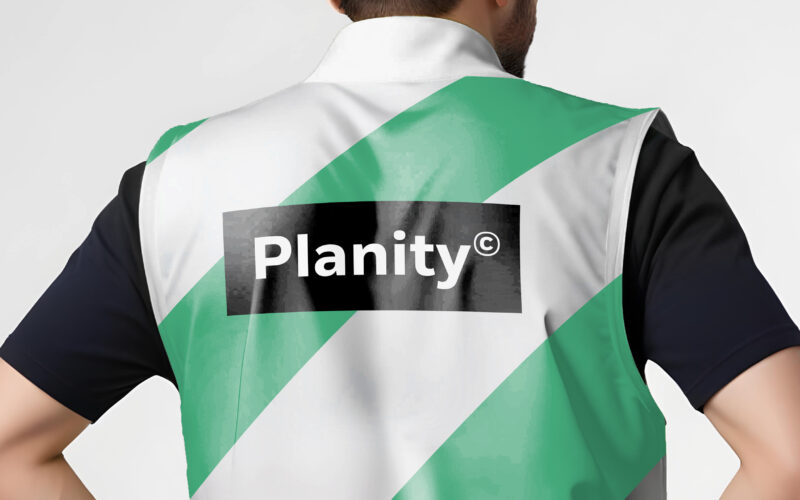
Planity
How can design unite industry and sustainability? Planity’s green-white palette and eco-inspired visuals explore how graphic identity communicates environmental commitment while maintaining professionalism and clarity in construction...
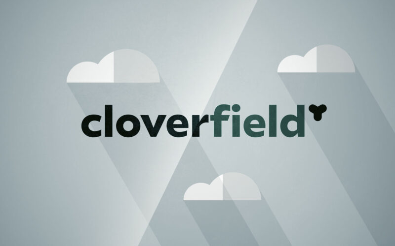
Cloverfield
How can a brand in energy distribution convey both innovation and eco-responsibility? Cloverfield answers with a bright, modern film that blends clean visuals, symbolism, and rhythm to express sustainable mobility everywhere. The...