


More details
How to capture raw surf culture digitally? Aaron Lynch’s site blends pale pink and mauve with handwritten brush typography, creating an authentic, laid-back vibe that celebrates freedom and artistic spirit.
The graphic design of Aaron Lynch’s showcase website reflects the brand’s laid-back, authentic surf culture. Using a very pale pink and deep mauve color palette, the site features surfboards displayed like spontaneous snapshots—scattered casually across the canvas like fridge memories. This creates a carefree, effortless vibe. The logo and headings use bold, handwritten brush typography, reinforcing the idea of a personal, artistic signature—Aaron Lynch’s mark of freedom and authenticity. The boards themselves feature tribal, minimal, or intentionally worn-out graphics, suggesting heavy use and soulful experience. Nothing flashy—just real, raw surf spirit. It’s simple, it’s cool, it’s Aaron Lynch.
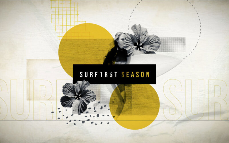
Surf Season
How can niche sports like surfing find their voice in mainstream media? F1RST responds with a sun-drenched, handcrafted trailer that captures the raw, natural spirit of surf culture in its purest form. F1RST (a play on "first" and "1") is...
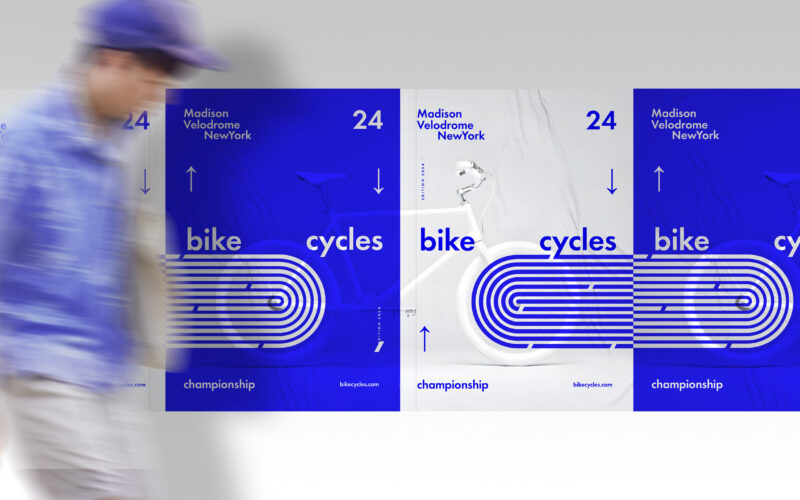
Cycles
How can graphic design convey motion and competition? Cycles 24’s identity uses minimalist forms and kinetic layout to explore how structure, rhythm, and abstraction express the intensity of indoor speed racing. The brand identity for...
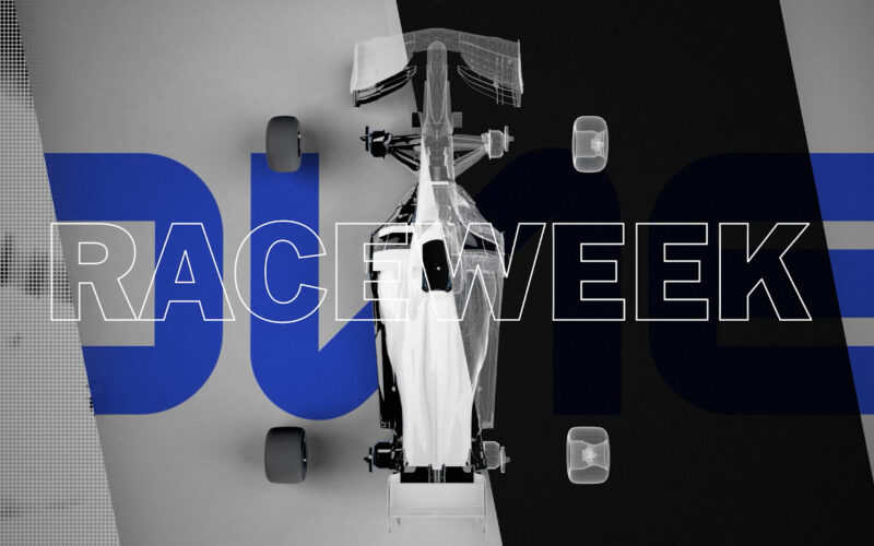
One
How can a motorsport channel convey the thrill and precision of racing? One answers with a sleek, dynamic trailer that blends sharp editing, energetic pacing, and futuristic visuals to capture the essence of high-speed competition. One is...
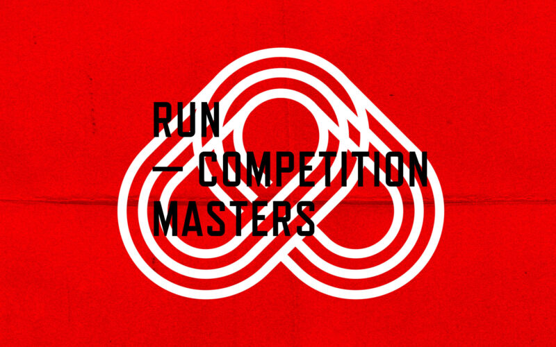
Acropolis
How can a trailer convey the raw intensity of competition before it begins? Acropolis captures this charged silence with focused, minimal visuals of elite athletes poised to launch, embodying the calm before the storm. Acropolis is a...