


More details
How can canned seafood feel both luxurious and disciplined? Akabe’s graphic identity fuses Japanese minimalism with maritime heritage—using coral hues and compartmental layouts to express artisanal quality through elegant, functional design.
The graphic design for Akabe, a premium seafood cannery, blends modern Japanese minimalism with artisanal precision. Inspired by both maritime heritage and the sound of its name—a nod to Captain Ahab—the brand uses salmon and coral hues, breaking away from traditional sea blues. The packaging and visuals, applied to cans, notebooks, signage, bags, and aprons, feature clean lines and a rational layout. Information is delivered in neat compartments, like labels in a bento box. The result is refined yet functional, evoking both craftsmanship and discipline. Akabe tells a story of the sea through elegant design, structured simplicity, and bold color choice.
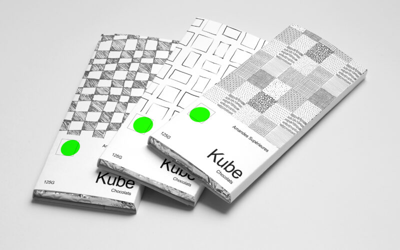
Kube
How can Kube’s graphic design use simple geometric forms and minimal color to communicate artisanal authenticity and purity in a bold yet understated way? Bold in simplicity, the identity of Kube centers on the square—both as form and...
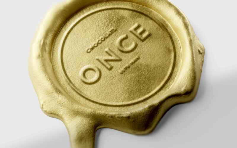
Once
How can design elevate a chocolate bar into a golden ingot — where “once” embodies both an ounce of gold and a unique, precious moment of indulgence? ONCE merges two meanings into one elegant concept — “once,” as in something rare and...
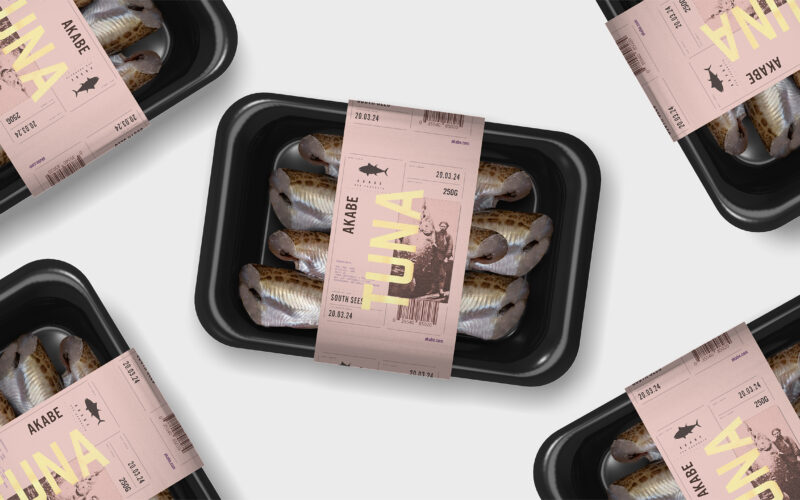
Akabe
How can seafood packaging express both freshness and legacy? Akabe’s graphic identity balances minimalist structure with artisanal luxury—using salmon tones and gold accents to merge modern clarity with timeless ocean heritage. The graphic...
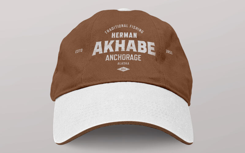
Akhabe
How can a seafood brand channel literary legacy and bold character? Akhabe’s design fuses vintage Americana with maritime grit, using a strong central figure to anchor a timeless yet contemporary visual identity. “Akhabe” is a premium...