


More details
How can seafood packaging express both freshness and legacy? Akabe’s graphic identity balances minimalist structure with artisanal luxury—using salmon tones and gold accents to merge modern clarity with timeless ocean heritage.
The graphic design for Akabe’s seafood range combines minimalist, rational layout with artisanal prestige. Dominated by a fresh salmon hue, the design breaks from traditional marine blues, echoing the natural color of premium catches like crab, shrimp, and tuna. Labels for freshness trays, magazines, signage, bags, and aprons feature structured cartouches, each delivering precise information. A hot-stamped gold product name overlays the layout, adding both clarity and luxury. In the background, a vintage photo of a fisherman beside an enormous catch suggests exceptional, almost mythical quality. The overall aesthetic is refined and authentic—modern design that honors the legacy of the sea.
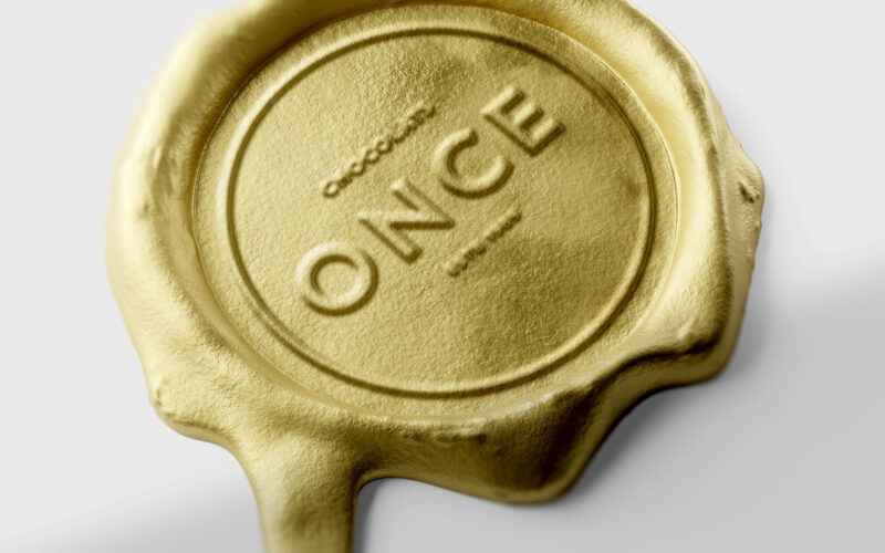
Once
How can design elevate a chocolate bar into a golden ingot — where “once” embodies both an ounce of gold and a unique, precious moment of indulgence? ONCE merges two meanings into one elegant concept — “once,” as in something rare and...
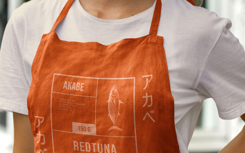
Akabe
How can canned seafood feel both luxurious and disciplined? Akabe’s graphic identity fuses Japanese minimalism with maritime heritage—using coral hues and compartmental layouts to express artisanal quality through elegant, functional...
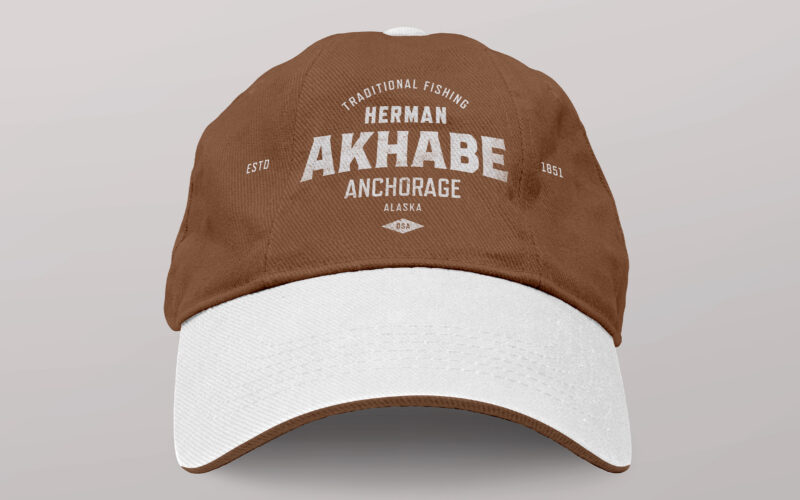
Akhabe
How can a seafood brand channel literary legacy and bold character? Akhabe’s design fuses vintage Americana with maritime grit, using a strong central figure to anchor a timeless yet contemporary visual identity. “Akhabe” is a premium...
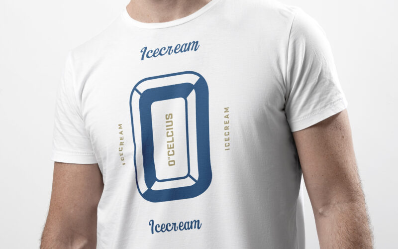
Zero
How to visually blend nostalgia and freshness? Zero’s retro-inspired design uses bold typography and vintage imagery, mixing icy whites with elegant blues and golds to evoke timeless American dessert charm. Cool and nostalgic, Zero (or 0°...