


More details
How can graphic design embody architectural research and elite education? AR/EA’s minimal, dual-directional logo and earthy palette capture space, sustainability, and industrial heritage, merging identity with New York’s architectural spirit.
Structured yet understated, the visual identity of AR/EA reflects the fusion of Architectural Research and Elite Academy into a single, unified school. The name evokes both the initials and the word “area,” central to architectural discourse. The logo, designed to be read vertically and horizontally like a set square, introduces spatial depth. Applied to notebooks, sketchbooks, tote bags, T-shirts, murals, and communication materials, the design embraces minimalism to foreground content—plans, photos, and ideas. Dominated by black, recycled light brown, and white, the palette references both eco-consciousness and the industrial character of the New York building housing the institution.
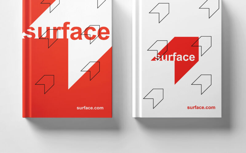
Surface
How to convey architectural duality? Surface uses red and white with a minimalist, 3D-illusion logo that balances flatness and volume, creating a refined, modern identity for the exhibition’s visual universe. The graphic design for the...
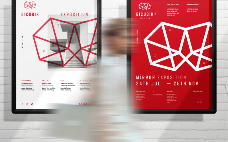
Bicubik
How can graphic design translate the conceptual depth of architecture—geometry, volume, ambiguity—into a clean, modern visual identity that balances the precision of form with the emotional impact of space? A sleek, modern design that...
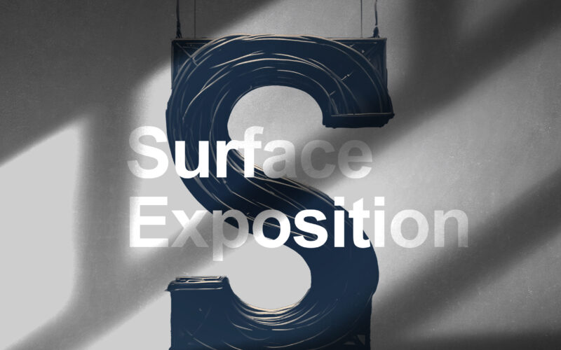
Surface
How can graphic design embody architecture as a “living machine”? Surface Exposition explores the tension between structure and flow, merging technological precision with the organic rhythm of human experience. The Surface Exposition...
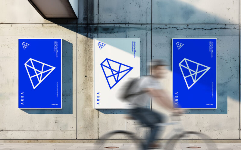
Area
How can design symbolize innovation and collaboration? AREA’s minimalist blue-and-white identity uses a suspended “A” logo referencing pyramids to embody timeless architecture and interconnected ideas within a modern school brand. The...