


More details
How can a graphic identity balance elegance and intensity, using color, typography, and composition to express both romance and danger while maintaining a refined, luxurious brand presence?
The Bloody Valentine branding concept blends elegance and provocation through a bold visual identity. The design uses deep reds, delicate calligraphy, and fluid curves to merge romance with intensity. Each element — from the packaging to the apparel and fragrance bottle — echoes a vintage sophistication tinged with modern sensuality. The contrast of pure white and vivid crimson evokes both passion and precision. The refined typography, framed by ornamental flourishes, suggests a handcrafted attention to detail. This graphic system transforms the brand into an experience — one that is simultaneously luxurious, daring, and emotionally charged, leaving a lasting visual impression.
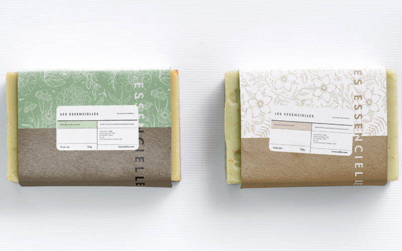
Essencielle
How can a soap brand express both artisanal heritage and ecological commitment through design? Les Essencielles explores this through natural tones, delicate engravings, and sustainable materials that highlight purity and tradition. The...
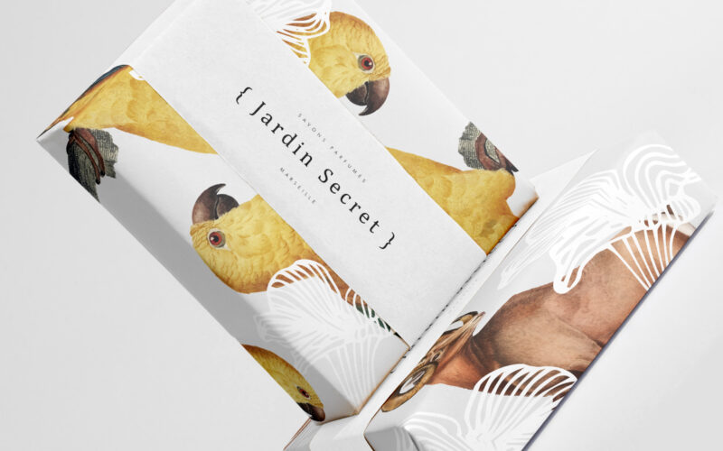
Jardin Secret
How can Jardin Secret’s graphic design balance vibrant natural imagery with intimacy and exclusivity, creating a fresh, radiant identity that evokes a personal sensory escape in eco-friendly packaging? Bright and lush, {Jardin Secret} by...
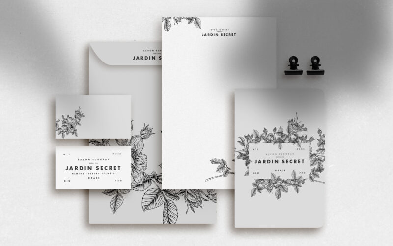
Jardin Secret
How can Jardin Secret’s graphic design express eco-consciousness and intimacy using delicate black and white illustrations, creating a poetic and personal identity that evokes hidden gardens and quiet self-care rituals? Jardin Secret...
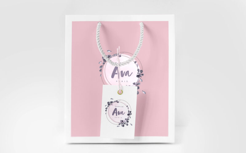
Ava
How can graphic design translate fragrance into emotion? AVA’s identity explores softness and intimacy through pale tones, floral frames, and handwritten details—turning visual elements into a delicate, sensory expression of femininity....