


More details
How can a brand identity embody innovation and power? Bombyx’s design leverages bold symbolism and kinetic visuals to question how form, color, and metaphor shape perceptions of high-tech precision and ambition.
Bold and futuristic, Bombyx expresses cutting-edge technological expertise through a high-impact corporate identity. The name—blending references to explosive power (Bomb), butterflies, and the dynamic letter X (as wings) —sets the tone for a brand rooted in precision and innovation. Dominated by a vibrant orange, the visual system is structured around the X symbol, used as both a graphic anchor and a metaphorical target. This form frames images of the company’s aerospace and military operations across the website, creating an organized yet energetic layout. The overall impression is one of controlled movement, modernity, and rigor, positioning Bombyx as a player firmly focused on the future.
Planity
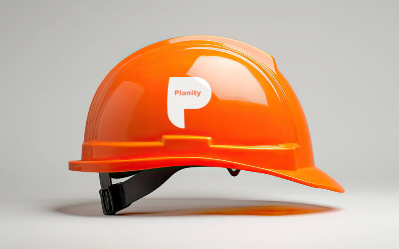
How to convey strength and precision visually? Planity’s graphic design uses bold white and orange tones with a structured “P” motif, reflecting professionalism and the scale of major construction projects. The graphic design for Planity,...
Planity
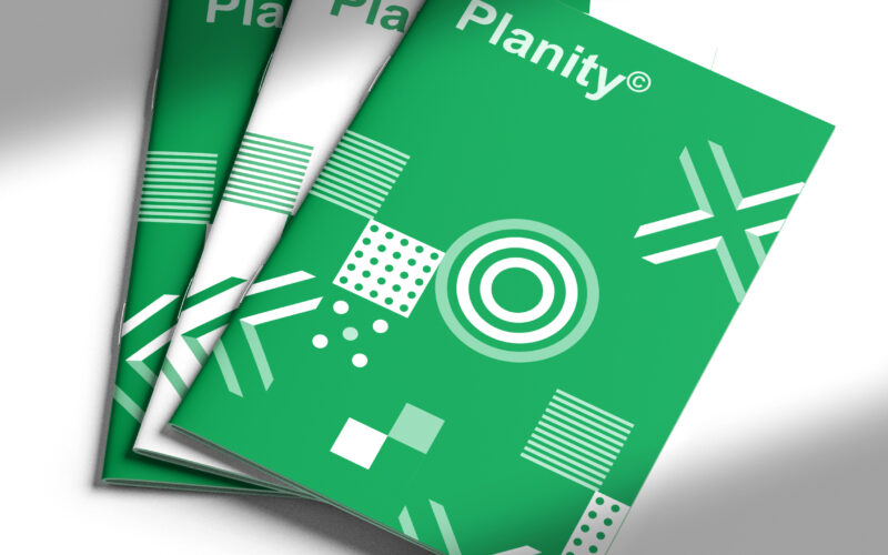
How to visually unite sustainability and structure? Planity’s graphic design uses white and green geometric patterns, symbolizing nature and organized diversity, embodying a modern, eco-conscious construction identity. The graphic design...
Thorps
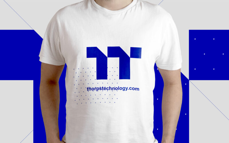
How can graphic design convey innovation and precision for an aviation engine manufacturer? Thops Technology uses a blue palette and a turbine-inspired double “T” logo, projecting reliability and cutting-edge expertise. The graphic design...
Planity
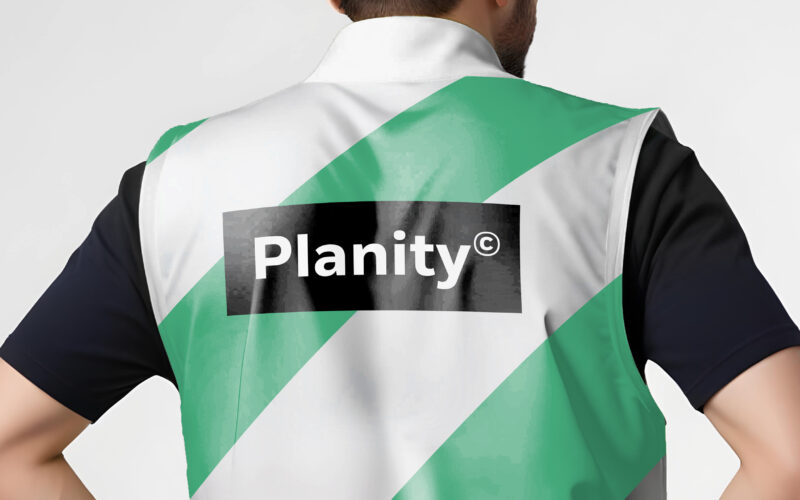
How can design unite industry and sustainability? Planity’s green-white palette and eco-inspired visuals explore how graphic identity communicates environmental commitment while maintaining professionalism and clarity in construction...