


More details
How can a graphic identity express sound without sound? EKO’s challenge is to make music visible—through movement, rhythm, and energy—while staying clean, modern, and instantly recognizable.
Clean and dynamic, the EKO website uses bold visual cues to reflect a love of sound and movement. At its core, the logo anchors the design: the “K” mimics a speaker volume icon, immediately suggesting audio function. Repeated in a wireframe style, the logo multiplies across the layout like echoes—reinforcing the brand name both visually and conceptually. A bright neon green contrasts with pure white backgrounds, creating a vibrant, high-energy atmosphere aimed at a young, mobile, music-loving audience. The spacious white layout adds clarity and breathability, subtly hinting at the precision and purity of EKO’s audio performance.
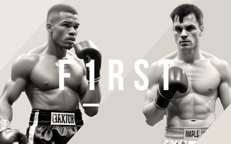
F1RST
How can digital design amplify the intensity of a boxing match? This visual countdown builds hype through stats, motion, and contrast — turning a website into a battleground of anticipation. This digital content for the upcoming boxing...
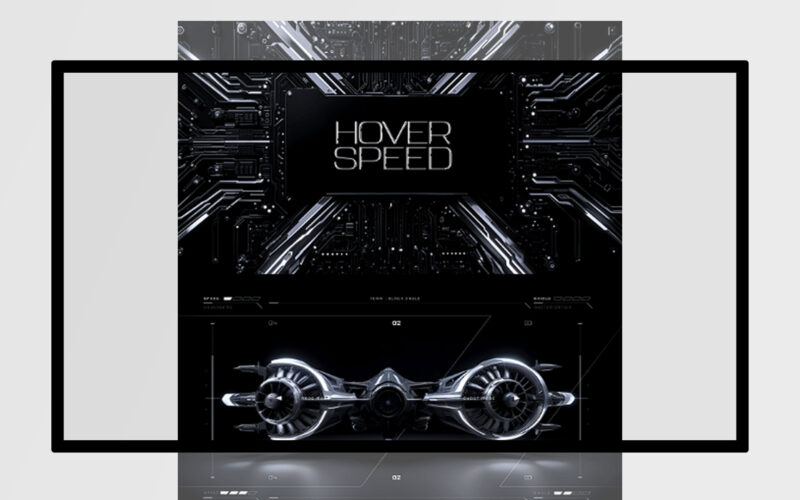
Hoverspeed
How can Hover Speed’s graphic design combine futuristic neon aesthetics with immersive darkness to convey speed, danger, and technological dominance, enhancing the gaming experience through tension and visual allure? The graphic design for...
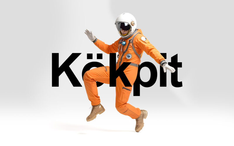
Kokpit
How can kökpit’s graphic design balance retro-futuristic aesthetics and modern minimalism to create a bold, aspirational e-commerce experience inspired by aerospace precision and adventure? The e-commerce website for "kökpit" features a...
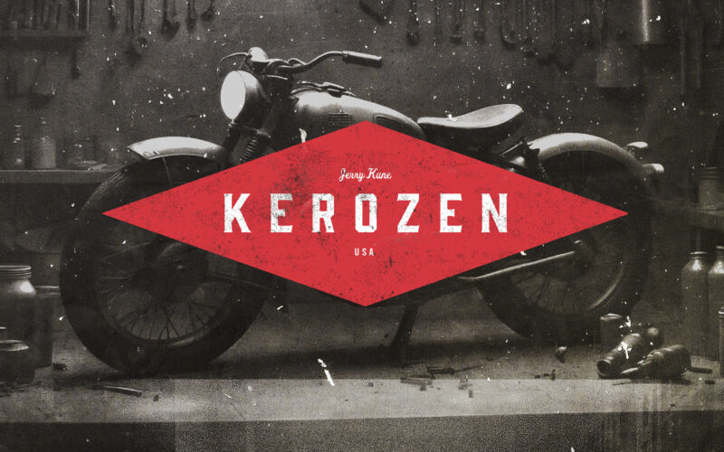
Kerozen
How can a heritage motorcycle clothing brand visually bridge its 1924 origins with a modern 2024 audience, balancing vintage authenticity with contemporary appeal across digital and physical supports? This graphic design presents a bold...