


More details
How can editorial design elevate a luxury watch brand’s aviation heritage? Esquadron translates precision, adventure, and identity into visuals that echo cockpit geometry and evoke sky-bound elegance and technical mastery.
Esquadron is a special edition magazine for the luxury Swiss watch brand, showcasing legendary timepieces inspired by aviation — precision, performance, adventure, navigation, courage, and camaraderie. The dominant color is sky blue, evoking a sense of openness and clarity. The design emphasizes the unique “round in square” shape of the watches, inspired by vintage aircraft cockpit instruments. This shape is also echoed in the logo, where the letterforms are structured to mirror the square. The word “escadron” itself carries connotations of precision and unity, reinforcing the aviation theme with both form and meaning in the graphic design.
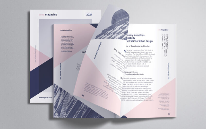
Area
How can editorial design embody architectural thinking? AREA Magazine’s brochure uses layered, intersecting forms and unexpected imagery to mirror the structural logic and creative spontaneity that define the built environment. The graphic...
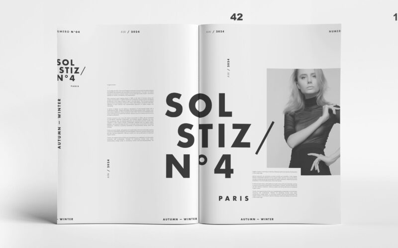
Solstiz
How can Soltiz N°4’s design balance bold creativity with clarity? The graphic identity merges minimalism and controlled chaos, crafting a refined yet raw look that captivates without overwhelming. The graphic design of Soltiz N°4,...
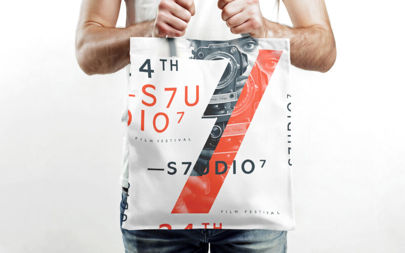
S7UDIO 7
How does S7UDIO 7’s graphic design embody the essence of cinema through typography and color? The bold use of the number 7 and energetic palette highlights creativity and cinematic power. The visual identity of S7UDIO 7, a film festival,...
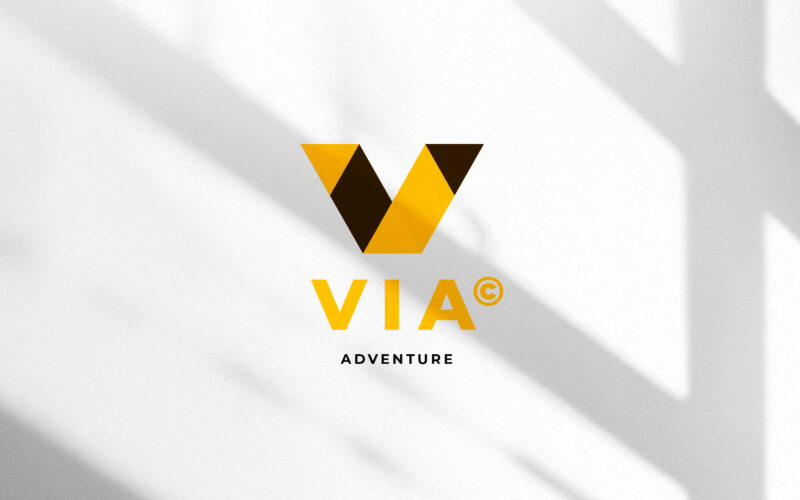
Via
How can a visual identity translate the energy of travel — movement, direction, and discovery — through geometry and contrast, while maintaining a clear, modern sense of structure and destination? This travel identity system for VIA...