


More details
The graphic design for Horizon adopts a flat design style inspired by 1950s–60s space-age aesthetics—the golden age of cosmic dreams. Used on caps, posters, T-shirts, badges, stationery, and sleep masks, it evokes the innocent wonder of childhood space fantasies. Warm orange tones, like a sunset or the Martian sky, dominate the palette. The layout features rectangular modules containing various icons related to stellar travel—rockets, stars, planets, and control panels. These visual elements form a modular path, guiding the viewer through a nostalgic and emotional journey. The design blends mid-century optimism with modern clarity, celebrating imagination and the enduring pull of exploration.
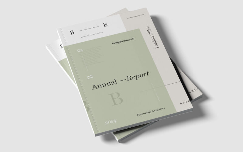
Bridge
Brige Bank’s identity centers on the dash linking its two Bs—a metaphorical bridge and connection. How can visual design express trust and relationship within a contemporary banking image? The Brige Bank of London Annual Report centers its...

Ecocycle
How can ecological certification be visually translated into a recognizable, trustworthy emblem—one that conveys sustainable values and speaks meaningfully to both producers and consumers through form, color, and material? At the center of...
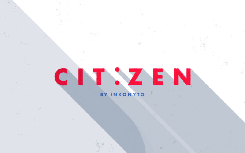
Cityzen
How can intercity travel be simplified and seamless? Citizen answers with a colorful, flat-design film showcasing a smooth journey from New York to London, emphasizing ease, connectivity, and global reach. Citizen is a service designed to...
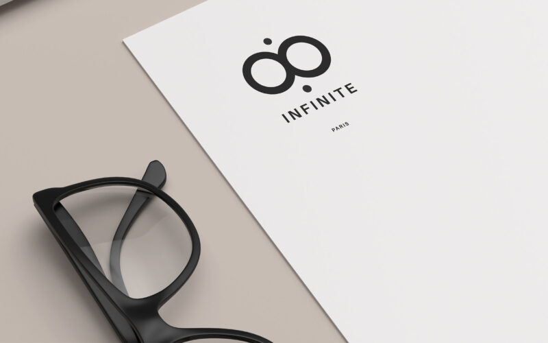
Infinite
How can Infinite’s graphic design express minimalist elegance and natural calm while symbolizing infinite vision and optical precision through subtle logo integration across packaging and communication tools? Infinite’s graphic design...