


More details
How can design express modern masculinity and energy? On-Off’s sleek black-and-white cans with subtle Helvetica typography reflect raw power and elegance, matching a bold soda flavor that energizes body and mind.
“On/Off” is a soda graphic design branding. The black and white “On/Off” can embodies modern masculinity and energy. Its sleek design, highlighted with subtle Helvetica typography, captures the essence of raw power and refined elegance. With each sip, vibrant licorice and lively ginger intertwine for an invigorating experience, complemented by a touch of fresh mint.
This energy elixir awakens both body and mind, ready to tackle challenges. “On/Off” encapsulates American dynamism, combining captivating packaging and distinctive graphic design with a unique flavor. It’s a switch to vitality – one sip, and you’re in “On/Off” mode, embracing a masculine brand image with energizing graphics.
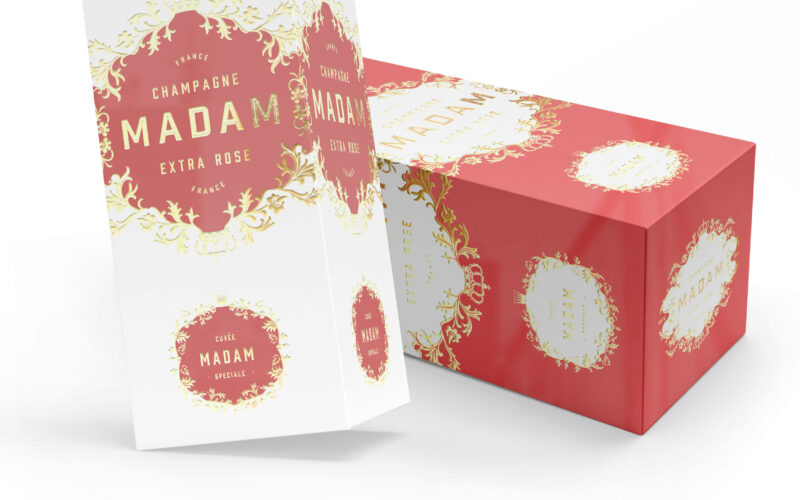
Madam
MADAM champagne blends tradition and modern elegance, echoing legacy brands led by women. But how can a new name assert heritage and authenticity in an industry defined by centuries-old maisons? This elegant champagne packaging features...
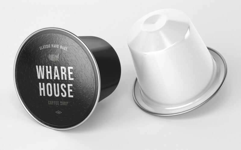
Wharehouse
How can graphic design communicate both craftsmanship and eco-conscious professionalism? Whare House uses vintage textures, natural kraft tones, and a clear system to reflect heritage, authenticity, and refined coffee expertise. The...
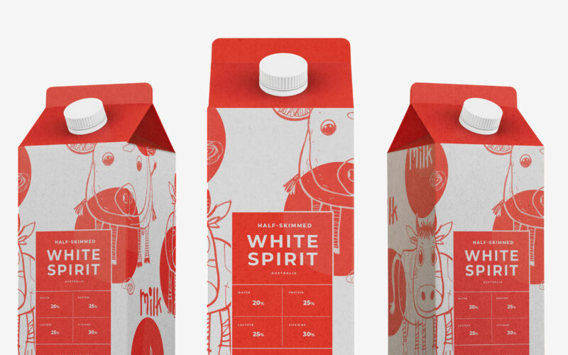
White Spirit
Playful and endearing, White Spirit features childlike cow illustrations that give the packaging a joyful, youthful spirit. The name evokes the color and purity of milk, while red polka dots scattered across the design recall cowhide...
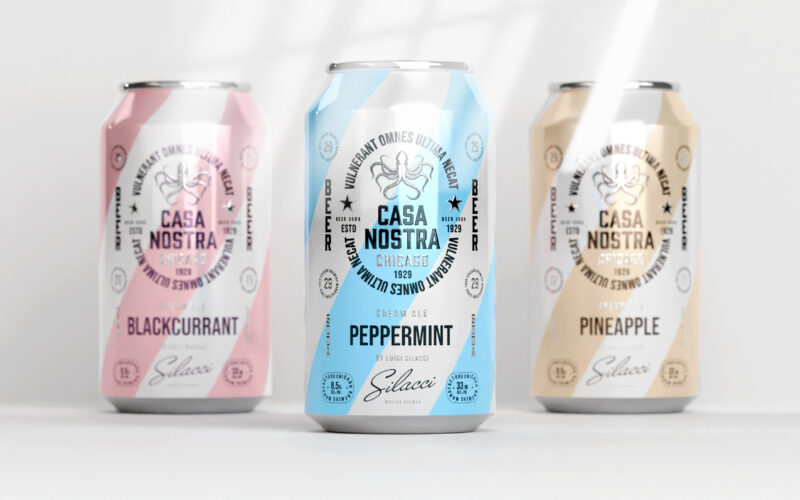
Casa Nostra
How can graphic design express light rebellion while remaining approachable?Casa Nostra uses pastel ribbons and a vintage octopus motif to playfully evoke Prohibition-era mafia culture, blending humor, heritage, and visual softness with...