


More details
How can design elevate a chocolate bar into a golden ingot — where “once” embodies both an ounce of gold and a unique, precious moment of indulgence?
ONCE merges two meanings into one elegant concept — “once,” as in something rare and unforgettable, and “an ounce,” the unit that measures gold. This fusion of language and material creates a brand rooted in prestige, purity, and desire. The chocolate bars, wrapped like gold ingots, reflect a sense of value and timeless indulgence. Minimalist typography and refined surfaces convey sophistication and restraint, transforming chocolate into a symbol of excellence. More than a confection, ONCE represents a golden experience — a moment of rarity, crafted with precision and meant to be savored once, yet remembered always.
Ava
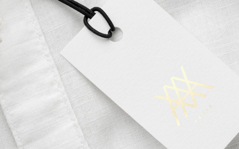
How can a minimalist graphic identity use purity and restraint—white, gold, symmetry—to hint at hidden temptation, turning visual silence into seduction and transforming grace into a quietly provocative luxury statement? White and gold...
Area
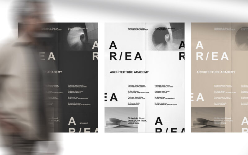
How can graphic design embody architectural research and elite education? AR/EA’s minimal, dual-directional logo and earthy palette capture space, sustainability, and industrial heritage, merging identity with New York’s architectural...
Private
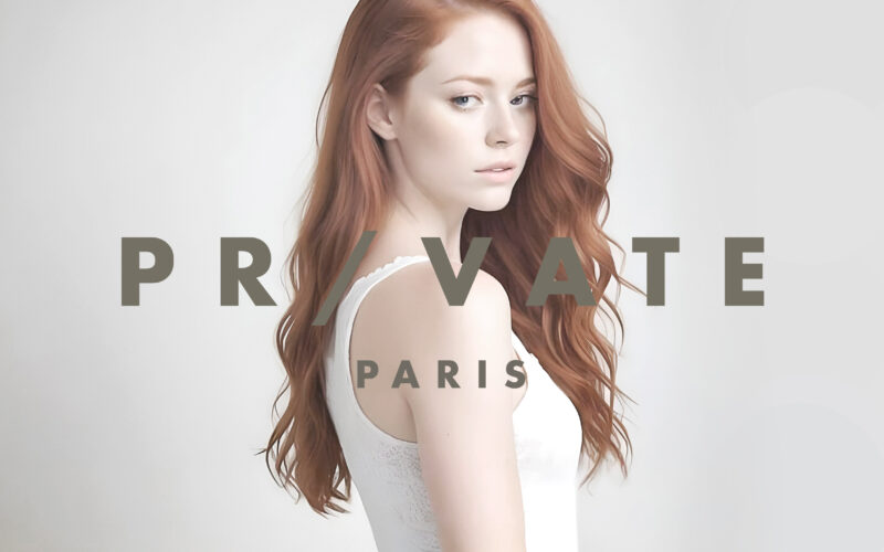
How can fashion design speak without shouting? Pr/vate challenges graphic design to express elegance, strength, and identity through silence—using minimalism to honor discretion as a powerful visual statement. Pr/vate’s website uses...
Surface
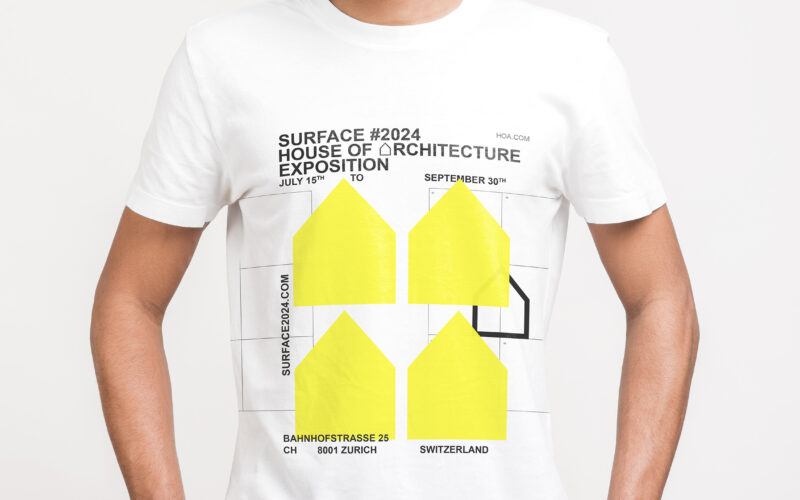
How to visually express architectural innovation? Surface uses neon yellow, minimalist logos, and grid motifs to create a bold, modern identity that reflects precision, structure, and contemporary design. The brand identity for Surface, an...