


More details
How to convey strength and precision visually? Planity’s graphic design uses bold white and orange tones with a structured “P” motif, reflecting professionalism and the scale of major construction projects.
The graphic design for Planity, a major construction company, embraces a corporate and structured visual style. Applied across safety vests, visitor badges, catalogs, the website, caps, stationery, and posters, the identity uses a dominant white and orange palette, reflecting the traditional colors of the construction industry. A defining feature is the use of the initial “P” from Planity, which acts as a visual frame within posters and layouts, organizing the content while reinforcing the brand. This graphic system highlights the company’s values—planning, precision, and scale—while maintaining a strong, professional presence aligned with large-scale infrastructure and building projects.
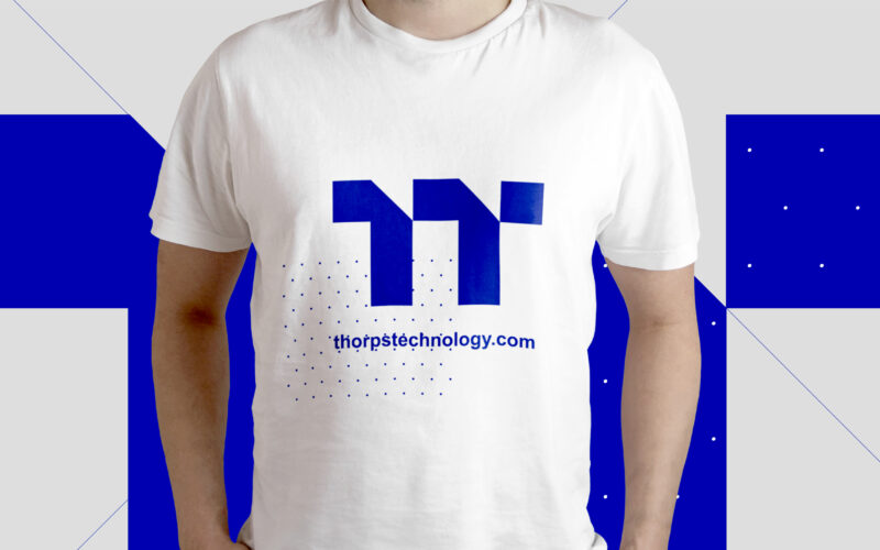
Thorps
How can graphic design convey innovation and precision for an aviation engine manufacturer? Thops Technology uses a blue palette and a turbine-inspired double “T” logo, projecting reliability and cutting-edge expertise. The graphic design...
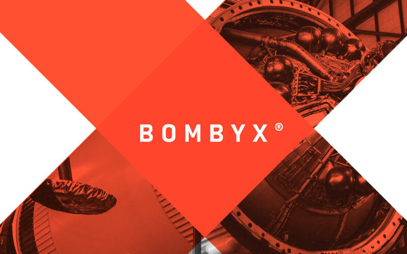
Bombyx
How can a brand identity embody innovation and power? Bombyx’s design leverages bold symbolism and kinetic visuals to question how form, color, and metaphor shape perceptions of high-tech precision and ambition. Bold and futuristic, Bombyx...
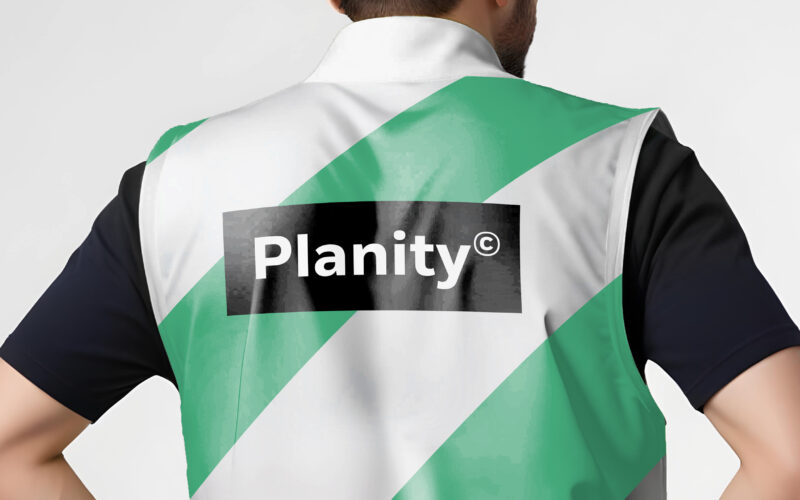
Planity
How can design unite industry and sustainability? Planity’s green-white palette and eco-inspired visuals explore how graphic identity communicates environmental commitment while maintaining professionalism and clarity in construction...
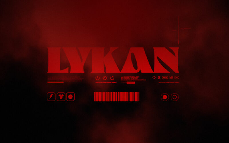
Lykan
How can a supercar brand express both raw power and mythical allure? Lykan does so through a 3D motion film that blends fantasy and mystery, turning the vehicle into a wild, legendary creature. This 3D animated film is built around the...