


More details
How can ice cream packaging evoke nostalgia, glamour, and space-age adventure? Popstar’s graphic challenge is to turn a simple treat into a retro-futuristic journey through identity and imagination.
Popstar’s graphic design blends 1950s–60s vintage charm with cosmic flair. Used across packaging, T-shirts, and books, the visuals feature retro-futuristic illustrations: pastel rockets, sparkling stars, and bold, playful fonts. The brand name—Popstar—combines “popsicle” and “star,” turning ice cream into an interstellar experience. Each bite becomes a journey through glamour and mystery, inviting the consumer to feel like a modern icon. Eating a Popstar isn’t just indulgence—it’s transformation. It’s glitter, adventure, and nostalgia in one. Popstar positions itself as more than a dessert: it’s a pop-culture dreamscape, where every flavor launches a heroine into her own galactic fantasy.
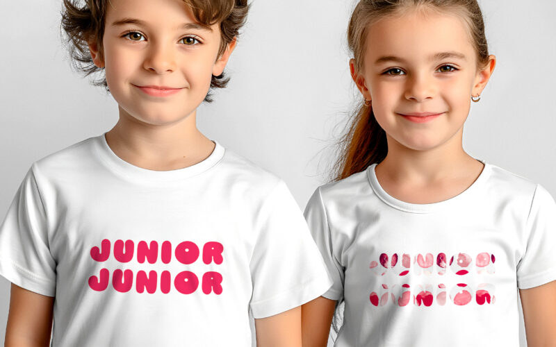
Junior Junior
How can we design a visual identity that is playful and appealing to children, while also reassuring parents with a clear, modern message that communicates quality and trustworthiness? This graphic design showcases a playful and colorful...
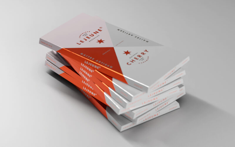
Lejeune
How can a chocolate packaging communicate artisanal excellence while standing out on modern shelves? Lejeune solves this by merging geometric purity, heritage cues, and premium finishes into a timeless graphic identity. The packaging...
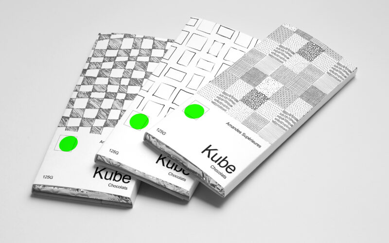
Kube
How can Kube’s graphic design use simple geometric forms and minimal color to communicate artisanal authenticity and purity in a bold yet understated way? Bold in simplicity, the identity of Kube centers on the square—both as form and...
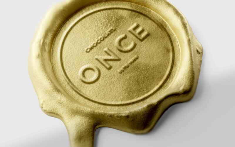
Once
How can design elevate a chocolate bar into a golden ingot — where “once” embodies both an ounce of gold and a unique, precious moment of indulgence? ONCE merges two meanings into one elegant concept — “once,” as in something rare and...