


More details
Playful and rebellious, The Rock Factory (The nickname given to Alcatraz prison) draws its identity from Alcatraz’s infamous legacy, turning its cans into coded messages of escape. Referencing the prison once home to Al Capone, the brand uses a visual language inspired by vintage escape plans—lines, arrows, and notes that resemble smuggled blueprints. The palette of white, yellow, and orange reflects the refreshing nature of the beer itself. Printed on glass and aluminum cans, T-shirts, and booklets, the design invites the drinker into a tongue-in-cheek narrative of subversion and freedom. Each sip becomes an act of escape, a nod to mischief and liberation through craft brewing.
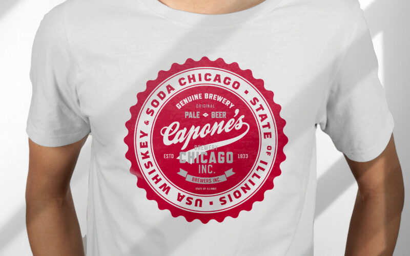
Capone’s
How can design capture heritage and rebellion? Capone’s vintage label, with deep red tones and handwritten typography, evokes Prohibition-era Chicago, blending bold whiskey elements to reflect the beer’s daring character. The 33cl glass...
On Off
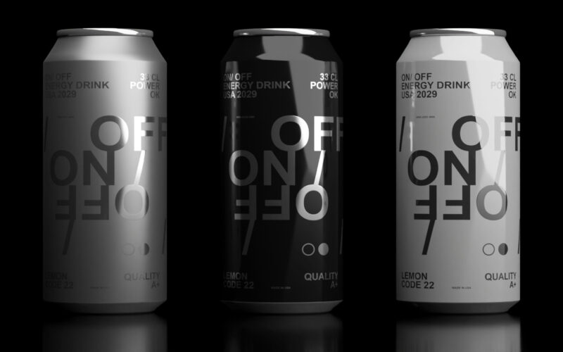
How can design express modern masculinity and energy? On-Off’s sleek black-and-white cans with subtle Helvetica typography reflect raw power and elegance, matching a bold soda flavor that energizes body and mind. "On/Off" is a soda graphic...
Evil Red
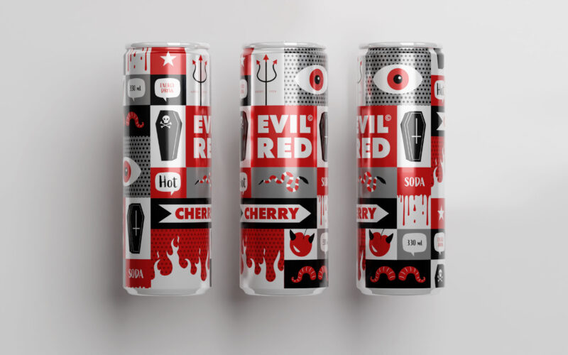
How does packaging express rebellious energy? Evil Red’s comic-inspired design uses bold red panels and mischievous imagery to capture a cheeky, edgy spirit, matching the soda’s spicy, nightlife vibe. The 33cl aluminum can for "Evil Red"...
Power+
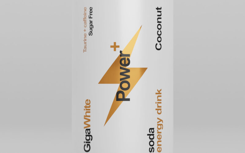
Power+ cans evoke sleek Swiss design with a battery-inspired motif symbolizing energy. Black, white, and gold accents highlight premium flavors, combining minimalism, clarity, and strength for an efficient, sophisticated look. The 33cl...