


More details
Saÿnt Löuys’ graphic design blends classic black and gold to evoke timeless prestige. Its emblem, inspired by justice and royal heritage, crafts a dignified, authoritative identity for the law firm.
The graphic design for Saÿnt Löuys, a law firm, conveys timeless prestige through a classic visual identity. Featured on business cards, a seal, and the website, the design uses a refined black and gold color palette, evoking elegance and authority. At its center is a monogram symbolizing a balance of justice, topped with a cross, subtly intertwined with an “S” resembling a caduceus. This emblem also appears as a royal seal, referencing Saint Louis—King of France and historic figure of divine justice. The design reflects heritage, dignity, and the noble roots of law, blending symbolism with sober sophistication.
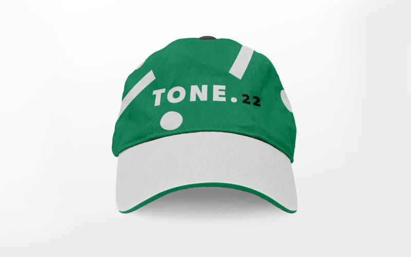
Tone
How can design visually capture music’s energy and harmony? TONE 22’s vibrant greens and animated typography explore rhythm, nature, and authenticity, creating a dynamic identity that celebrates sound and movement. The visual identity of...
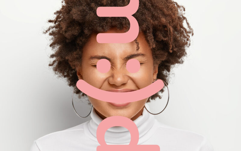
Mood
How can a communication agency visually translate the emotional atmosphere it aims to create for its clients, using playful codes, color, and typography to reflect mood, tone, and intention? The graphic design for Mood, a communication...
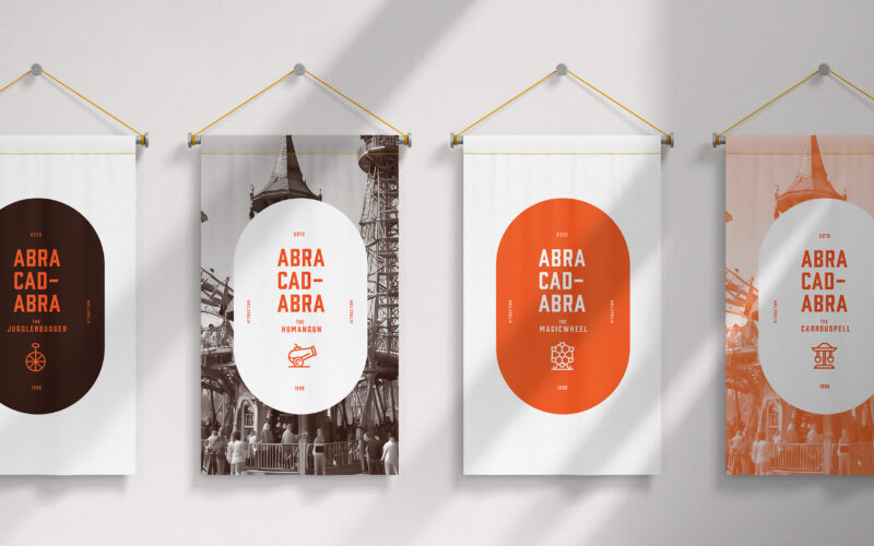
Abracadabra
How can design modernize magical tradition? Abracadabra’s bold orange and black visuals blend heritage with contemporary style, creating an immersive identity that redefines enchantment for today’s theme park audience. The graphic identity...
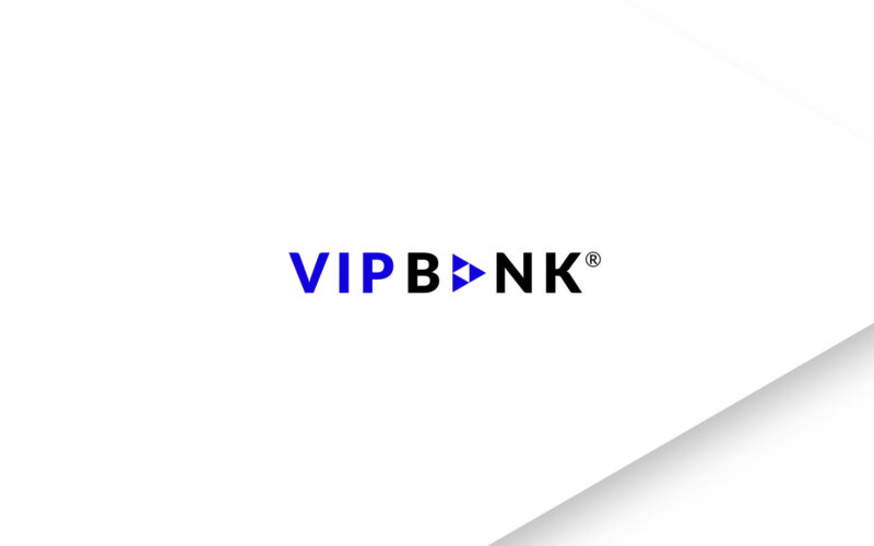
VIP Bank
How can banking merge with the luxury travel experience? VIP Bank answers with a sleek, reassuring film that blends corporate elegance, symbolic design, and serene visuals to promise effortless, first-class journeys. VIP Bank (VIP stands...