


More details
How can SIN⁶⁹’s design express sensuality while maintaining elegance? The minimalist typography and subtle typographic twist balance provocative meaning with refined visual restraint, creating a compelling, intimate brand identity.
The graphic design for SIN⁶⁹, a perfume brand, embraces a minimalist yet provocative aesthetic. Applied to stationery, posters, perfume packaging, bags, and signage, the identity is built around the brand’s three-letter name with an unexpected typographic twist: the “69” appears as a superscript oddly placed between the “i” and the “n,” replacing the dot of the “i” in a subtly disturbing way. Rendered in a rose-copper tone, the design suggests elegance tinged with sensuality. The number references both the boutique’s address and a suggestive position, while the visuals hint at veiled passion—intimate desires simmering beneath a restrained, refined exterior.
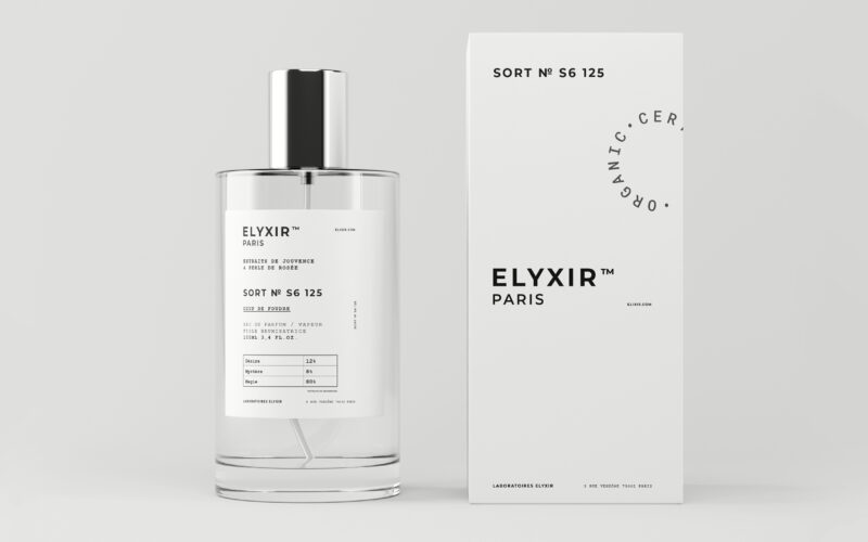
Elyxir
How can a perfume brand visually balance the clinical codes of science with the mystical allure of emotions, creating a design that feels both pharmaceutical and enchantingly magical? The graphic design for Elyxir, a fragrance line, plays...
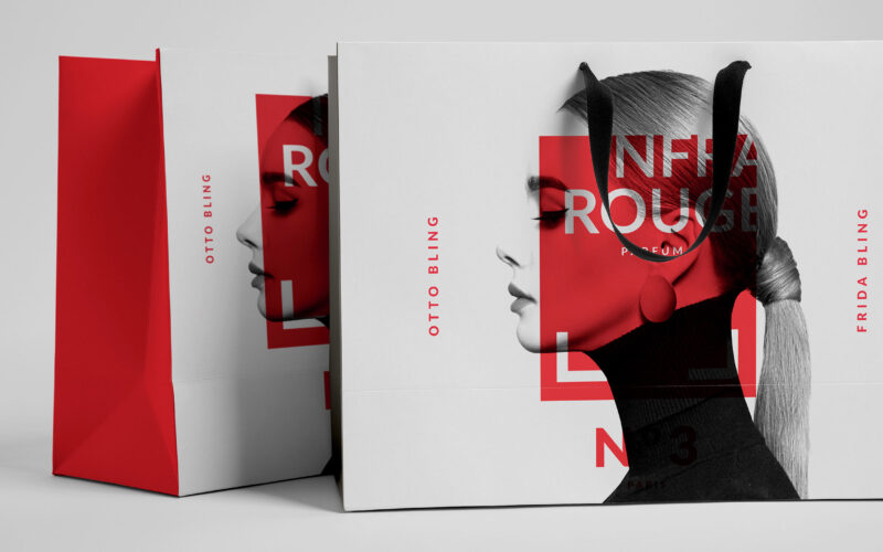
Infrarouge
How can Infrarouge’s graphic design express deep emotion and sensuality through a modern, precise aesthetic that reveals passion while balancing scientific clarity and intimate intensity? Red becomes a language of emotion in Infrarouge,...
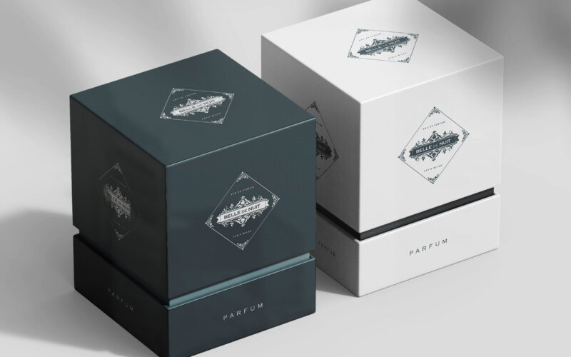
Belle De Nuit
How can Belle De Nuit’s graphic identity express a perfume’s secret sensuality—balancing vintage elegance with veiled desire—through imagery that conceals and reveals, inviting viewers into a world of silent temptation? Elegant and...
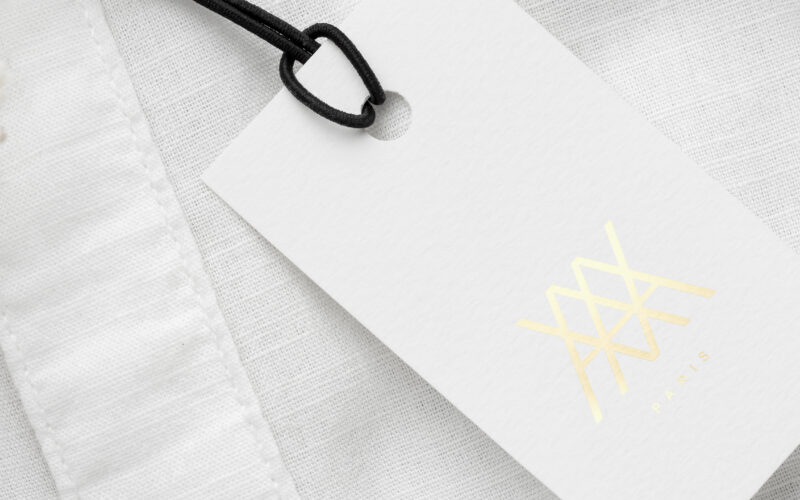
Ava
How can a minimalist graphic identity use purity and restraint—white, gold, symmetry—to hint at hidden temptation, turning visual silence into seduction and transforming grace into a quietly provocative luxury statement? White and gold...