


More details
How can design visually capture music’s energy and harmony? TONE 22’s vibrant greens and animated typography explore rhythm, nature, and authenticity, creating a dynamic identity that celebrates sound and movement.
The visual identity of TONE 22, a music festival, features a fresh and expressive graphic design. Dominated by vibrant shades of green, the visuals evoke energy, nature, and harmony. A key element is the typographic animation of the word “TONE,” which occasionally shifts into “NOTE,” subtly reinforcing the festival’s musical theme. Black and white photos of musicians provide contrast and authenticity, while animated graphic elements — reminiscent of jazzy, bouncing notes — bring rhythm and motion to the compositions. The identity is applied across posters, t-shirts, tote bags, tickets, books, stationery, and newspapers, offering a playful yet refined celebration of sound.
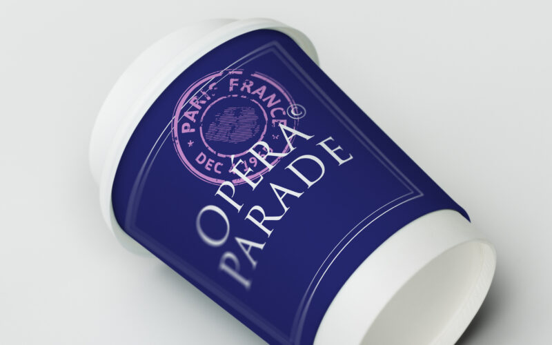
Opera Parade
How can Opéra Parade’s graphic design blend classical elegance with nomadic playfulness, turning each performance into a visual postcard that celebrates movement, music, and shared cultural journeys? The graphic identity for Opéra Parade,...
Area
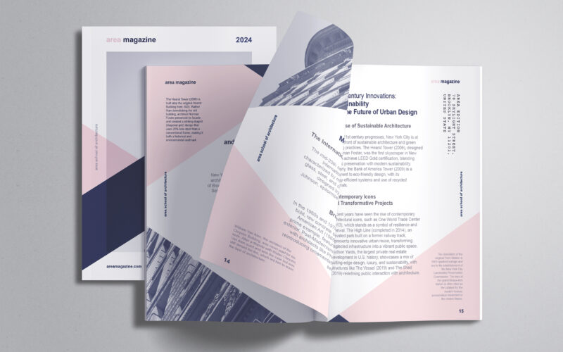
How can editorial design embody architectural thinking? AREA Magazine’s brochure uses layered, intersecting forms and unexpected imagery to mirror the structural logic and creative spontaneity that define the built environment. The graphic...
Area
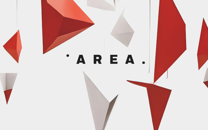
Can graphic design express the concept of space itself? AREA Academy’s identity uses suspended geometric forms and stark minimalism to evoke architecture’s dual nature—structured yet free, fragmented yet visionary. The graphic design for...
Area
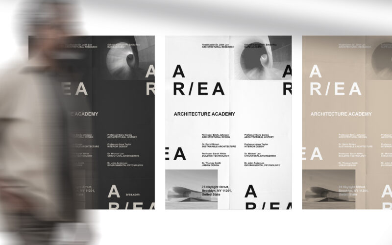
How can graphic design embody architectural research and elite education? AR/EA’s minimal, dual-directional logo and earthy palette capture space, sustainability, and industrial heritage, merging identity with New York’s architectural...