


More details
How can graphic design embody trust and ambition for a travel-focused bank? VIP Bank uses a sleek palette and dynamic triangles to symbolize progress, merging financial reliability with the freedom of travel.
The graphic design for VIP Bank, a banking service tailored for frequent travelers, embraces a sleek, corporate identity with a refined palette of blue, white, grey, and black—“blue for travel.” The branding is deployed across credit cards, stationery, storefronts, posters, ads, and T-shirts. At its core is a dynamic, modular system of triangular shapes, reminiscent of directional arrows or a flag in motion, symbolizing progress and movement. This bold yet professional visual language connects the idea of financial trust with ambition and freedom, encouraging clients to go further—both in their travels and personal projects—with VIP Bank by their side.
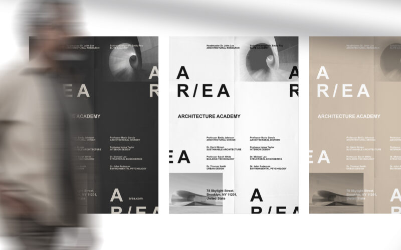
Area
How can graphic design embody architectural research and elite education? AR/EA’s minimal, dual-directional logo and earthy palette capture space, sustainability, and industrial heritage, merging identity with New York’s architectural...
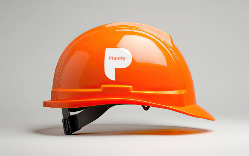
Planity
How to convey strength and precision visually? Planity’s graphic design uses bold white and orange tones with a structured “P” motif, reflecting professionalism and the scale of major construction projects. The graphic design for Planity,...
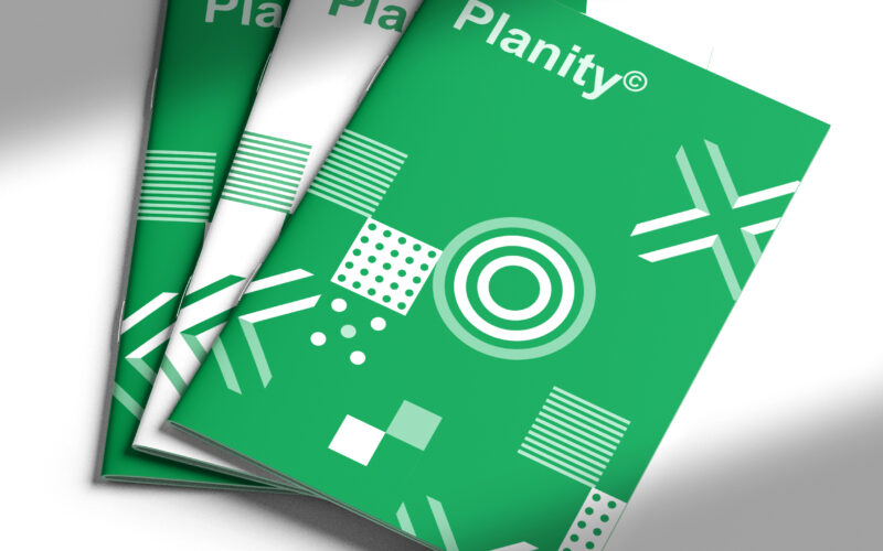
Planity
How to visually unite sustainability and structure? Planity’s graphic design uses white and green geometric patterns, symbolizing nature and organized diversity, embodying a modern, eco-conscious construction identity. The graphic design...
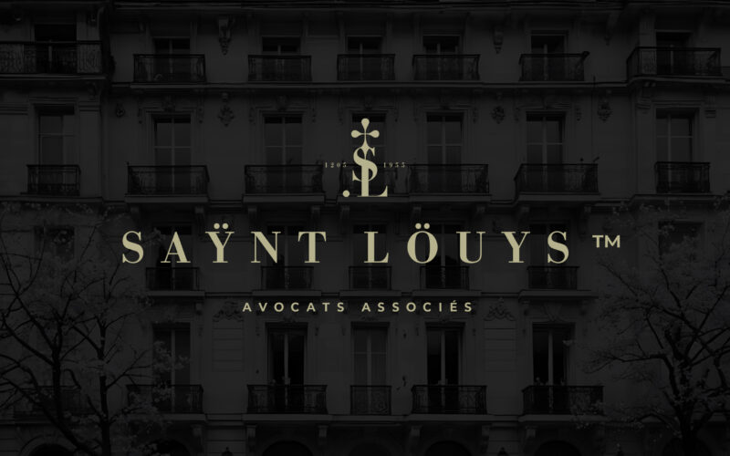
Saynt Louys
The graphic challenge for Saÿnt Löuys lies in merging ancestral heritage with modern sophistication. The design must balance tradition and innovation while conveying authority, elegance, and trustworthiness in a minimalist visual language....