


More details
Playful and endearing, White Spirit features childlike cow illustrations that give the packaging a joyful, youthful spirit. The name evokes the color and purity of milk, while red polka dots scattered across the design recall cowhide markings, reinforcing the connection to nature and childhood. This graphic approach emphasizes milk’s nurturing, maternal origins, making it appealing to young audiences. The color red also has a functional role: it signals the milk’s cream content. A simple color code—red, blue, or green—guides consumers easily. The design blends innocence with clarity, offering a wholesome product wrapped in warmth, fun, and visual simplicity.

Over
How can a travel agency visually reinterpret classic adventure tales in a modern, playful flat design to evoke the joy, ease, and hopeful spirit of discovering new worlds? The graphic design for Over, a travel agency, draws inspiration...
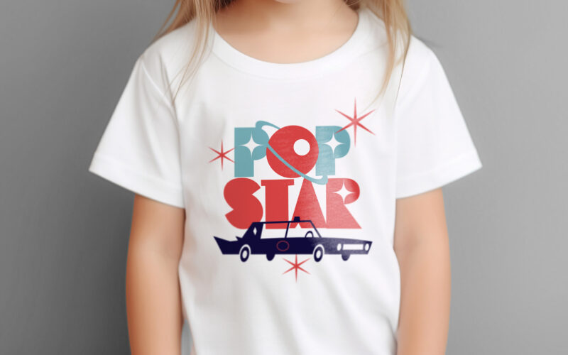
Popstar
How can ice cream packaging evoke nostalgia, glamour, and space-age adventure? Popstar’s graphic challenge is to turn a simple treat into a retro-futuristic journey through identity and imagination. Popstar’s graphic design blends...
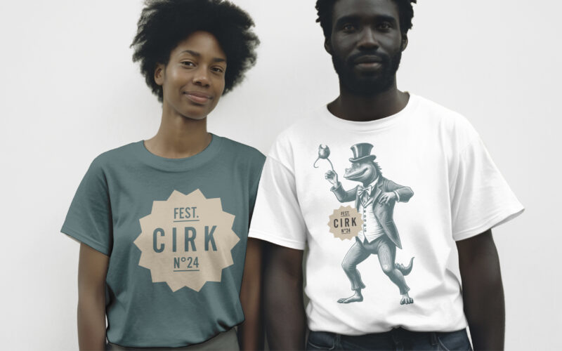
Cirk
How can CIRK N°24’s graphic design capture both nostalgia and surreal imagination? Through rich colors and mythical engravings, the identity creates a poetic, theatrical world balancing whimsy and eerie wonder. The visual identity of CIRK...

Sirk
How can graphic design reinterpret nostalgic imagery with a fresh, contemporary tone? SIRK revives vintage circus icons through playful motifs and rhythmic elegance, blending 1950s charm with modern visual poetry. Playful and poetic, the...