


More details
How can graphic design balance vintage charm and modern minimalism to convey authenticity and innovation? White Whale combines engraving-style illustrations with a fresh, bold palette to create a trusted, stylish seafood brand.
The graphic design for White Whale blends modern minimalism with vintage charm, using old engraving-style whale illustrations to evoke craftsmanship and authenticity. The dominant palette—navy blue, coral red, and crisp white—suggests freshness, maritime heritage, and a touch of boldness. The brand references Moby Dick, adding literary depth to the seafood experience. Applied to packaging, aprons, paperware, and cups, the identity positions the restaurant and seafood brand in a middle-premium segment. The balance between classic and contemporary design communicates both trust and innovation, appealing to discerning customers looking for quality and style in their culinary journey.
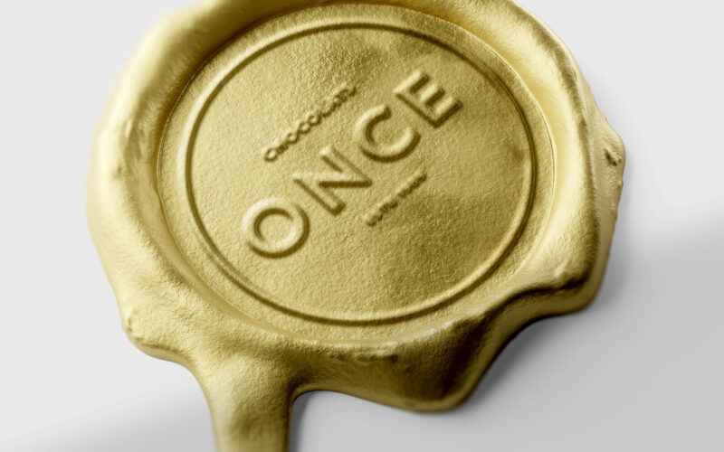
Once
How can design elevate a chocolate bar into a golden ingot — where “once” embodies both an ounce of gold and a unique, precious moment of indulgence? ONCE merges two meanings into one elegant concept — “once,” as in something rare and...
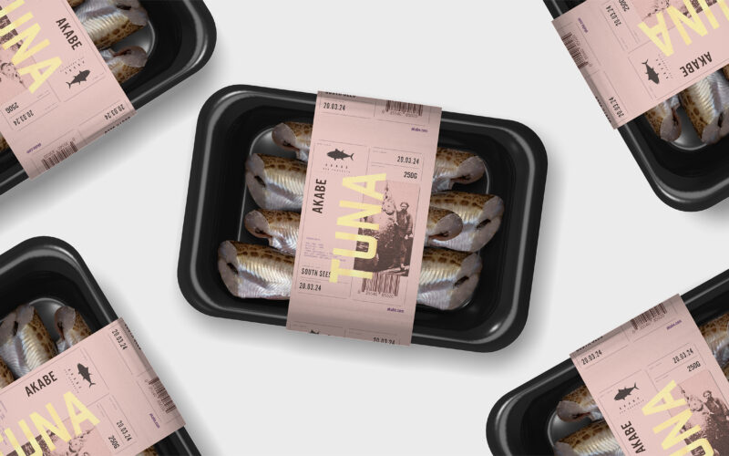
Akabe
How can seafood packaging express both freshness and legacy? Akabe’s graphic identity balances minimalist structure with artisanal luxury—using salmon tones and gold accents to merge modern clarity with timeless ocean heritage. The graphic...
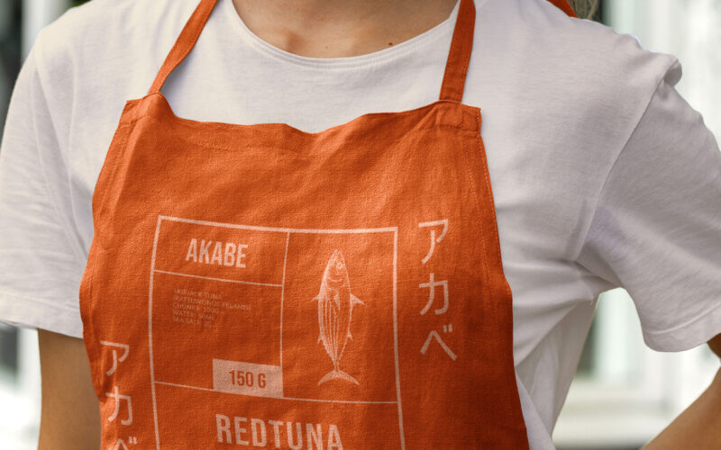
Akabe
How can canned seafood feel both luxurious and disciplined? Akabe’s graphic identity fuses Japanese minimalism with maritime heritage—using coral hues and compartmental layouts to express artisanal quality through elegant, functional...
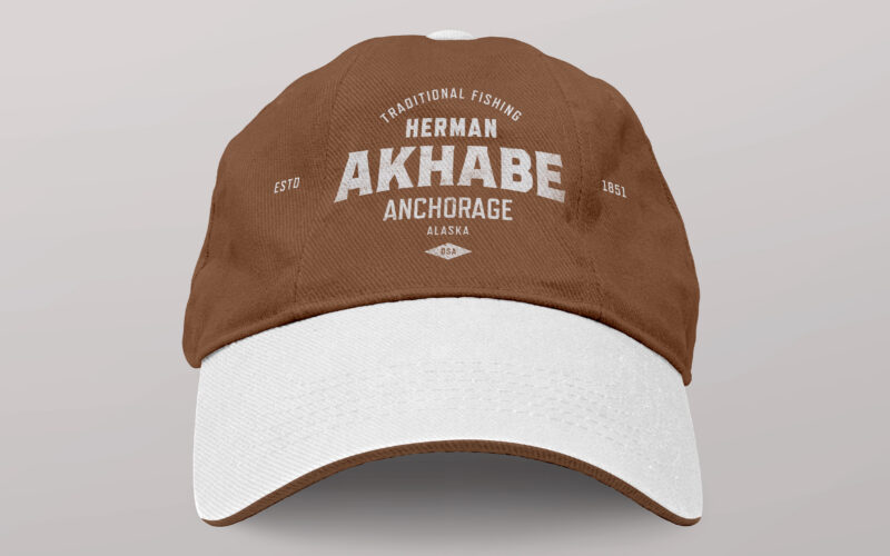
Akhabe
How can a seafood brand channel literary legacy and bold character? Akhabe’s design fuses vintage Americana with maritime grit, using a strong central figure to anchor a timeless yet contemporary visual identity. “Akhabe” is a premium...