


More details
How to visually blend nostalgia and freshness? Zero’s retro-inspired design uses bold typography and vintage imagery, mixing icy whites with elegant blues and golds to evoke timeless American dessert charm.
Cool and nostalgic, Zero (or 0° Celsius) draws its identity from the icy charm of post-war American ice cream parlors. Large, bold lettering with shadow effects evokes retro signage, while halftone images of a smiling Eskimo and a polar bear recall vintage newspaper prints, reinforcing the product’s authenticity. The dominant white palette reflects the arctic cold, while accents of blue and gold add a touch of crisp elegance. Displayed across ice cream boxes, popsicles, T-shirts, and bags, the visual language captures both freshness and heritage, offering a timeless frozen treat with a wink to the golden age of American desserts.
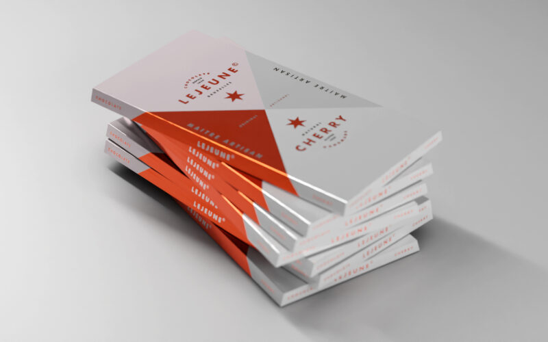
Lejeune
How can a chocolate packaging communicate artisanal excellence while standing out on modern shelves? Lejeune solves this by merging geometric purity, heritage cues, and premium finishes into a timeless graphic identity. The packaging...
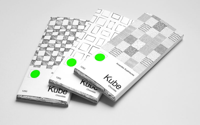
Kube
How can Kube’s graphic design use simple geometric forms and minimal color to communicate artisanal authenticity and purity in a bold yet understated way? Bold in simplicity, the identity of Kube centers on the square—both as form and...
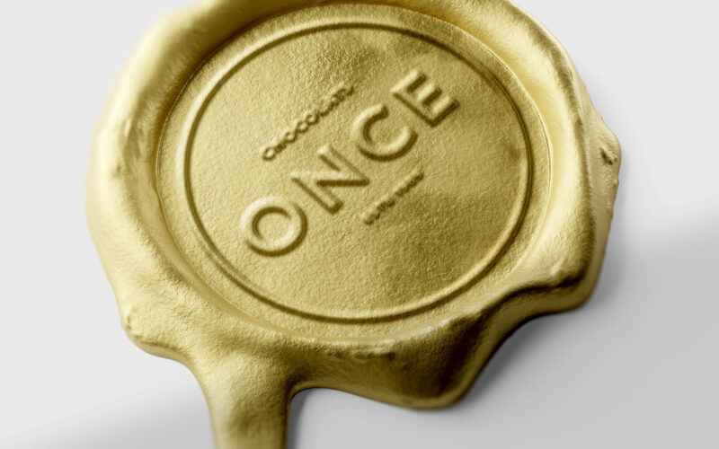
Once
How can design elevate a chocolate bar into a golden ingot — where “once” embodies both an ounce of gold and a unique, precious moment of indulgence? ONCE merges two meanings into one elegant concept — “once,” as in something rare and...
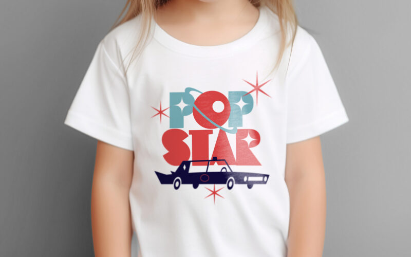
Popstar
How can ice cream packaging evoke nostalgia, glamour, and space-age adventure? Popstar’s graphic challenge is to turn a simple treat into a retro-futuristic journey through identity and imagination. Popstar’s graphic design blends...