


More details
How to balance minimalism with nature’s poetry? Polen’s design uses white and green with subtle floral motifs and geometric framing, creating a refined identity that highlights purity and delicate beauty.
The graphic design of Polen, a flower-inspired perfume brand, combines minimalism and nature. Seen on bottles, boxes, business cards, t-shirts, and tote bags, it uses a white and green palette symbolizing purity and simplicity. The logo features a clean, elegant typeface subtly framed within an invisible diamond—like a hidden gem—surrounded by delicate floral motifs that evoke the lightness of pollen drifting in the wind. This subtle geometry adds a touch of sophistication, while the floral elements highlight the natural origins of the fragrance. The result is a refined, poetic visual identity that captures the product’s simple and precious beauty.
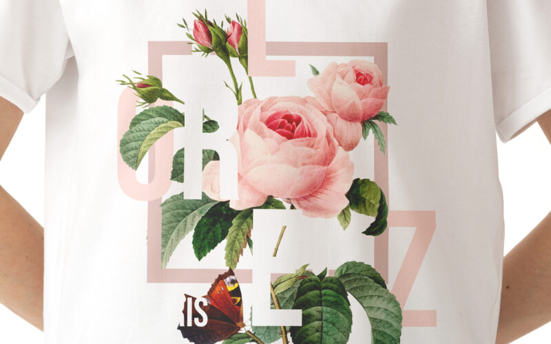
Florenz
How can graphic design express the emotional richness of a fragrance brand—merging romantic intensity, layered storytelling, and floral abundance—while maintaining clarity, elegance, and a deeply personal artistic identity? Vibrant and...
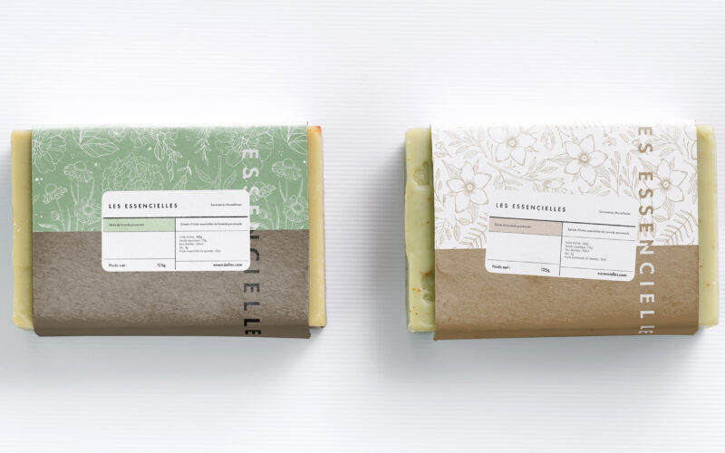
Essencielle
How can a soap brand express both artisanal heritage and ecological commitment through design? Les Essencielles explores this through natural tones, delicate engravings, and sustainable materials that highlight purity and tradition. The...
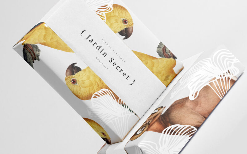
Jardin Secret
How can Jardin Secret’s graphic design balance vibrant natural imagery with intimacy and exclusivity, creating a fresh, radiant identity that evokes a personal sensory escape in eco-friendly packaging? Bright and lush, {Jardin Secret} by...
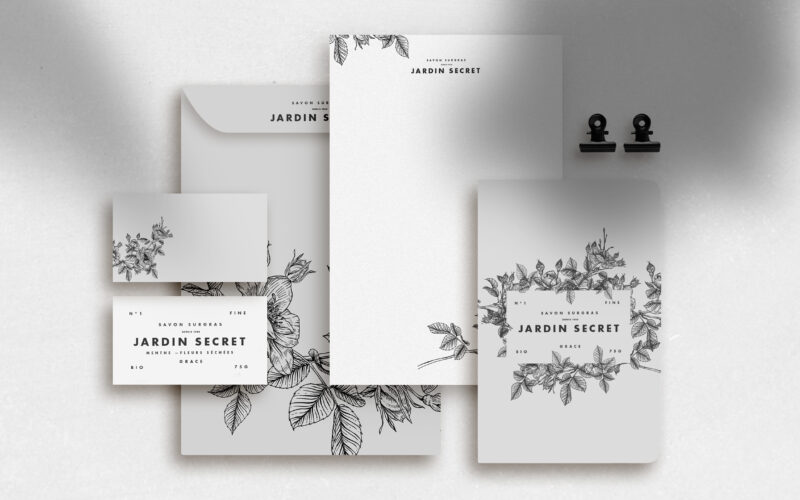
Jardin Secret
How can Jardin Secret’s graphic design express eco-consciousness and intimacy using delicate black and white illustrations, creating a poetic and personal identity that evokes hidden gardens and quiet self-care rituals? Jardin Secret...