


More details
How can Soltiz N°4’s design balance bold creativity with clarity? The graphic identity merges minimalism and controlled chaos, crafting a refined yet raw look that captivates without overwhelming.
The graphic design of Soltiz N°4, alternating seasonally with EquinoKs, defines a bold fashion magazine identity. Dominated by black and white, the layout embraces a minimalist, deceptively chaotic aesthetic with a subtle sense of anarchy. It evokes a fragile balance and total creative freedom, inspired by David Carson’s Ray Gun, but in a far more refined, stripped-back style. Large white margins frame the model visuals, enhancing their impact while providing breathing space for the reader’s eye. This thoughtful emptiness avoids visual overload, creating a tension between structure and disorder that feels both modern and intentionally raw.
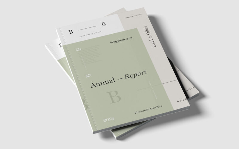
Bridge
Brige Bank’s identity centers on the dash linking its two Bs—a metaphorical bridge and connection. How can visual design express trust and relationship within a contemporary banking image? The Brige Bank of London Annual Report centers its...
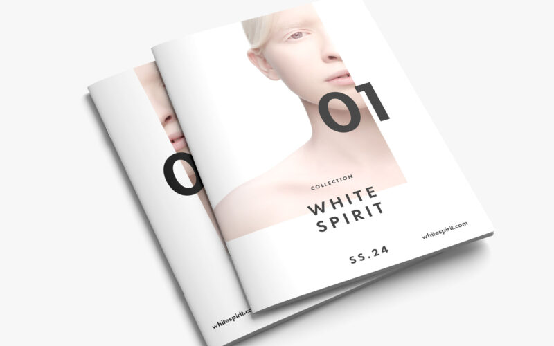
White Spirit
White Spirit SS.24 questions the notion of purity in modern aesthetics — is whiteness a symbol of innocence or emptiness? The magazine explores identity, fragility, and transcendence through minimalist visual storytelling. White Spirit...
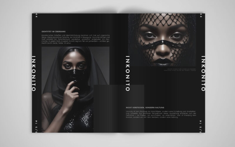
Inkonito
How can visual design affirm a modest, deliberate identity — using fashion and the metaphor of the mask not to hide, but to reveal the self with elegance, distance, and quiet power?INKONITO is a conceptual brochure exploring identity...
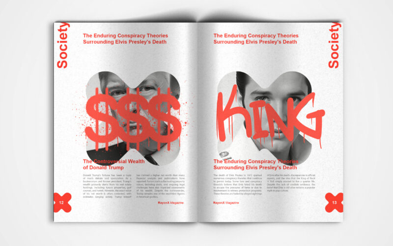
X-Ray
X-Ray magazine uses bold design and the X motif to decode society's layers. But can visual aesthetics alone effectively unveil the hidden complexities shaping modern culture and public discourse? This is a visually striking society...