


More details
How can Opéra Parade’s graphic design blend classical elegance with nomadic playfulness, turning each performance into a visual postcard that celebrates movement, music, and shared cultural journeys?
The graphic identity for Opéra Parade, a traveling musical performance, is both vintage and contemporary. Dominated by white and blue, the design is structured with animated cartouches that frame informative text and engraved-style visuals evoking classical music. These refined illustrations bring a nostalgic yet fresh tone to the overall look. The entire layout is overlaid with postal-style stamps marking the names and dates of each performance, reminiscent of a well-traveled poscard. This playful and poetic concept celebrates movement, culture, and communication. The identity is consistently applied across posters, t-shirts, cups, caps, and stationery, creating a unified and memorable visual experience.
Tone
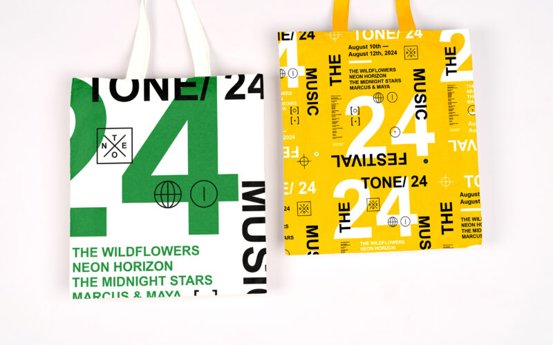
How can graphic design capture youthful energy and spontaneity for a music festival? TONE 24 uses bright colors and dynamic typography, creating a playful, DIY aesthetic that celebrates rhythm and community. The visual identity of TONE 24,...
Tone Jazz
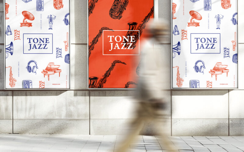
How does graphic design balance tradition and modernity for a jazz festival? TONE JAZZ uses orange and blue with intricate musician engravings, blending vintage charm and contemporary clarity in a cohesive visual identity. The visual...
Sirk
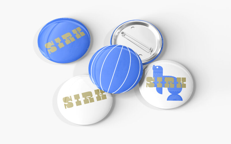
How can graphic design reinterpret nostalgic imagery with a fresh, contemporary tone? SIRK revives vintage circus icons through playful motifs and rhythmic elegance, blending 1950s charm with modern visual poetry. Playful and poetic, the...
Circus
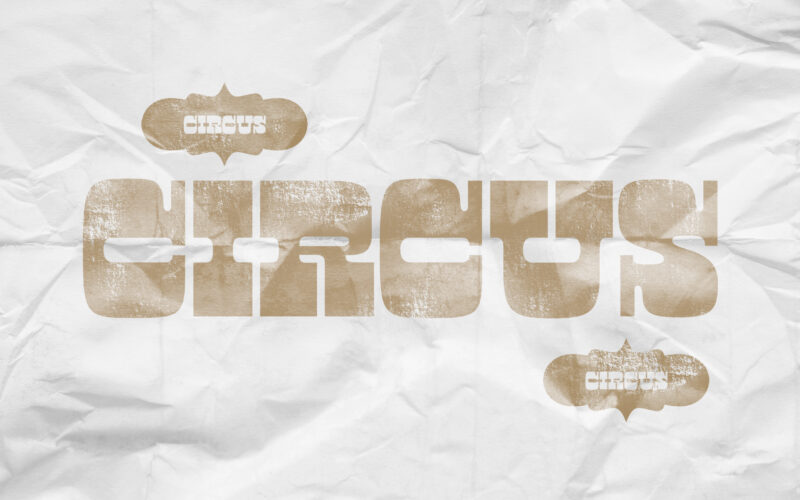
How can graphic design revive historical spectacle without falling into nostalgia? Circus reimagines 19th-century show aesthetics through sepia tones and stark layouts, creating a timeless visual mythology of performance. Evoking the charm...