
")
")
")
")
")
")
")
")
More details
How can intercity travel feel simple, joyful, and stress-free? Cityzen answers with a playful, colorful identity and cheerful visuals that turn booking transport into a light, carefree experience across all platforms.
The brand identity for Cityzen, an intercity transport ticket booking app, features a cheerful and playful graphic design applied across multiple media. The name blends “city” and “zen,” reflecting stress-free urban travel. The dominant colors — green, pale yellow, and soft pink — create a light, welcoming atmosphere. The visual language is built around geometric, childlike illustrations that evoke a sense of carefree adventure, suggesting that using the app makes travel simple and joyful. This whimsical tone is reinforced in promotional videos through the use of music with playful, childlike tones, further emphasizing ease, positivity, and the pleasant experience of moving between cities.
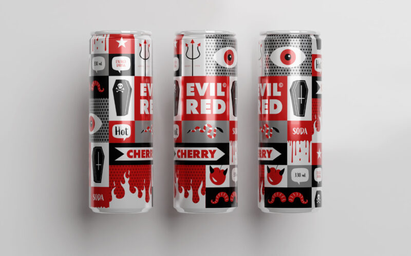
Evil Red
How does packaging express rebellious energy? Evil Red’s comic-inspired design uses bold red panels and mischievous imagery to capture a cheeky, edgy spirit, matching the soda’s spicy, nightlife vibe. The 33cl aluminum can for "Evil Red"...
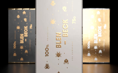
Blen Bleck
Blen-Beck’s playful pixel-art packaging channels classic video games with pixelated creatures and chocolate-inspired squares. The black, gold, and white palette adds whimsy and premium flair, appealing to kids and nostalgic geeks alike....
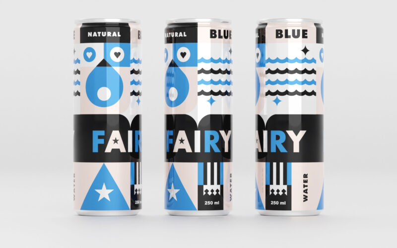
Blue Fairy
Blue Fairy’s 33cl can features gentle blues and pale pinks with geometric, childlike shapes evoking water, stars, and hearts. The design radiates calm, magic, and youthful whimsy for a soothing experience. The 33cl aluminum can for "Blue...