


More details
How can a chocolate packaging communicate artisanal excellence while standing out on modern shelves? Lejeune solves this by merging geometric purity, heritage cues, and premium finishes into a timeless graphic identity.
The packaging design for Lejeune chocolate blends minimalism and elegance through a bold geometric cross layout in white, matte silver, and bright metallic copper foil. This artisan brand from Brussels emphasizes its handcrafted quality through symmetrical type placement, clean typography, and the use of the eight-pointed star as a signature mark. The diagonal split of the wrapper both frames and enhances the brand name and flavor (cherry), elevating perception of quality. The copper shine evokes premium tradition while the restraint of the layout speaks of refinement. It feels both classic and contemporary—a design as refined as the chocolate it protects.
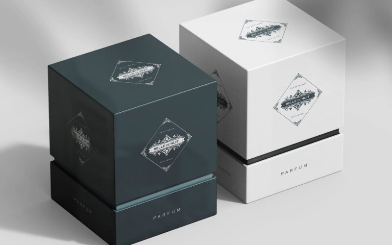
Belle De Nuit
How can Belle De Nuit’s graphic identity express a perfume’s secret sensuality—balancing vintage elegance with veiled desire—through imagery that conceals and reveals, inviting viewers into a world of silent temptation? Elegant and...
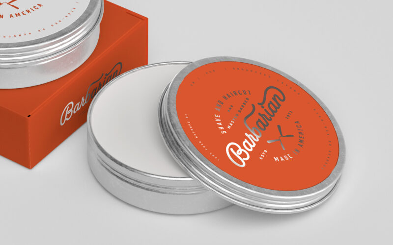
Barbarian
How can graphic design express Barbarian’s dual identity—raw masculinity and expert precision—by merging vintage barber traditions with a bold, modern aesthetic that celebrates strength, care, and timeless masculine refinement? Bold and...
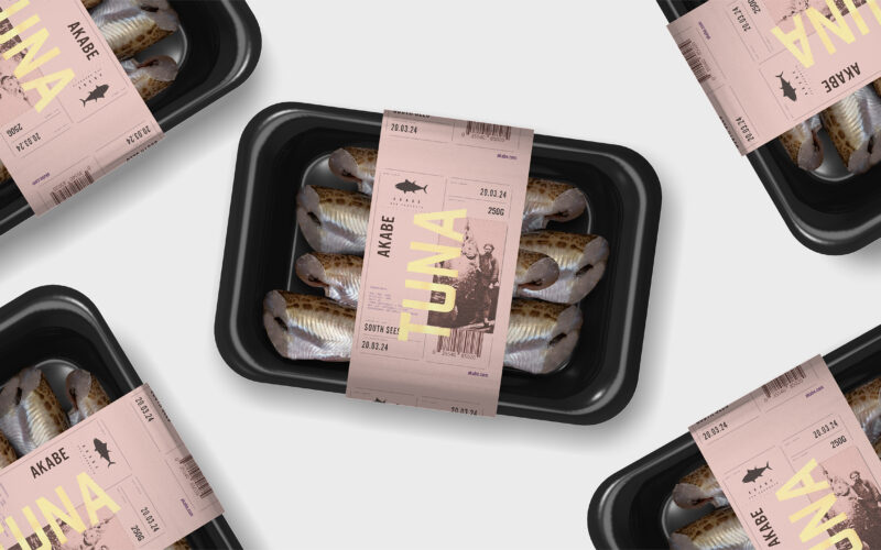
Akabe
How can seafood packaging express both freshness and legacy? Akabe’s graphic identity balances minimalist structure with artisanal luxury—using salmon tones and gold accents to merge modern clarity with timeless ocean heritage. The graphic...
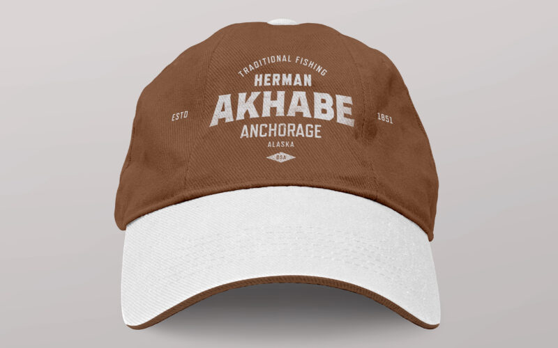
Akhabe
How can a seafood brand channel literary legacy and bold character? Akhabe’s design fuses vintage Americana with maritime grit, using a strong central figure to anchor a timeless yet contemporary visual identity. “Akhabe” is a premium...