


More details
How can graphic design balance tradition and modern irreverence for a men’s cosmetics brand? The Sweeney Todd Family uses vintage black and gold tones with playful irony to convey elegance and humor.
The graphic design for The Sweeney Todd Family, a men’s cosmetics brand, embraces a vintage masculine style rooted in tradition and expertise. Dominated by black and gold, the visual identity suggests elegance and confidence. The name cheekily references the infamous barber, hinting at the brand’s “razor-sharp” effectiveness while injecting humor and irony. Applied to T-shirts, aprons, shop windows, bags, signage, and packaging, the design strikes a balance between classic barbershop aesthetics and modern irreverence. It appeals to a discerning clientele with a strong sense of humor—men who value quality but don’t take themselves too seriously.
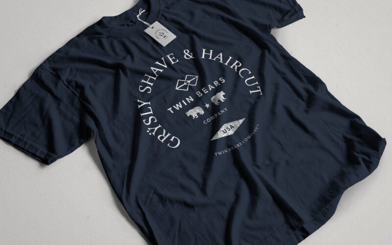
Grysly
How can graphic design channel primal masculinity and refined craftsmanship into a cohesive identity? Grÿsly explores this balance through bold colors, wild imagery, and vintage codes rooted in nature and heritage. The graphic design of...
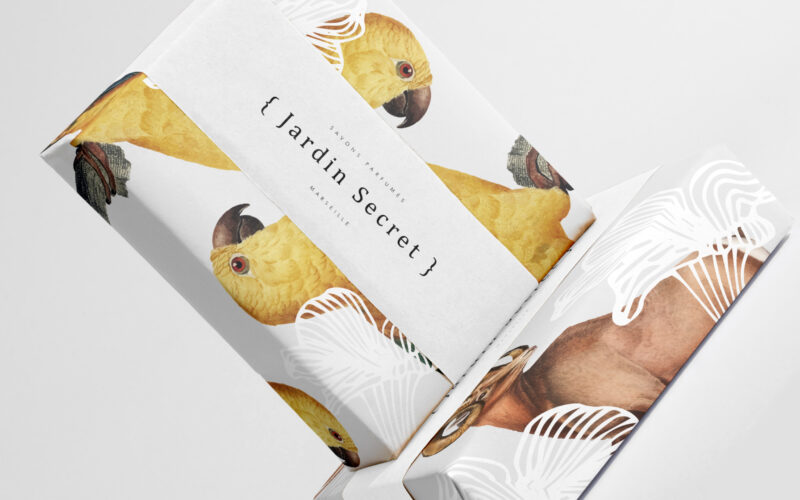
Jardin Secret
How can Jardin Secret’s graphic design balance vibrant natural imagery with intimacy and exclusivity, creating a fresh, radiant identity that evokes a personal sensory escape in eco-friendly packaging? Bright and lush, {Jardin Secret} by...
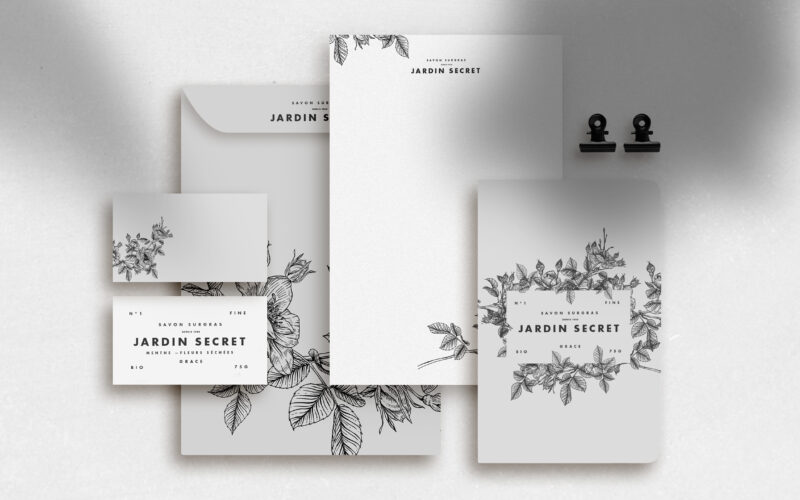
Jardin Secret
How can Jardin Secret’s graphic design express eco-consciousness and intimacy using delicate black and white illustrations, creating a poetic and personal identity that evokes hidden gardens and quiet self-care rituals? Jardin Secret...
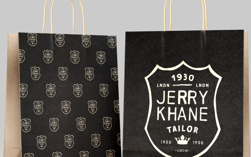
Jerry Khane
How can Jerry Khane’s graphic design balance vintage sophistication and artisanal rawness, combining aristocratic heritage with modern rebellion through textured visuals and a refined yet rugged identity? Jerry Khane – Tailor blends...