


More details
How can CIRK N°24’s graphic design capture both nostalgia and surreal imagination? Through rich colors and mythical engravings, the identity creates a poetic, theatrical world balancing whimsy and eerie wonder.
The visual identity of CIRK N°24, a contemporary circus festival, is rich, surreal, and poetic. Dominated by deep green, light green, and gold tones, the design features engravings of a fantastical bestiary—creatures that are both magical and frightening, yet endearing and whimsical. These beings perform acts reminiscent of old circus shows where strange, mysterious “freaks” were part of the spectacle. The title appears in a star-shaped label, echoing traditional circus emblems. This identity blends nostalgia and dreamlike imagination, creating a festival universe that feels theatrical, otherworldly, and wildly creative. It is applied across posters, t-shirts, tote bags, badges, books, and caps.
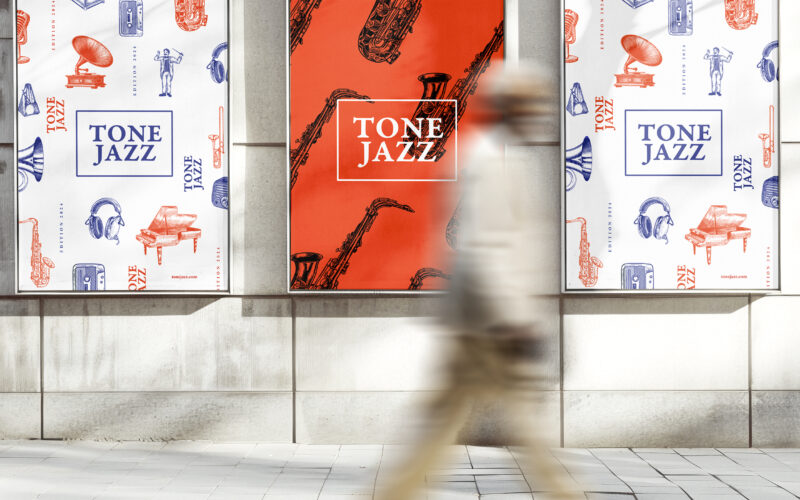
Tone Jazz
How does graphic design balance tradition and modernity for a jazz festival? TONE JAZZ uses orange and blue with intricate musician engravings, blending vintage charm and contemporary clarity in a cohesive visual identity. The visual...
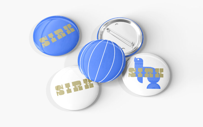
Sirk
How can graphic design reinterpret nostalgic imagery with a fresh, contemporary tone? SIRK revives vintage circus icons through playful motifs and rhythmic elegance, blending 1950s charm with modern visual poetry. Playful and poetic, the...
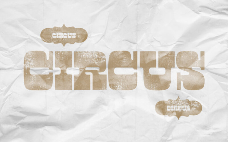
Circus
How can graphic design revive historical spectacle without falling into nostalgia? Circus reimagines 19th-century show aesthetics through sepia tones and stark layouts, creating a timeless visual mythology of performance. Evoking the charm...
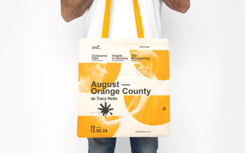
Les Arênes
How can graphic design balance tradition and modernity? Théâtre Les Arènes uses vibrant yellow and geometric motifs to explore how visual identity combines architectural heritage with contemporary clarity and dynamic creativity. The visual...