


More details
How does S7UDIO 7’s graphic design embody the essence of cinema through typography and color? The bold use of the number 7 and energetic palette highlights creativity and cinematic power.
The visual identity of S7UDIO 7, a film festival, is bold and conceptual, centered around the number 7 to emphasize its connection to the seventh art—cinema. The typographic treatment replaces the “T” in “Studio” with a “7”, while a second “7” appears as a superscript at the end, suggesting a festival “raised to the power of 7.” The color palette—orange, black, and white—adds energy and contrast. The key visual features a large, graphic number 7 framing a black-and-white photo of a filmmaker’s face, half-hidden, as if filming the viewer from behind the camera. The identity spans posters, t-shirts, bags, stationery, and programs.
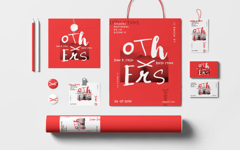
Others
How can graphic design convey reconstruction and the rewriting of truths, using fragmented typography and the “X” to reveal, conceal, and question the narratives of “the others”? The Others project builds a bold, minimalist identity...
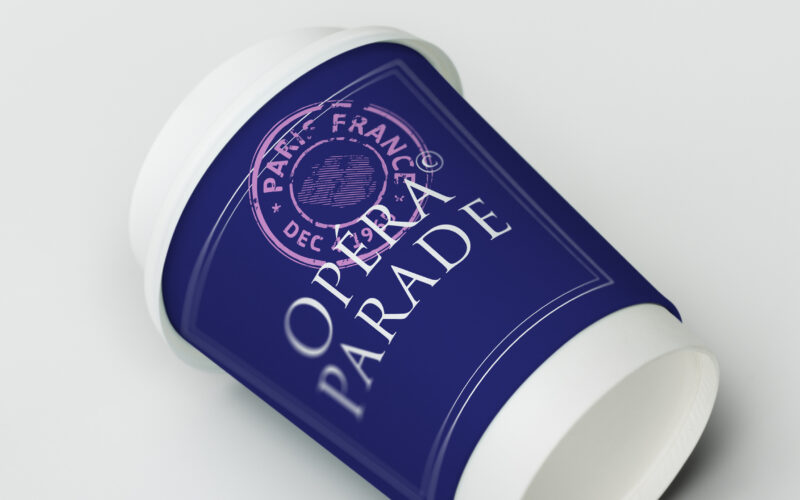
Opera Parade
How can Opéra Parade’s graphic design blend classical elegance with nomadic playfulness, turning each performance into a visual postcard that celebrates movement, music, and shared cultural journeys? The graphic identity for Opéra Parade,...
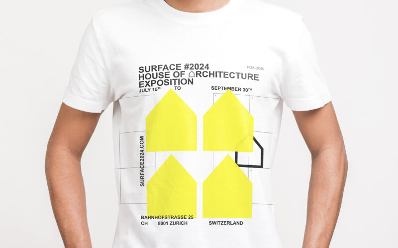
Surface
How to visually express architectural innovation? Surface uses neon yellow, minimalist logos, and grid motifs to create a bold, modern identity that reflects precision, structure, and contemporary design. The brand identity for Surface, an...
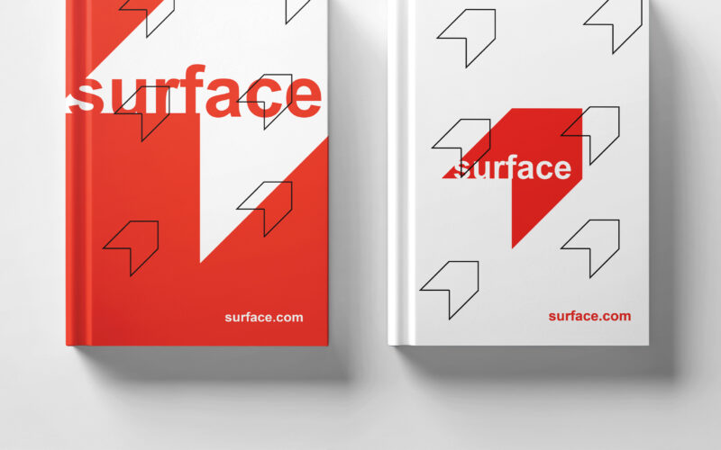
Surface
How to convey architectural duality? Surface uses red and white with a minimalist, 3D-illusion logo that balances flatness and volume, creating a refined, modern identity for the exhibition’s visual universe. The graphic design for the...