


More details
How can graphic design balance boldness and refinement? Bling Bling’s identity uses black and gold contrasts with symbolic typography to explore luxury, elegance, and the mystique of timeless regal power.
The visual identity of the Bling Bling brand appears on stationery, jewelry boxes, and paper bags, featuring a design that is both bold and refined. Dominated by black and gold, the creation plays with contrasts and symbolism. The name “Bling Bling” is subtly embedded within the initials BB, revealing an unexpected double arrow. These same letters frame the images of two queens adorned with jewelry. The gold line-art style brings delicacy and lightness, like a lace veil covering the richness of the ornaments. Combined with black, the overall design evokes a sense of timeless, mystical majesty.
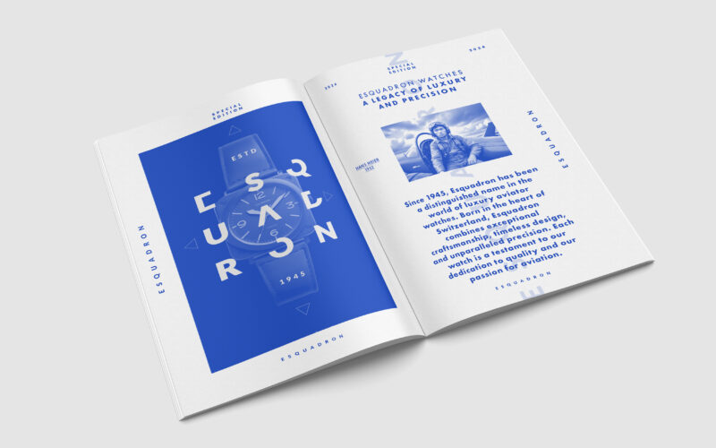
Escadron
How can editorial design elevate a luxury watch brand’s aviation heritage? Esquadron translates precision, adventure, and identity into visuals that echo cockpit geometry and evoke sky-bound elegance and technical mastery. Esquadron is a...
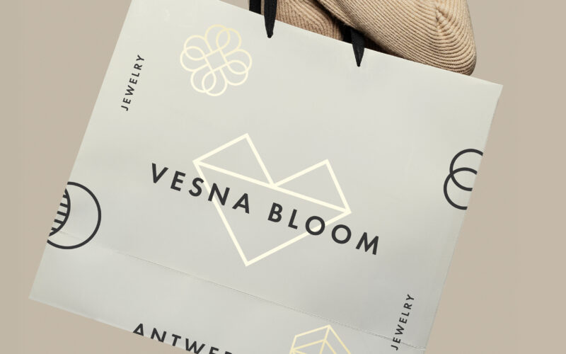
Vesna Bloom
How can graphic design convey elegance and emotion for a jewelry brand? Vesna Bloom uses soft beige and gold tones with a monogram symbolizing diamond and heart, blending refinement and heartfelt artistry. The visual identity for Vesna...
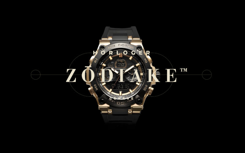
Zodiake
How can graphic design convey cosmic precision and luxury in the high-end watch market? Zodiake merges celestial symbolism with black-and-gold elegance, positioning its chronometers as timeless, exclusive objects of desire. The Zodiake...
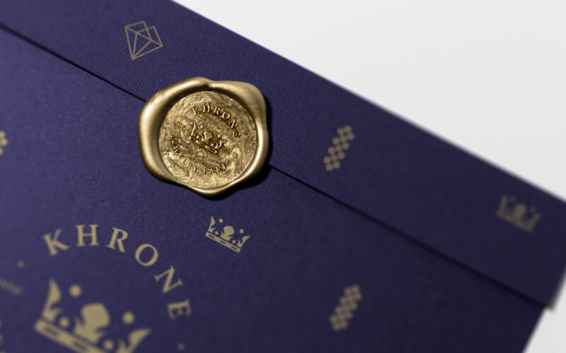
Khrone
Khrone’s graphic design uses bold violet and regal gold, combining delicate geometric patterns to evoke modern luxury and emotion. It balances craftsmanship with contemporary elegance for a refined, exclusive clientele. The graphic design...