


More details
How can graphic design communicate both craftsmanship and eco-conscious professionalism? Whare House uses vintage textures, natural kraft tones, and a clear system to reflect heritage, authenticity, and refined coffee expertise.
The graphic design of Whare House evokes the world of docks, cargo, and storage sheds, aligning with the brand’s identity rooted in craftsmanship and logistics. Dominated by natural kraft, black, and white, the visual language reflects an artisanal, eco-conscious ethos. The branding blends vintage textures with modern minimalism, suggesting heritage and professionalism. Coffee products are clearly structured using a numbered and color-coded system based on intensity. Applied to bags, cups, aprons, and stationery, the design communicates consistency and authenticity. Whare House aims to bring the expertise of a leading coffee distributor directly to the customer in an accessible and refined form.
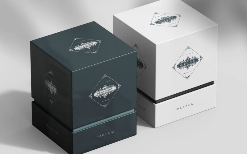
Belle De Nuit
How can Belle De Nuit’s graphic identity express a perfume’s secret sensuality—balancing vintage elegance with veiled desire—through imagery that conceals and reveals, inviting viewers into a world of silent temptation? Elegant and...
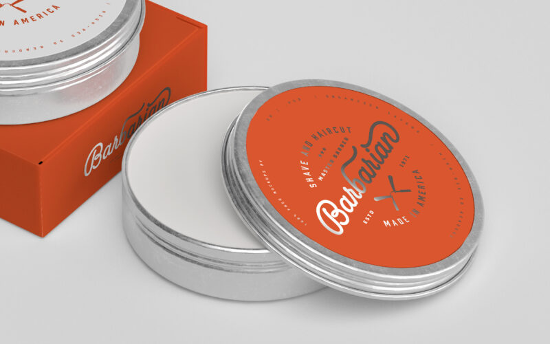
Barbarian
How can graphic design express Barbarian’s dual identity—raw masculinity and expert precision—by merging vintage barber traditions with a bold, modern aesthetic that celebrates strength, care, and timeless masculine refinement? Bold and...
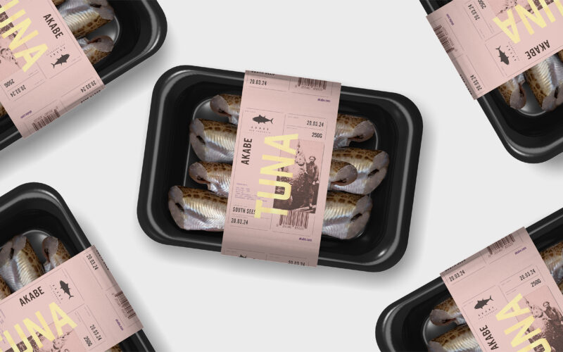
Akabe
How can seafood packaging express both freshness and legacy? Akabe’s graphic identity balances minimalist structure with artisanal luxury—using salmon tones and gold accents to merge modern clarity with timeless ocean heritage. The graphic...
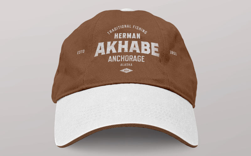
Akhabe
How can a seafood brand channel literary legacy and bold character? Akhabe’s design fuses vintage Americana with maritime grit, using a strong central figure to anchor a timeless yet contemporary visual identity. “Akhabe” is a premium...