


More details
How can we design a visual identity that is playful and appealing to children, while also reassuring parents with a clear, modern message that communicates quality and trustworthiness?
This graphic design showcases a playful and colorful branding concept for a product named “Junior Junior” by the brand “gumgum.” The dominant color is a vibrant pinkish-red, evoking sweetness and youth. The design is applied across various supports: candy packaging, T-shirts, and promotional visuals. The typography is bold, rounded, and bubbly, reinforcing the fun and friendly tone. Circular watercolor dots create a cheerful pattern in the background. The layout is clean and symmetrical, making it visually appealing to children and parents alike. The overall identity feels fresh, sugar-free, and tailored for a youthful target audience.
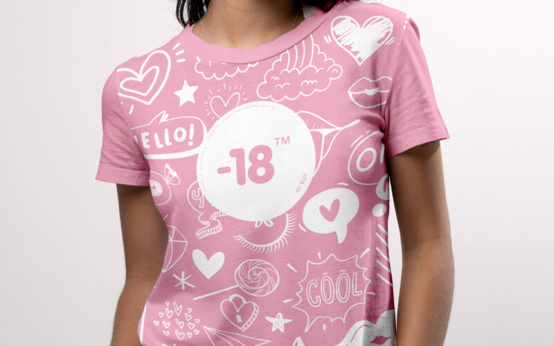
-18
How can a visual identity empower teenage girls through design? “-18” turns diary scribbles, irony, and soft tones into a playful code, creating a youthful, exclusive world that joyfully excludes adults. The graphic design for the brand...
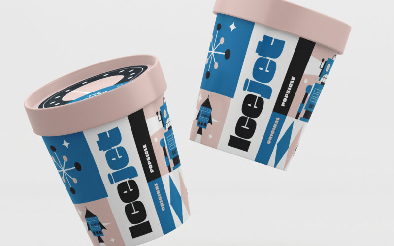
Icejet
How can IceJet’s graphic design capture children’s imagination by blending nostalgic space-age visuals with playful colors and characters, creating a joyful, adventurous brand that makes ice cream a cosmic journey? The graphic design for...
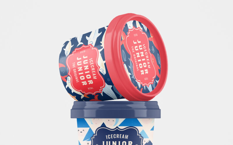
Junior Junior
How can Junior Junior’s graphic design capture playful nostalgia while appealing to children and adults alike, blending vintage charm with modern joy through colorful, whimsical packaging? Junior Junior brings a burst of playful nostalgia...
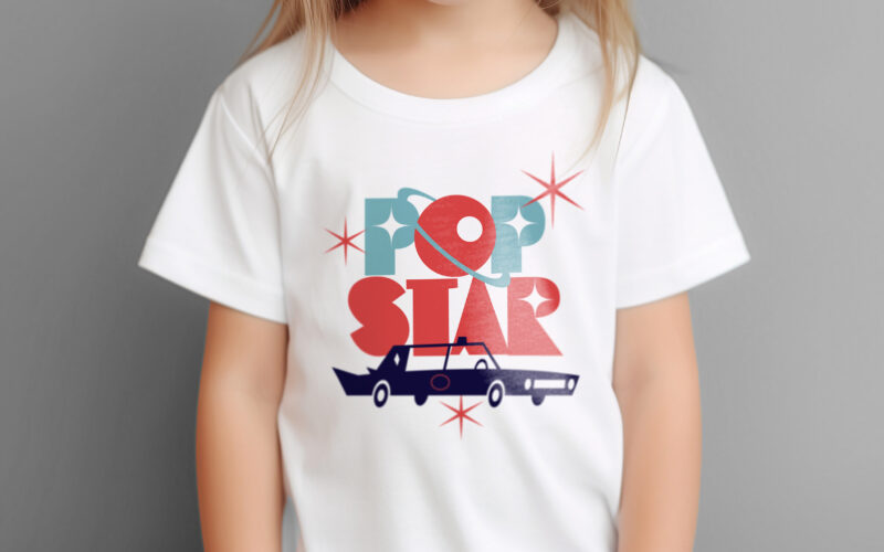
Popstar
How can ice cream packaging evoke nostalgia, glamour, and space-age adventure? Popstar’s graphic challenge is to turn a simple treat into a retro-futuristic journey through identity and imagination. Popstar’s graphic design blends...