


More details
How can Kube’s graphic design use simple geometric forms and minimal color to communicate artisanal authenticity and purity in a bold yet understated way?
Bold in simplicity, the identity of Kube centers on the square—both as form and symbol. Hand-drawn square motifs echo the shape of chocolate pieces, expressing authenticity, warmth, and artisanal origin. These visual elements appear on chocolate bars, notebooks, tote bags, hot chocolate cups, and signage, reinforcing a handcrafted aesthetic. The overall design remains minimal and clean, with black and white dominating the palette. A single touch of neon green signals the chocolate’s nature and origin, coded for clarity. Artistic yet restrained, Kube presents itself with quiet confidence: the best, nothing more—letting the purity of its product speak for itself.
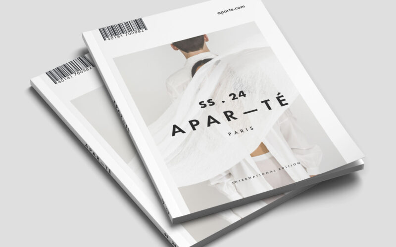
Apar-te
Apar-Té explores balance through emptiness, contrast, and space. The challenge lies in creating visual emotion with minimal elements—how to express depth and tension through pure graphic restraint. The Apar-Té brochure captures refined...
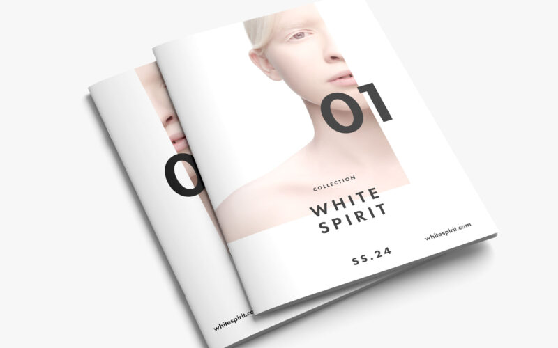
White Spirit
White Spirit SS.24 questions the notion of purity in modern aesthetics — is whiteness a symbol of innocence or emptiness? The magazine explores identity, fragility, and transcendence through minimalist visual storytelling. White Spirit...
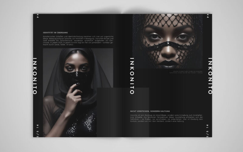
Inkonito
How can visual design affirm a modest, deliberate identity — using fashion and the metaphor of the mask not to hide, but to reveal the self with elegance, distance, and quiet power?INKONITO is a conceptual brochure exploring identity...
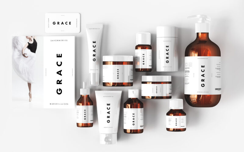
Grace
The graphic design of Grace by Les Savonneries Marseillaises is featured on cosmetics, bags, booklets, and posters. With a dominant white palette, the design is stripped to its minimalist core, evoking clinical purity and the essential...