


More details
How can a travel agency visually reinterpret classic adventure tales in a modern, playful flat design to evoke the joy, ease, and hopeful spirit of discovering new worlds?
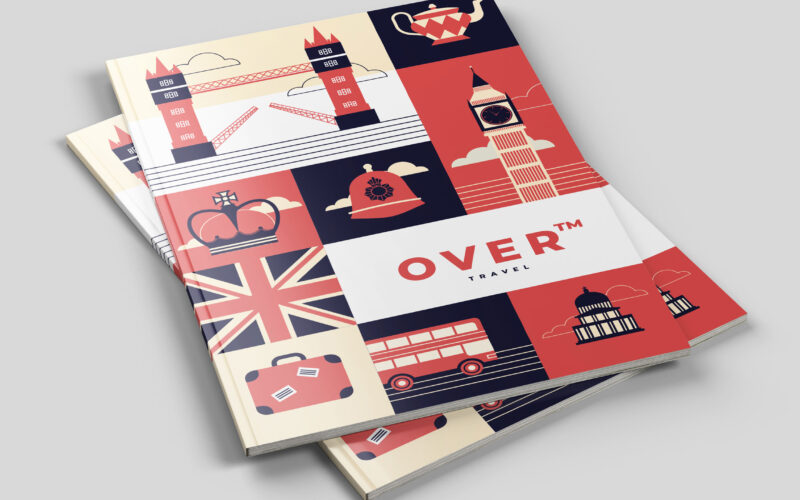
The graphic design for Over, a travel agency, draws inspiration from Jules Verne’s grand travel stories published by Hetzel but reimagined in a contemporary flat design style. Applied across stationery, hats, travel bags, notebooks, t-shirts, books, and tickets, the visuals use a dominant palette of pink and green, with other colors in the collection. This design approach emphasizes the ease and playful nature of travel, reflecting the agency’s message that a journey is not just transportation but the hopeful pursuit of joyful adventure. The imagery evokes discovery of new worlds and treasures, inviting clients to embrace exploration with carefree enthusiasm.
Over
How can Over’s graphic design balance playful structure and cultural symbolism to transform travel into an engaging, memorable journey that visually guides and excites its audience? The graphic design for Over, a travel agency, uses a...
To
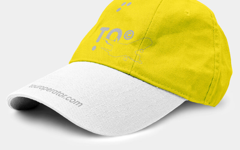
How can a travel brand balance clarity, movement, and meaning in one bold graphic system? TO’s challenge: symbolize both journey and destination, with a name that says it all—literally. TO—short for Tour Operator and the English...
Via
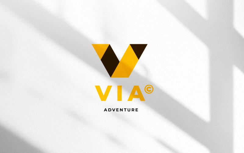
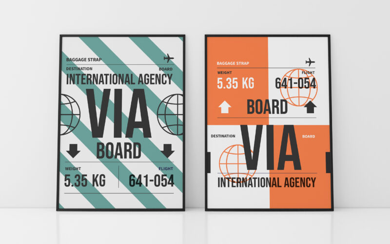
How can a visual identity translate the energy of travel — movement, direction, and discovery — through geometry and contrast, while maintaining a clear, modern sense of structure and destination? This travel identity system for VIA...
Via
How can a soap brand express both artisanal heritage and ecological commitment through design? Les Essencielles explores this through natural tones, delicate engravings, and sustainable materials that highlight purity and tradition. The...