


More details
How can a travel brand balance clarity, movement, and meaning in one bold graphic system? TO’s challenge: symbolize both journey and destination, with a name that says it all—literally.
TO—short for Tour Operator and the English preposition “to”—builds its identity around the symbolic power of the dot. Seen on tickets, caps, badges, posters, and airplane livery, the dot becomes a destination marker, a point of connection, a radar blip. Bold yellow and silver enhance visibility and energy. The graphic system is sleek, modern, and full of direction. Ironically, TO flips the old saying—“it’s not the destination, it’s the journey”—as a wink: here, what matters is where you’re going. The brand simplifies travel to its essence with one clear message: get to the point.
Over
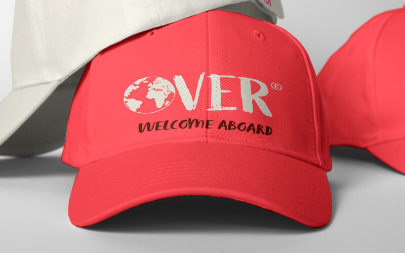
How can Over’s graphic design express the spirit of authentic, joyful exploration through a warm, personal, and vibrant visual language that breaks from conventional travel norms? The graphic design for Over, a travel agency, captures a...
Over
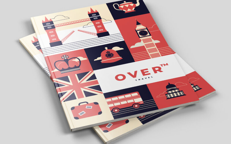
How can Over’s graphic design balance playful structure and cultural symbolism to transform travel into an engaging, memorable journey that visually guides and excites its audience? The graphic design for Over, a travel agency, uses a...

Over
How can a travel agency visually reinterpret classic adventure tales in a modern, playful flat design to evoke the joy, ease, and hopeful spirit of discovering new worlds? The graphic design for Over, a travel agency, draws inspiration...
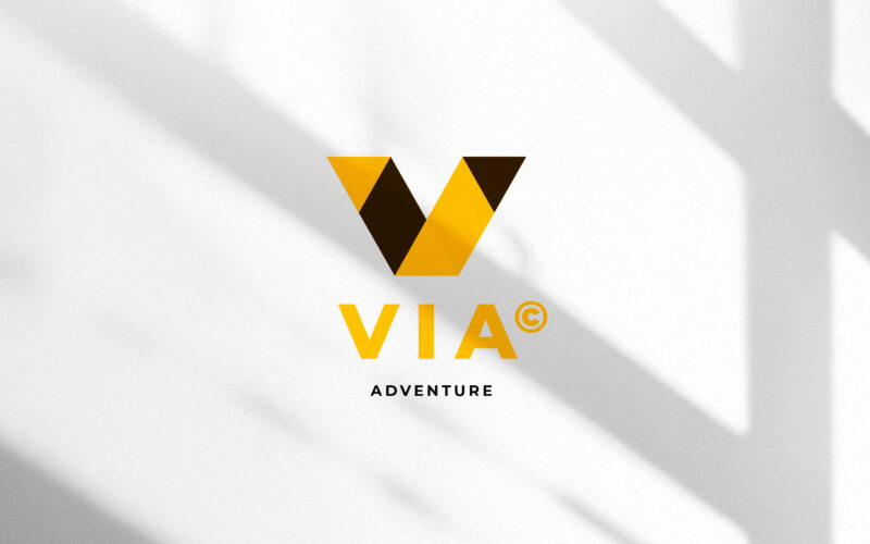
Via
How can a visual identity translate the energy of travel — movement, direction, and discovery — through geometry and contrast, while maintaining a clear, modern sense of structure and destination? This travel identity system for VIA...