


More details
How can graphic design capture youthful energy and spontaneity for a music festival? TONE 24 uses bright colors and dynamic typography, creating a playful, DIY aesthetic that celebrates rhythm and community.
The visual identity of TONE 24, a music festival, is energetic and youthful, reflecting the vibrancy of live performance. Dominated by bright, saturated colors, the graphic design captures the spirit of celebration and rhythm. The number “24” — representing this year’s edition — becomes the central design element, animated through playful, dynamic typography. The layout is reminiscent of student flyers, with an informal, DIY aesthetic that adds spontaneity and approachability. This bold and expressive identity is rolled out across posters, t-shirts, tote bags, tickets, books, stationery, and newspapers, uniting all touchpoints of the festival under one lively and distinctive visual language.
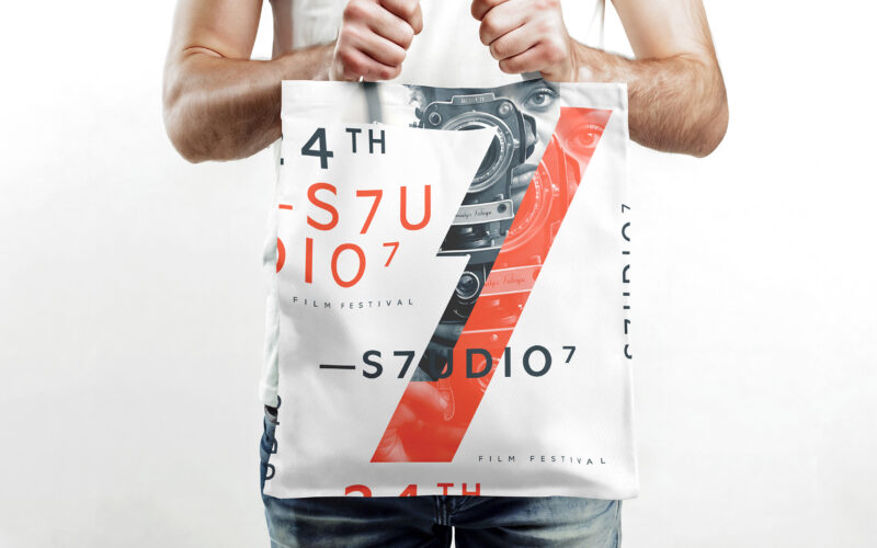
S7UDIO 7
How does S7UDIO 7’s graphic design embody the essence of cinema through typography and color? The bold use of the number 7 and energetic palette highlights creativity and cinematic power. The visual identity of S7UDIO 7, a film festival,...
Tone
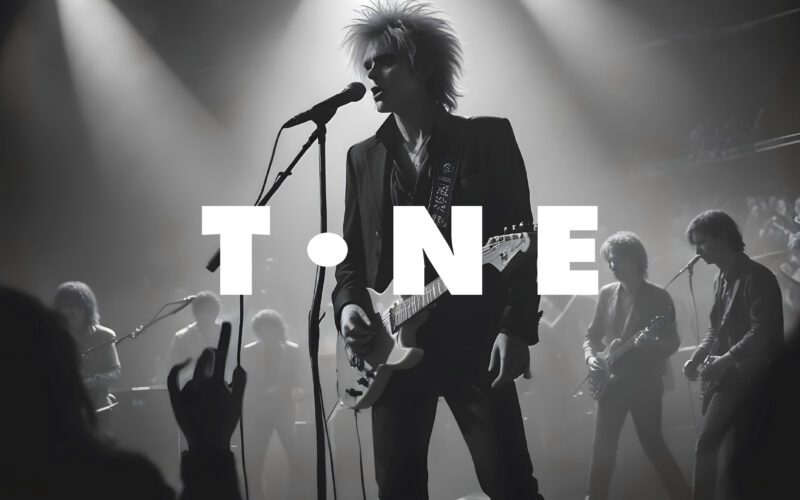
How can a website visually echo the universal language of music? The challenge: create a modular, adaptive design that feels rhythmic, immersive, and responsive—like music itself. The TONE website is a digital space dedicated to all forms...
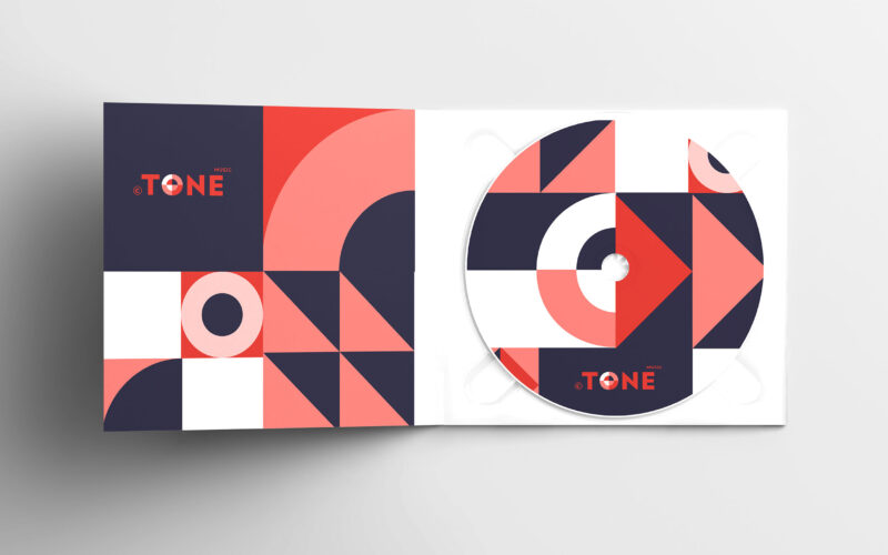
Tone
How can graphic design visually translate the rhythm, spontaneity, and structure of jazz? The challenge: create a bold, cohesive identity that feels as alive and dynamic as the music itself. The graphic design for the “TONE” Jazz Music...
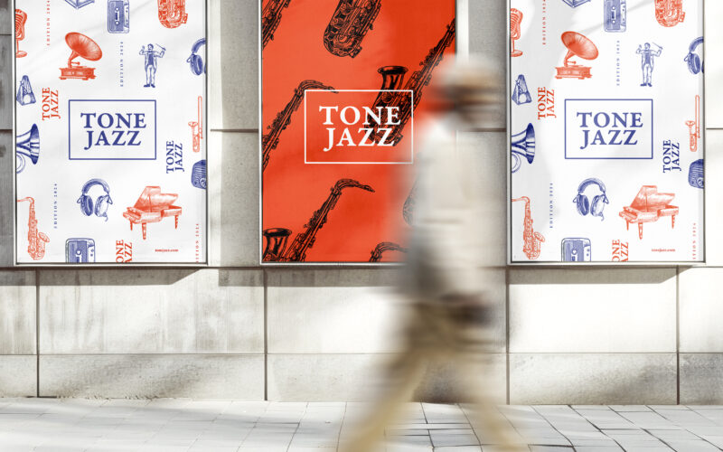
Tone Jazz
How does graphic design balance tradition and modernity for a jazz festival? TONE JAZZ uses orange and blue with intricate musician engravings, blending vintage charm and contemporary clarity in a cohesive visual identity. The visual...