


More details
Brige Bank’s identity centers on the dash linking its two Bs—a metaphorical bridge and connection. How can visual design express trust and relationship within a contemporary banking image?
The Brige Bank of London Annual Report centers its design on the dash linking the two “B”s—a visual bridge symbolizing trust, connection, and continuity. The soft green palette, reminiscent of currency, subtly reinforces themes of prosperity and financial stability. This hue also echoes the London Bridge, an emblem of the city’s heritage, aristocratic refinement, and global financial prestige. Structured typography and minimal layouts convey order and discipline, while spacious composition invites clarity and confidence. The report reflects Brige Bank’s B2B identity: a bridge between tradition and innovation, uniting clients and institutions through enduring values of trust and excellence.
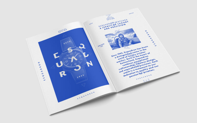
Escadron
How can editorial design elevate a luxury watch brand’s aviation heritage? Esquadron translates precision, adventure, and identity into visuals that echo cockpit geometry and evoke sky-bound elegance and technical mastery. Esquadron is a...
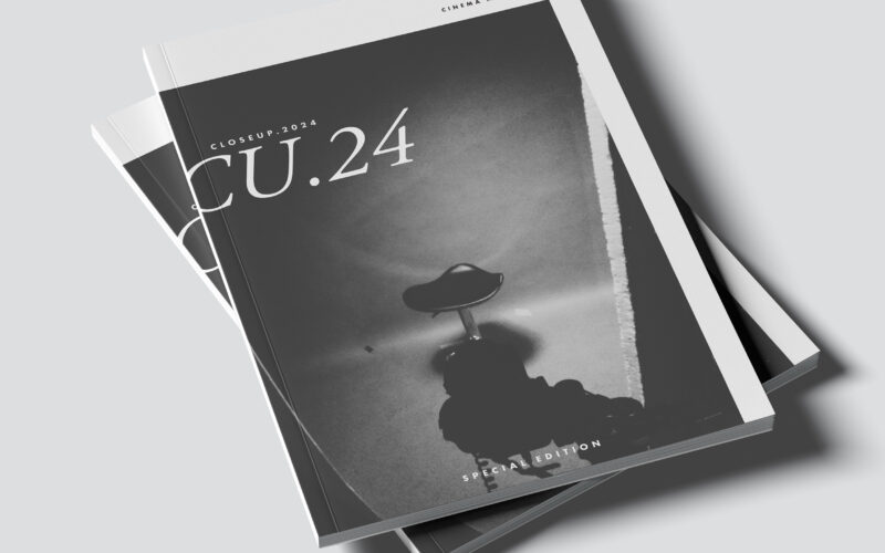
Close Up
CU.24 plays with contrast, framing, and cinematic rhythm. The challenge: how can graphic design capture the depth of film language—light, shadow, and emotion—through purely static composition? The CU.24 brochure embodies cinematic...
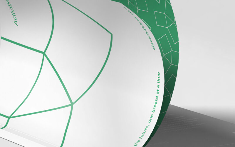
Clover
How can Clover’s magazine graphic design balance minimalist Swiss modernism with ecological symbolism, integrating the helix logo to reflect clean energy and sustainability while maintaining elegance and clarity? The magazine for Clover, a...
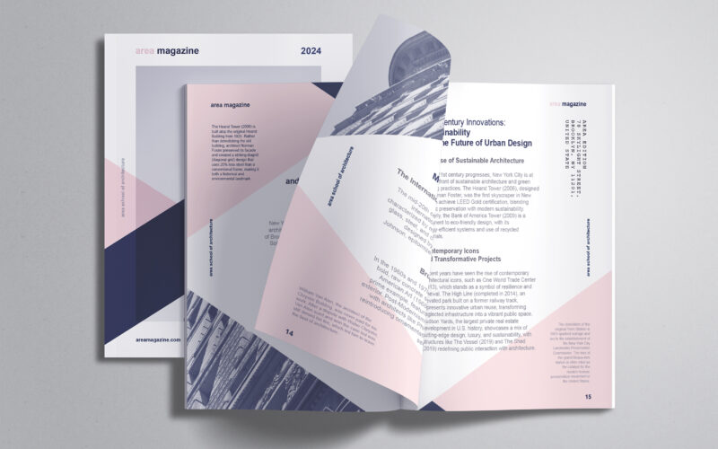
Area
How can editorial design embody architectural thinking? AREA Magazine’s brochure uses layered, intersecting forms and unexpected imagery to mirror the structural logic and creative spontaneity that define the built environment. The graphic...