


More details
The graphic design of Grace by Les Savonneries Marseillaises is featured on cosmetics, bags, booklets, and posters. With a dominant white palette, the design is stripped to its minimalist core, evoking clinical purity and the essential nature of the product. The name references the word “grace,” the name Grace, and the Provençal town of Grasse, famed for flowers and perfumes. To bring warmth and humanity, the brand uses photographs of ballet dancers. Their poise conveys elegance, femininity, beauty, fragility, and discipline. The dancers’ flowing dresses unfold like blooming flowers, suggesting natural grace, subtle movement, and the poetry of the human form.
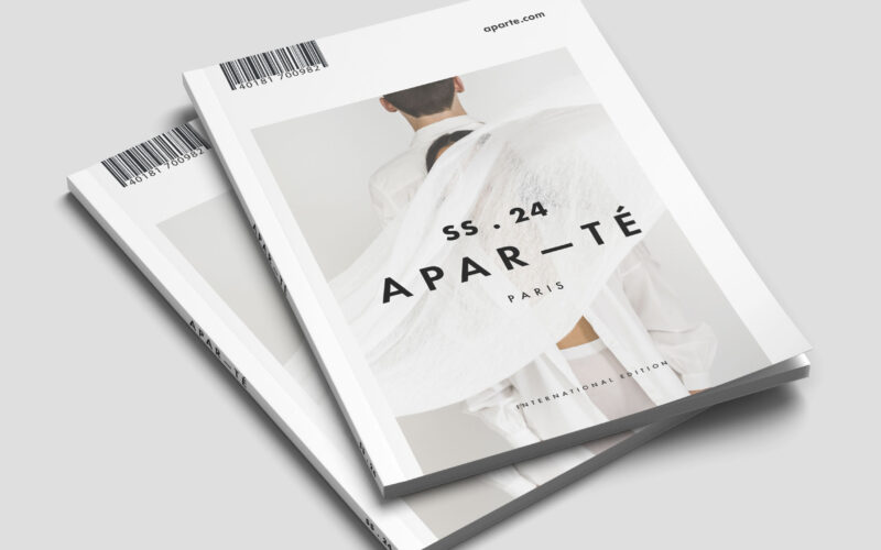
Apar-te
Apar-Té explores balance through emptiness, contrast, and space. The challenge lies in creating visual emotion with minimal elements—how to express depth and tension through pure graphic restraint. The Apar-Té brochure captures refined...
Aparte
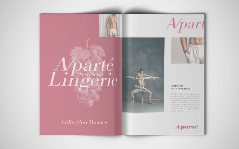
How can a lingerie brand communicate sensuality and intimacy without falling into clichés — instead creating an artistic, emotional experience that celebrates connection, elegance, and the shared space between two bodies?Aparté is a...
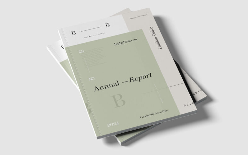
Bridge
Brige Bank’s identity centers on the dash linking its two Bs—a metaphorical bridge and connection. How can visual design express trust and relationship within a contemporary banking image? The Brige Bank of London Annual Report centers its...
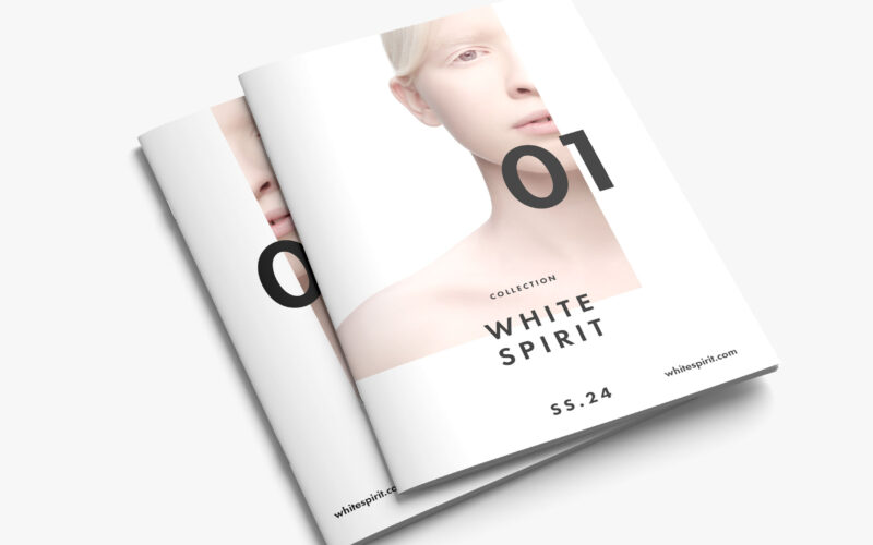
White Spirit
White Spirit SS.24 questions the notion of purity in modern aesthetics — is whiteness a symbol of innocence or emptiness? The magazine explores identity, fragility, and transcendence through minimalist visual storytelling. White Spirit...