


More details
How can a visual identity empower teenage girls through design? “-18” turns diary scribbles, irony, and soft tones into a playful code, creating a youthful, exclusive world that joyfully excludes adults.
The graphic design for the brand “-18” is playful and rebellious, inspired by teen diary doodles. It features soft pink and white tones, appealing to young girls. The logo, resembling an age restriction sign, flips the concept: instead of barring minors, it humorously prohibits adults. This ironic twist creates a fun, exclusive space for youth. The design appears on T-shirts, cosmetic packaging, badges, bags, and stationery. Every item reflects a personal, intimate vibe, like a secret club. With its hand-drawn aesthetic and cheeky messaging, “-18” claims a whimsical world where only the young are allowed. Adults? Sorry, you’re not invited.
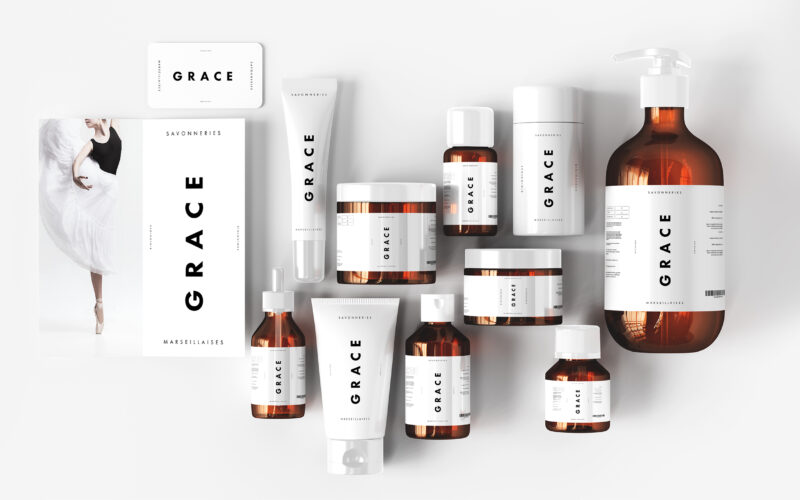
Grace
The graphic design of Grace by Les Savonneries Marseillaises is featured on cosmetics, bags, booklets, and posters. With a dominant white palette, the design is stripped to its minimalist core, evoking clinical purity and the essential...
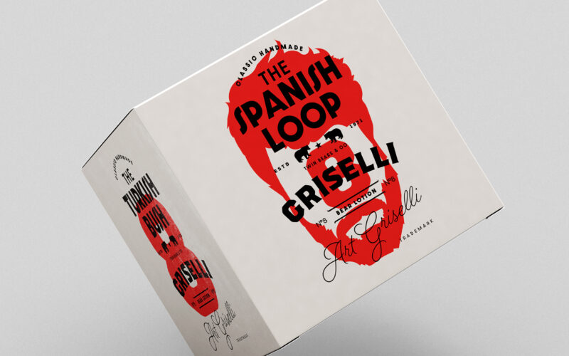
Griselli
How can a grooming brand express both artisanal tradition and rebellious identity through graphic design that blends symbolism, personalization, and a touch of vintage, all while embracing its wild, “bear-like” roots? The graphic design...
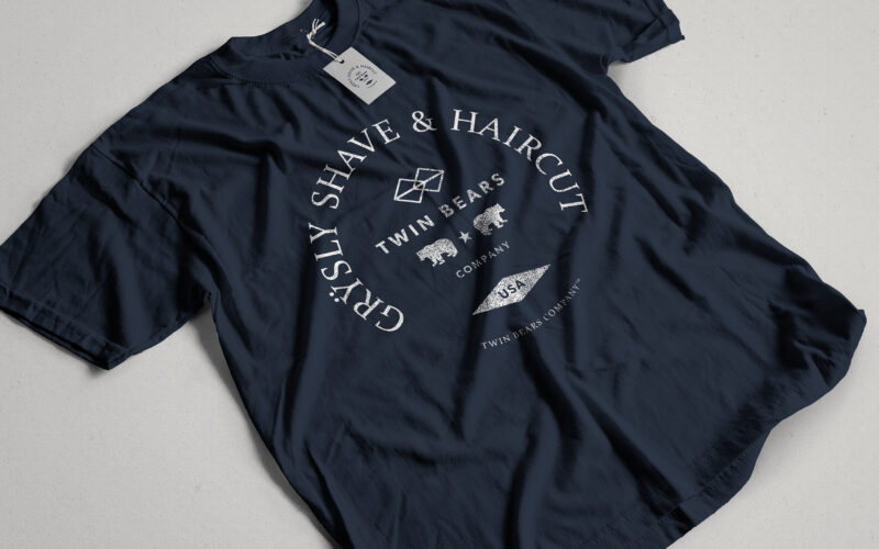
Grysly
How can graphic design channel primal masculinity and refined craftsmanship into a cohesive identity? Grÿsly explores this balance through bold colors, wild imagery, and vintage codes rooted in nature and heritage. The graphic design of...
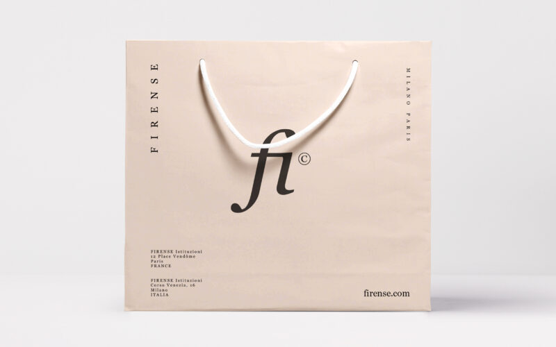
Firense
How can graphic design create a sense of intimacy and natural elegance in the beauty industry? Fi explores minimalism, softness, and personal symbolism to form a deeply emotional brand experience. The graphic design for Fi by Firense, a...