


More details
How can Clover’s magazine graphic design balance minimalist Swiss modernism with ecological symbolism, integrating the helix logo to reflect clean energy and sustainability while maintaining elegance and clarity?
The magazine for Clover, a wind-powered electricity distribution company, features a clean and timeless graphic design inspired by Swiss modernism. The layout is minimalist and structured, prioritizing clarity and function while maintaining an elegant, professional look. The dominant color is green, symbolizing ecology, sustainability, and the brand’s clover namesake. A distinctive visual element is the use of the company’s helix-shaped logo—reminiscent of both a clover and a wind turbine blade — as a framing device for photographs throughout the magazine. This thoughtful integration of form and function reflects Clover’s commitment to clean energy and intelligent, forward-thinking design.
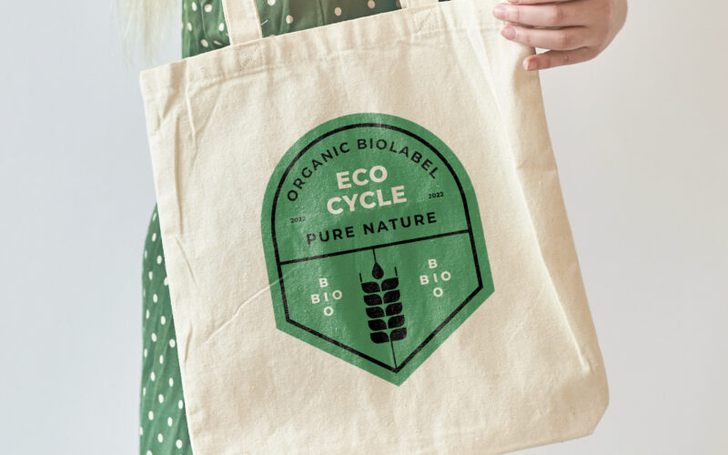
Ecocycle
How can ecological certification be visually translated into a recognizable, trustworthy emblem—one that conveys sustainable values and speaks meaningfully to both producers and consumers through form, color, and material? At the center of...
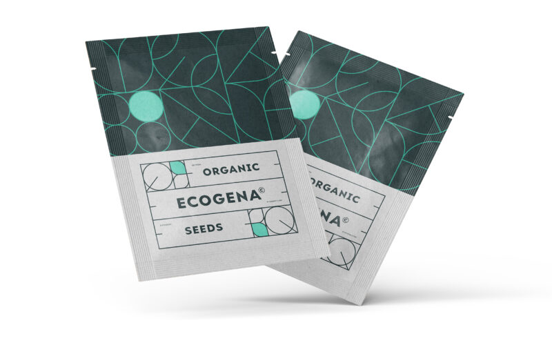
Ecogena
How can graphic design express both ecological sensitivity and scientific rigor? Ecogena balances organic motifs with structured layouts, crafting a visual identity that feels both natural and technical—designed for serious, sustainable...
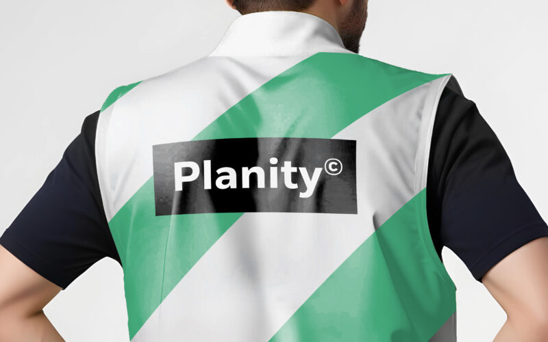
Planity
How can design unite industry and sustainability? Planity’s green-white palette and eco-inspired visuals explore how graphic identity communicates environmental commitment while maintaining professionalism and clarity in construction...
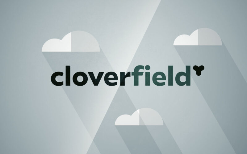
Cloverfield
How can a brand in energy distribution convey both innovation and eco-responsibility? Cloverfield answers with a bright, modern film that blends clean visuals, symbolism, and rhythm to express sustainable mobility everywhere. The...