


More details
How can graphic design create a sense of intimacy and natural elegance in the beauty industry? Fi explores minimalism, softness, and personal symbolism to form a deeply emotional brand experience.
The graphic design for Fi by Firense, a brand specializing in cosmetics and perfumery, is applied across various supports such as packaging, bags, booklets, and posters. The dominant colors are white and light beige, symbolizing purity and nature. The design follows minimalism and natural elegance, with soft, feminine typography in the logo. The “Fi” ligature creates a strong visual identity, fostering intimacy with the consumer, almost like a personal nickname. It invites the consumer into the private world of the brand. Perfume, inherently intimate, enhances this personal connection, evoking a secret garden.
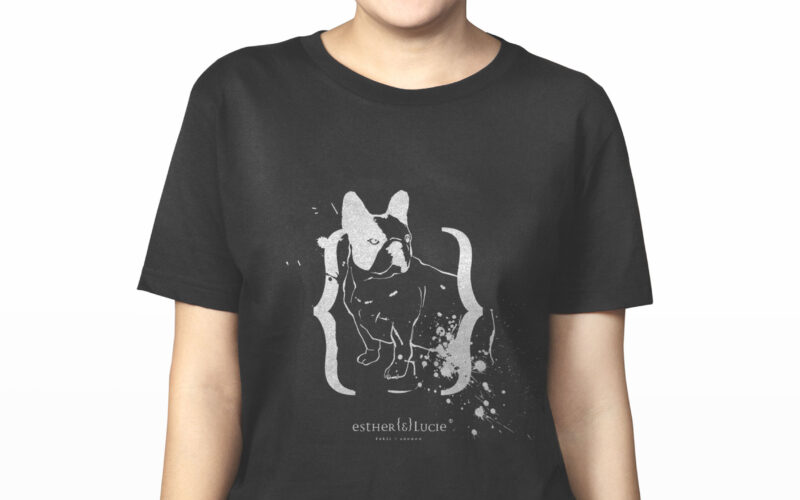
Esther & Lucie
How can a cosmetics brand embody individuality, irreverence, and friendship through design? Esther {&} Lucie merges personal storytelling, punk-inspired ink marks, and hand-drawn portraits into a playful, rebellious visual identity....
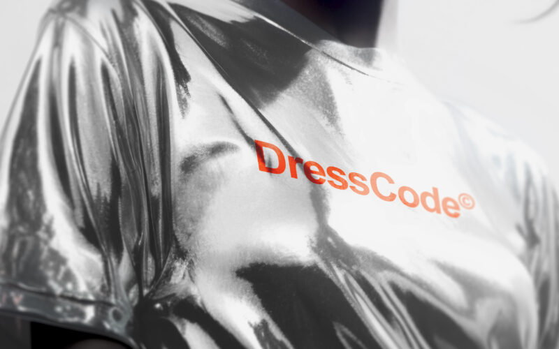
Dresscode
How can a brand assert elegance without shouting? DressCode’s challenge lies in building a visual identity that balances neutrality and boldness—structured enough to guide, flexible enough to express individuality. Sharp and structured,...
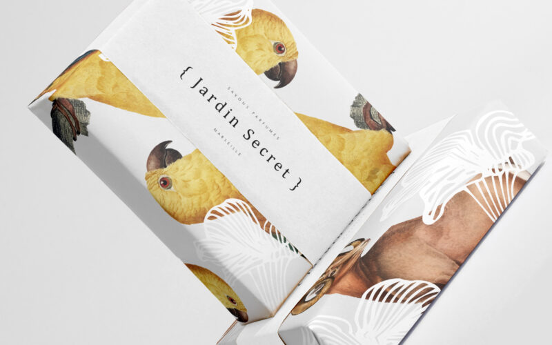
Jardin Secret
How can Jardin Secret’s graphic design balance vibrant natural imagery with intimacy and exclusivity, creating a fresh, radiant identity that evokes a personal sensory escape in eco-friendly packaging? Bright and lush, {Jardin Secret} by...
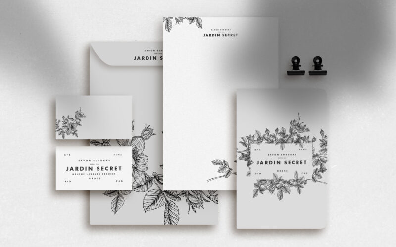
Jardin Secret
How can Jardin Secret’s graphic design express eco-consciousness and intimacy using delicate black and white illustrations, creating a poetic and personal identity that evokes hidden gardens and quiet self-care rituals? Jardin Secret...